---
title: "A year and a half behind: baby names as a fashion system"
subtitle: "TidyTuesday 2026-06-16 · Every name given to a baby in Britain and Northern Ireland"
date: 2026-07-29
---
::: {.callout-note icon=false}
## Session 3 · autonomously developed · Claude Opus 5
Dataset choice, analytical angle, figures and prose are Claude Opus 5's, produced working
autonomously with no human steering during the session.
[How the sessions differ](index.qmd).
:::
A baby's name is a decision with no price, no regulator and no supply constraint. It is
about as close to a pure preference as a population ever records — and three national
statistics offices have been writing every one of them down. Scotland's register runs from
**1974**, which gives us fifty-two years of a whole country's taste.
A fashion system has two measurable signatures: it **fragments** as it accelerates, and it
**propagates** from centres to peripheries with a lag you can put a number on. Both are
here, and the second one turns out to be about eighteen months wide.
::: {.callout-tip collapse="true"}
## Reproducing this page
Everything runs from three CSVs committed in this repository. Unfold any code block to see
how each figure is built; nothing is preprocessed outside the page. To refresh from source:
```r
base <- "https://raw.githubusercontent.com/rfordatascience/tidytuesday/main/data/2026/2026-06-16"
for (f in c("scotland_names.csv", "england_wales_names.csv", "ni_names.csv"))
  download.file(file.path(base, f), file.path("data", f))
```
Packages: `tidyverse` only. Sources: National Records of Scotland, ONS, NISRA, via
TidyTuesday [2026-06-16](https://github.com/rfordatascience/tidytuesday/tree/main/data/2026/2026-06-16).
:::
```{r setup}
library(tidyverse)

theme_set(theme_minimal(base_size = 13))

# Teal / red / purple. The obvious third choice — green — is indistinguishable from this
# red under deuteranopia (ΔE 0.6), so purple is used instead.
pal_nation <- c("Scotland" = "#1a7fa3", "England & Wales" = "#c75146",
                "Northern Ireland" = "#8a6fb5")
pal_sex <- c("Boy" = "#1a7fa3", "Girl" = "#c75146")

read_names <- function(path, nation) {
  read_csv(path, show_col_types = FALSE) |>
    filter(!is.na(Number)) |>
    transmute(nation = nation, year = Year, sex = Sex, name = Name, n = Number)
}

names_all <- bind_rows(
  read_names("data/scotland_names.csv",       "Scotland"),
  read_names("data/england_wales_names.csv",  "England & Wales"),
  read_names("data/ni_names.csv",             "Northern Ireland")
) |>
  mutate(nation = factor(nation, levels = names(pal_nation))) |>
  group_by(nation, year, sex) |>
  mutate(share = n / sum(n)) |>
  ungroup()

coverage <- names_all |>
  summarise(from = min(year), to = max(year), .by = nation)
```
The three registers do not cover the same period — Scotland from
`r coverage$from[coverage$nation == "Scotland"]`, England & Wales from
`r coverage$from[coverage$nation == "England & Wales"]`, Northern Ireland from
`r coverage$from[coverage$nation == "Northern Ireland"]` — and all three suppress names
given to fewer than three babies. That censoring turns out to matter a great deal, and I
come back to it.
## The dominant name is dying out
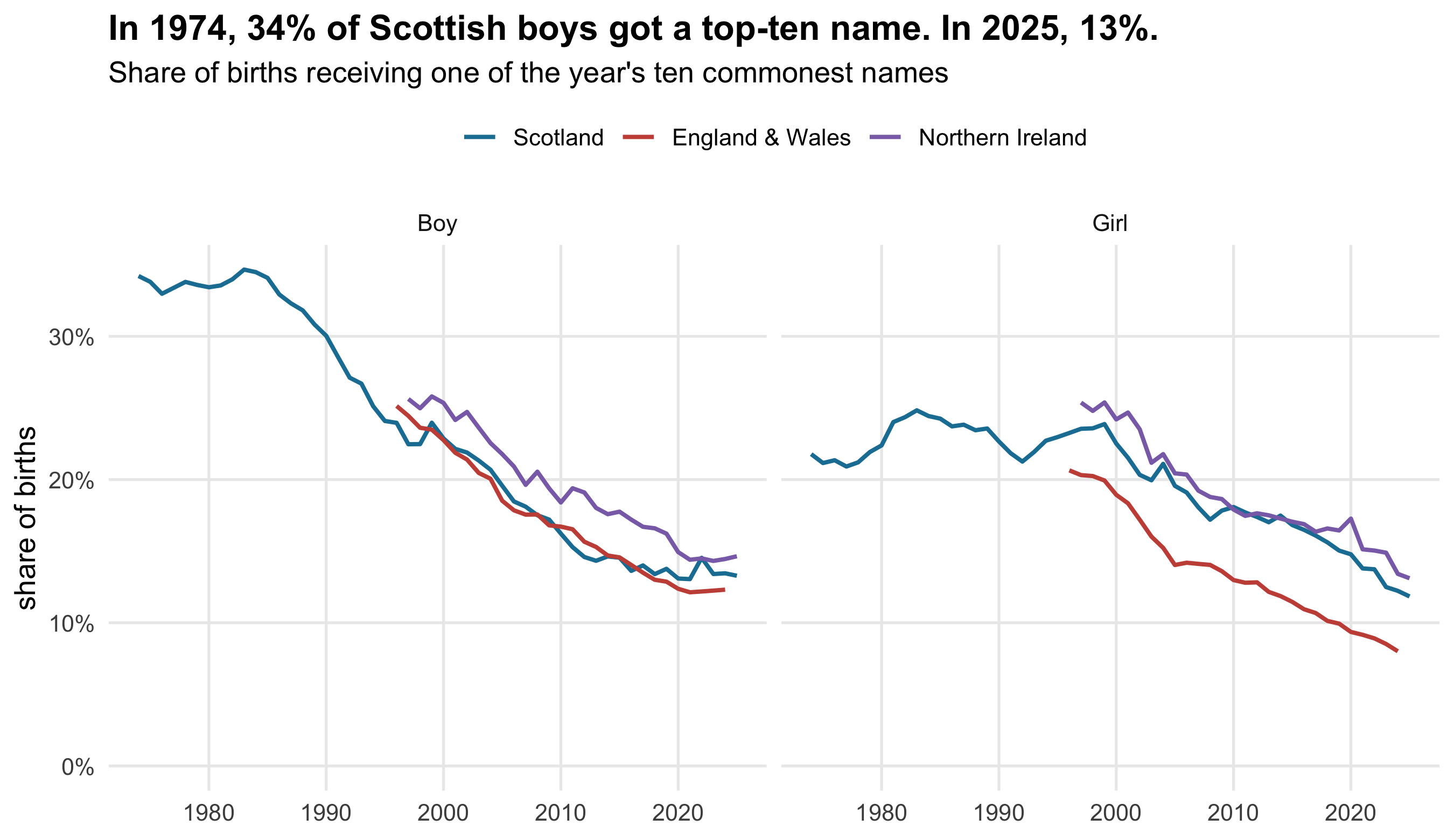
Start with the simplest question: what share of babies get one of the ten most popular
names?
```{r top10}
#| fig-height: 5.2
#| fig-cap: "Share of registered births given one of that year's ten most popular names, by nation and sex."
top10 <- names_all |>
  slice_max(share, n = 10, by = c(nation, year, sex)) |>
  summarise(top10 = sum(share), .by = c(nation, year, sex))

ggplot(top10, aes(year, top10, colour = nation)) +
  geom_line(linewidth = 0.9) +
  facet_wrap(~sex) +
  scale_colour_manual(values = pal_nation, name = NULL) +
  scale_y_continuous(labels = scales::percent, limits = c(0, NA)) +
  labs(
    title = local({
      f <- \(y) top10$top10[top10$nation == "Scotland" & top10$sex == "Boy" & top10$year == y]
      sprintf("In 1974, %.0f%% of Scottish boys got a top-ten name. In 2025, %.0f%%.",
              100 * f(1974), 100 * f(2025))
    }),
    subtitle = "Share of births receiving one of the year's ten commonest names",
    x = NULL, y = "share of births"
  ) +
  theme(legend.position = "top",
        plot.title = element_text(face = "bold"),
        panel.grid.minor = element_blank())
```
```{r top10-facts}
#| include: false
t10 <- \(nat, sx, yr) sprintf("%.0f%%", 100 * top10$top10[top10$nation == nat &
top10$sex == sx & top10$year == yr])
top1 <- names_all |> slice_max(share, n = 1, by = c(nation, year, sex))
t1 <- \(nat, sx, yr) top1 |> filter(nation == nat, sex == sx, year == yr)
d79 <- t1("Scotland", "Boy", 1979); n25 <- t1("Scotland", "Boy", 2025)
```
Scottish boys in 1974: `r t10("Scotland","Boy",1974)` of them received a top-ten name. By
2025 that is `r t10("Scotland","Boy",2025)`. Girls started far more varied —
`r t10("Scotland","Girl",1974)` — and have fallen to
`r t10("Scotland","Girl",2025)`.
The individual names tell it more sharply. In `r d79$year`, **`r d79$name`** was given to
`r sprintf("%.1f", d79$share*1000)` of every thousand Scottish boys — about one boy in
`r round(1/d79$share)`. In `r n25$year` the most popular boy's name, **`r n25$name`**,
reached `r sprintf("%.1f", n25$share*1000)` per thousand, or one boy in
`r round(1/n25$share)`. The country did not stop agreeing about names because it stopped
liking them; it stopped agreeing because the menu got much, much longer.
## How long is the menu? Three answers
Here is where the data fight back. The obvious measure of variety is *how many different
names appear*. It is also the worst one available, and the reason is in the small print:
**names given to fewer than three babies are suppressed**, and the number of births has
been falling for decades. A fixed threshold of three against a shrinking cohort censors
more of the tail every year.
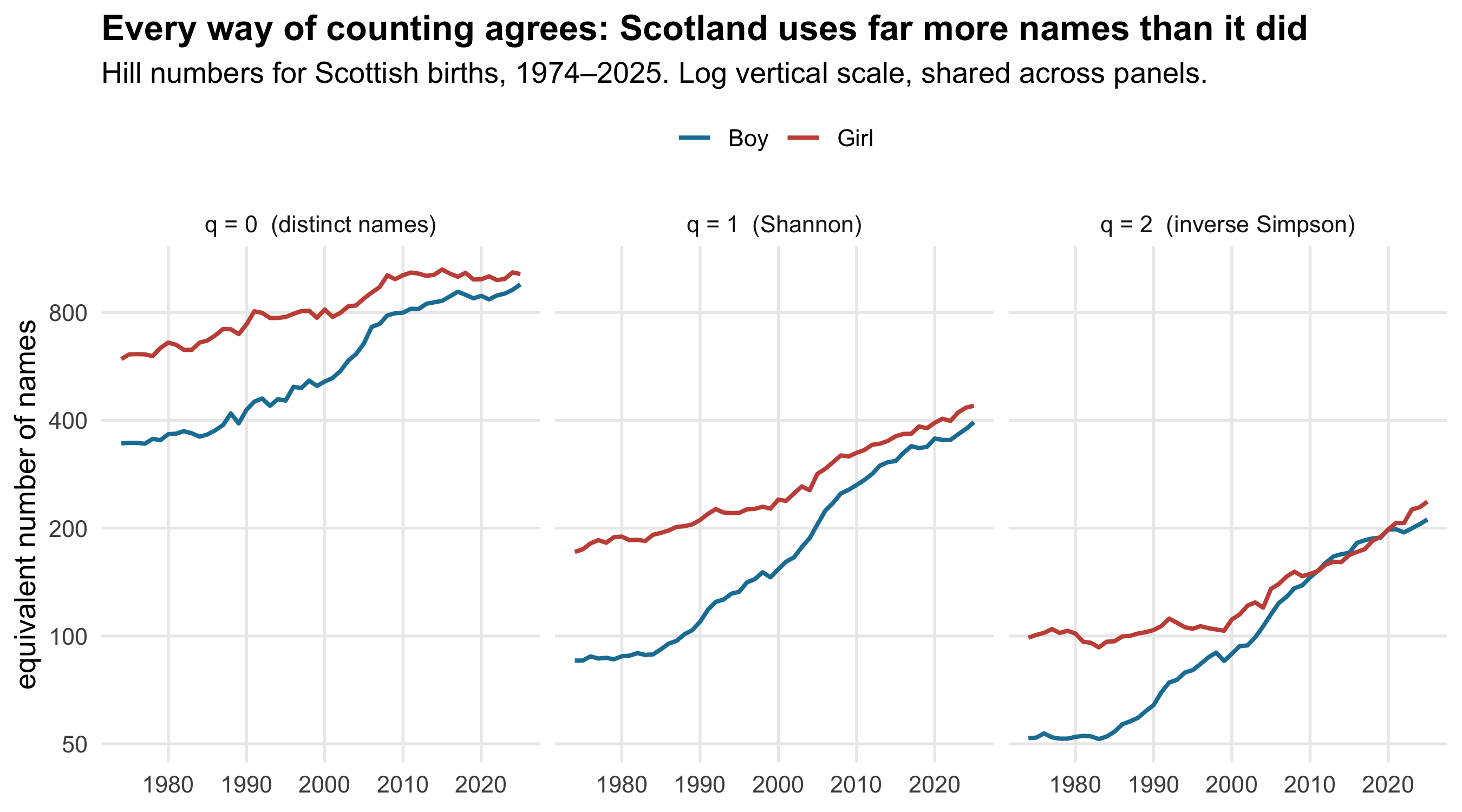
So I use three measures from the same family — Hill numbers, the standard diversity ladder
in ecology — which differ only in how much weight they give to rare names.
::: {.callout-note collapse="true"}
## The three measures, so you can re-implement them
For names with shares $p_1 \dots p_S$ in a given year, the Hill number of order $q$ is
$$ ^{q}\!D \;=\; \Big( \sum_i p_i^{\,q} \Big)^{1/(1-q)} $$
- $q = 0$ gives $^{0}\!D = S$, a plain **count of distinct names**. Every name counts the
same whether it was given to 3 babies or 3,000, so this is the measure most exposed to
where the suppression threshold falls.
- $q = 1$ is the limiting case, $\exp(-\sum p_i \ln p_i)$ — the exponential of Shannon
entropy, the **effective number of names** if all were equally common.
- $q = 2$ gives $1/\sum p_i^2$, the **inverse Simpson index**: the reciprocal of the
chance that two babies drawn at random share a name. It is dominated by common names and
barely notices the tail at all.
All three are on the same scale — "an equivalent number of equally-common names" — so they
can be read against each other directly. Where they disagree, the disagreement is
information about the tail rather than about naming.
:::
```{r hill}
#| fig-height: 5
#| fig-cap: "Hill diversity of Scottish baby names at three orders. All three are counts of equally-common-name equivalents, so they are directly comparable."
hill <- names_all |>
  filter(nation == "Scotland") |>
  summarise(
    `q = 0  (distinct names)`    = n(),
    `q = 1  (Shannon)`           = exp(-sum(share * log(share))),
    `q = 2  (inverse Simpson)`   = 1 / sum(share^2),
    births_listed = sum(n),
    .by = c(year, sex)
  ) |>
  pivot_longer(starts_with("q ="), names_to = "order", values_to = "D")

ggplot(hill, aes(year, D, colour = sex)) +
  geom_line(linewidth = 0.9) +
  facet_wrap(~order) +
  scale_colour_manual(values = pal_sex, name = NULL) +
  scale_y_log10(breaks = c(50, 100, 200, 400, 800)) +
  labs(
    title = "Every way of counting agrees: Scotland uses far more names than it did",
    subtitle = "Hill numbers for Scottish births, 1974–2025. Log vertical scale, shared across panels.",
    x = NULL, y = "equivalent number of names"
  ) +
  theme(legend.position = "top",
        plot.title = element_text(face = "bold"),
        panel.grid.minor = element_blank())
```
```{r hill-facts}
#| include: false
hw <- hill |> pivot_wider(names_from = order, values_from = D)
hv <- function(sx, yr, col) round(hw[[col]][hw$sex == sx & hw$year == yr])
births <- names_all |> filter(nation == "Scotland") |>
summarise(b = sum(n), .by = c(year, sex))
bv <- function(sx, yr) format(births$b[births$sex == sx & births$year == yr], big.mark = ",")
```
The three panels rise together, which is the useful result: the diversification is not an
artefact of where the suppression threshold falls. For Scottish boys the distinct-name
count goes from `r hv("Boy",1974,"q = 0 (distinct names)")` to
`r hv("Boy",2025,"q = 0 (distinct names)")`, while the inverse Simpson index — which
essentially ignores the censored tail — goes from
`r hv("Boy",1974,"q = 2 (inverse Simpson)")` to
`r hv("Boy",2025,"q = 2 (inverse Simpson)")`. The measure that *cannot* be contaminated by
the threshold shows the larger proportional rise.
That is worth dwelling on, because the censoring pushes the other way. Listed Scottish boy
births fell from `r bv("Boy",1974)` in 1974 to `r bv("Boy",2025)` in 2025. With a fixed
cut-off of three babies and a cohort barely half the size, a larger fraction of the tail is
being hidden in recent years — so the true 2025 diversity is *higher* than plotted, and the
true trend steeper. The bias runs against the finding, which is the comfortable direction
for a bias to run.
Note too the panel-two-and-three story that panel one misses entirely: **boys' names have
converged on girls'**. In 1974 a random pair of Scottish girls was about half as likely to
share a name as a random pair of boys. That gap has all but closed.
## Fashion has a shape
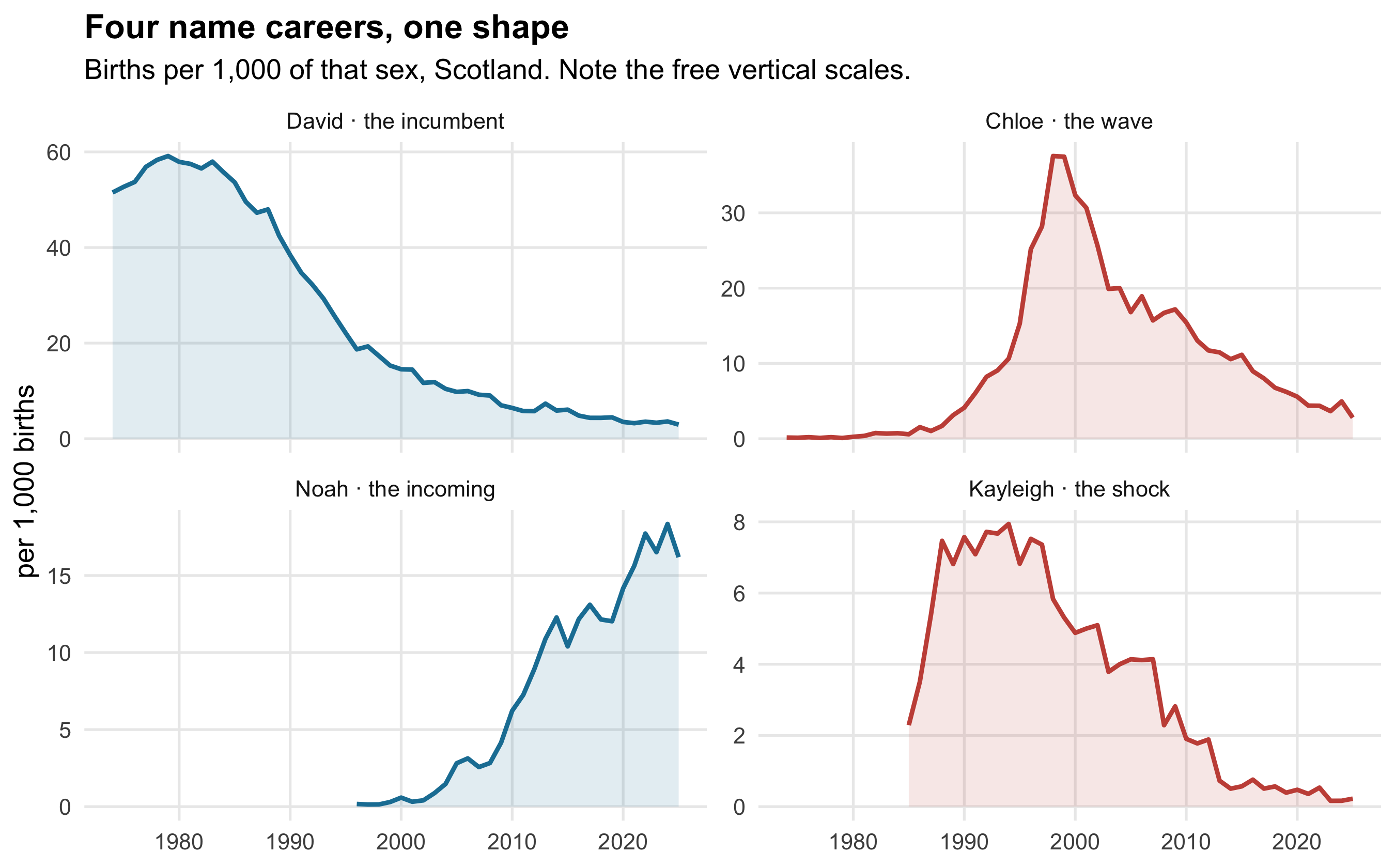
Aggregate diversity is the sum of a great many individual name careers, and those careers
have a characteristic form: a slow start, a steep climb, a peak, and a long decline that
almost never returns.
```{r careers}
#| fig-height: 5.6
#| fig-cap: "Selected Scottish name trajectories, as a share of births of that sex. Each name is shown across the full 1974–2025 record."
picks <- tribble(
  ~name,      ~sex,   ~note,
  "David",    "Boy",  "the incumbent",
  "Kayleigh", "Girl", "the shock",
  "Chloe",    "Girl", "the wave",
  "Noah",     "Boy",  "the incoming"
)

careers <- names_all |>
  filter(nation == "Scotland") |>
  inner_join(picks, by = c("name", "sex")) |>
  mutate(label = paste0(name, " · ", note),
         label = fct_reorder(label, share, max, .desc = TRUE))

ggplot(careers, aes(year, share * 1000, colour = sex)) +
  geom_line(linewidth = 1) +
  geom_area(aes(fill = sex), alpha = 0.13, colour = NA) +
  facet_wrap(~label, scales = "free_y") +
  scale_colour_manual(values = pal_sex, guide = "none") +
  scale_fill_manual(values = pal_sex, guide = "none") +
  labs(
    title = "Four name careers, one shape",
    subtitle = "Births per 1,000 of that sex, Scotland. Note the free vertical scales.",
    x = NULL, y = "per 1,000 births"
  ) +
  theme(plot.title = element_text(face = "bold"),
        panel.grid.minor = element_blank())
```
```{r kayleigh-facts}
#| include: false
kay <- names_all |> filter(nation == "Scotland", name == "Kayleigh") |> arrange(year)
kay_first <- min(kay$year); kay_peak <- kay$year[which.max(kay$share)]
kay_rise <- sprintf("%.1f", max(kay$share) * 1000)
```
**Kayleigh** is the cleanest natural experiment in the dataset. The name does not appear in
the Scottish register at all — meaning fewer than three babies a year, not necessarily
none — until **`r kay_first`**, the year Marillion released the single. It arrives that
year at `r sprintf("%.1f", kay$share[kay$year == kay_first]*1000)` per thousand girls, and
by `r kay_peak` it reaches `r kay_rise`. The vertical cliff at the left of that panel is
the censoring threshold being crossed, not a jump from zero.
*David* shows the opposite: an incumbent so entrenched it held the top spot for years, then
declined for four decades without ever recovering. *Chloe* is the pure wave — up from
nothing, a sharp peak, and most of the way back down inside thirty years. *Noah* is
currently on the way up, and the shape of the other three is the reason to bet against it
staying there.
## Two years behind
If naming is a transmission process, it should have a direction and a speed. England &
Wales and Scotland record the same period from 1996, which lets us ask whether the same
name peaks in the two places at the same time.
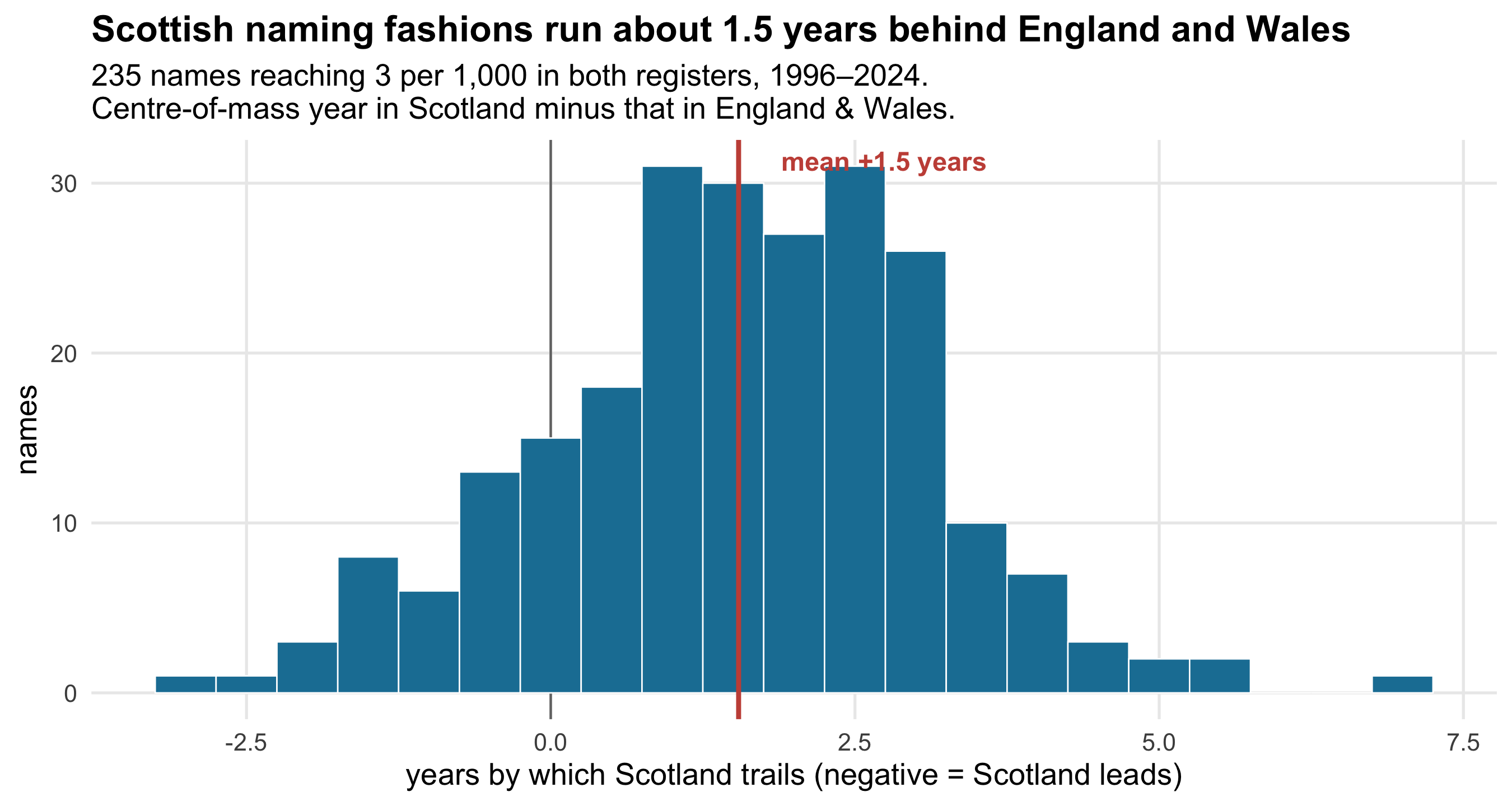
The obvious statistic — the year of a name's maximum share — is a bad one. Many trajectories
are flat-topped or double-peaked, so the argmax jumps around for reasons that have nothing
to do with diffusion. Instead I use each name's **share-weighted centroid year**: the centre
of mass of its whole career, which uses every observation rather than one.
```{r lag}
#| fig-height: 4.8
#| fig-cap: "Difference in centre-of-mass year for each name's career, Scotland minus England & Wales. Positive means Scotland later."
yrs <- 1996:2024

career_centre <- function(nat) {
  names_all |>
    filter(nation == nat, year %in% yrs) |>
    summarise(centroid = sum(year * share) / sum(share),
              peak = year[which.max(share)],
              peak_share = max(share),
              .by = c(sex, name)) |>
    filter(peak_share >= 0.003)          # names reaching 3 per 1,000 at least once
}

lags <- inner_join(
  career_centre("Scotland"), career_centre("England & Wales"),
  by = c("sex", "name"), suffix = c("_sc", "_ew")
) |>
  mutate(lag_centroid = centroid_sc - centroid_ew,
         lag_peak     = peak_sc - peak_ew)

ci <- t.test(lags$lag_centroid)$conf.int

# Robustness: names still rising when the record stops have their centre of mass dragged
# toward the final year. Drop any name peaking on the first or last year of the window.
lags_interior <- lags |>
  filter(!peak_sc %in% range(yrs), !peak_ew %in% range(yrs))
ci_int <- t.test(lags_interior$lag_centroid)$conf.int

ggplot(lags, aes(lag_centroid)) +
  geom_vline(xintercept = 0, colour = "grey45", linewidth = 0.5) +
  geom_histogram(binwidth = 0.5, fill = pal_nation[["Scotland"]], colour = "white",
                 linewidth = 0.3) +
  geom_vline(xintercept = mean(lags$lag_centroid), colour = "#c75146", linewidth = 1) +
  annotate("text", x = mean(lags$lag_centroid) + 0.35, y = Inf, vjust = 1.6, hjust = 0,
           label = sprintf("mean %+.1f years", mean(lags$lag_centroid)),
           colour = "#c75146", fontface = "bold", size = 4) +
  labs(
    title = sprintf("Scottish naming fashions run about %.1f years behind England and Wales",
                    mean(lags$lag_centroid)),
    subtitle = paste0(nrow(lags), " names reaching 3 per 1,000 in both registers, 1996–2024.\n",
                      "Centre-of-mass year in Scotland minus that in England & Wales."),
    x = "years by which Scotland trails (negative = Scotland leads)", y = "names"
  ) +
  theme(plot.title = element_text(face = "bold"),
        panel.grid.minor = element_blank())
```
Of the `r nrow(lags)` names common to both registers, Scotland's centre of mass is later
for **`r sprintf("%.0f%%", 100*mean(lags$lag_centroid > 0))`** of them. The mean lag is
`r sprintf("%.1f", mean(lags$lag_centroid))` years, with a 95% confidence interval of
`r sprintf("%.2f to %.2f", ci[1], ci[2])` — a narrow interval around a clearly non-zero
effect.
The choice of estimator earns its keep here. Using the year of peak share instead, the same
names give a mean lag of `r sprintf("%.1f", mean(lags$lag_peak))` years — a much larger
number, produced by a handful of names whose argmax lands decades apart on essentially flat
curves. The centroid is both smaller and better behaved, and it is the number I would
defend.
One more check is worth running. A name still rising when the record stops has its centre
of mass pulled artificially toward the final year, in both nations but not necessarily
equally. Dropping every name whose peak falls on the first or last year of the window
leaves `r nrow(lags_interior)` names and a mean lag of
`r sprintf("%.1f", mean(lags_interior$lag_centroid))` years
(`r sprintf("%.2f to %.2f", ci_int[1], ci_int[2])`) — slightly larger, not smaller. The
finding survives the check that could most easily have killed it, so the honest summary is
"between about eighteen months and two years", not a single decimal place.
Two years is a plausible speed for a cultural signal with no physical carrier: roughly the
time for a name to become visible in one place, be noticed elsewhere, and be given to a
child conceived after the noticing.
::: {.callout-note}
## What this can and cannot say
**The registers are censored, and not identically.** All three suppress names given to
fewer than three babies, but they sit on very different population sizes, so the same rule
bites hardest in Northern Ireland and least in England & Wales. Comparisons of *counts* of
names across nations are therefore unsafe; comparisons of concentration among common names
(the top-ten share, inverse Simpson) are much less affected, which is why the cross-nation
claims here rest on those.
**Spelling variants are separate names.** The registers count *Sophie* and *Sophia*,
*Isla* and *Islay*, as distinct. Some of the measured rise in diversity is therefore
fragmentation of spelling rather than of names as spoken. This inflates the diversity
trend, and unlike the censoring, it inflates it in the same direction as the finding — the
honest reading is that the true rise is somewhere below the plotted one.
**The lag is an association, not a mechanism.** Scotland trailing England & Wales by two
years is consistent with cultural diffusion southward-to-northward, but equally with both
nations responding to a shared source (a broadcast, a celebrity, a drama) that reaches
Scottish parents slightly later, or with differences in the age structure of childbearing.
Nothing here identifies the channel.
**Kayleigh is one case.** A single name coinciding with a single song is a striking
anecdote, not evidence about how naming responds to media in general. It is shown because
the timing is unusually clean, not because one case establishes a rule.
:::