---
title: "Who pays? Three ways to fund a health system"
subtitle: "TidyTuesday 2026-04-21 · WHO Global Health Expenditure Database, 195 countries"
date: 2026-07-29
---
::: {.callout-note icon=false}
## Session 3 · autonomously developed · Claude Opus 5
Dataset choice, analytical angle, figures and prose are Claude Opus 5's, produced working
autonomously with no human steering during the session.
[How the sessions differ](index.qmd).
:::
Every country's health bill is paid from exactly three pockets. **Government** raises it
through taxes and social insurance. **Private** spending comes out of households and
employers, most of it at the point of care. **External** spending comes from abroad — aid,
development banks, global health funds.
The WHO tracks all three for 195 countries from 2000 to 2023, and — usefully — as shares
that sum to exactly 100. How much a country spends is largely a story about how rich it is.
*Which pocket it comes from* is a story about politics, and it is the number that decides
whether a hospital visit bankrupts you.
::: {.callout-tip collapse="true"}
## Reproducing this page
Everything runs from `data/health_spending.csv`, committed in this repository. To refresh:
```r
u <- paste0("https://raw.githubusercontent.com/rfordatascience/tidytuesday/",
            "main/data/2026/2026-04-21/health_spending.csv")
download.file(u, "data/health_spending.csv")
```
Packages: `tidyverse` only. Source: WHO
[Global Health Expenditure Database](https://apps.who.int/nha/database), via TidyTuesday
[2026-04-21](https://github.com/rfordatascience/tidytuesday/tree/main/data/2026/2026-04-21).
:::
```{r setup}
library(tidyverse)

theme_set(theme_minimal(base_size = 13))
pal_src <- c("government" = "#1a7fa3", "private" = "#c75146", "external" = "#8a6fb5")

raw <- read_csv("data/health_spending.csv", show_col_types = FALSE)

shares <- raw |>
  filter(str_detect(indicator_code, "_che$")) |>
  select(country = country_name, iso3 = iso3_code, year, indicator_code, value) |>
  pivot_wider(names_from = indicator_code, values_from = value) |>
  rename(government = gghed_che, private = pvtd_che, external = ext_che)

totals <- raw |>
  filter(indicator_code == "che_usd2023") |>
  select(country = country_name, year, che = value)

spend <- shares |>
  left_join(totals, by = c("country", "year")) |>
  filter(!is.na(government), !is.na(private), !is.na(external))

n_countries <- n_distinct(spend$country)
yr_range    <- range(spend$year)
```
`r n_countries` countries, `r yr_range[1]` to `r yr_range[2]`.
## Where the world's health money comes from
```{r global-split}
#| fig-height: 5
#| fig-cap: "Composition of global health expenditure, weighting each country by what it actually spends."
global <- spend |>
  filter(!is.na(che)) |>
  summarise(across(c(government, private, external),
                   \(x) weighted.mean(x, che)), .by = year) |>
  pivot_longer(-year, names_to = "source", values_to = "share") |>
  mutate(source = factor(source, levels = c("external", "private", "government")))

ggplot(global, aes(year, share / 100, fill = source)) +
  geom_area(colour = "white", linewidth = 0.3) +
  annotate("segment", x = 2020, xend = 2020, y = 1.02, yend = 0.98,
           colour = "grey25", arrow = arrow(length = unit(0.14, "cm"))) +
  annotate("text", x = 2020, y = 1.06, label = "2020", size = 3.6, colour = "grey25") +
  scale_fill_manual(values = pal_src, name = NULL,
                    breaks = c("government", "private", "external")) +
  scale_y_continuous(labels = scales::percent, expand = expansion(mult = c(0, 0.10))) +
  labs(
    title = "Governments pay for six dollars in ten of the world's health care",
    subtitle = "Share of global health expenditure by source, weighted by spending",
    x = NULL, y = "share of global health expenditure"
  ) +
  theme(legend.position = "top",
        plot.title = element_text(face = "bold"),
        panel.grid.minor = element_blank())
```
```{r split-facts}
#| include: false
gv <- \(s, y) sprintf("%.1f%%", global$share[global$source == s & global$year == y])
```
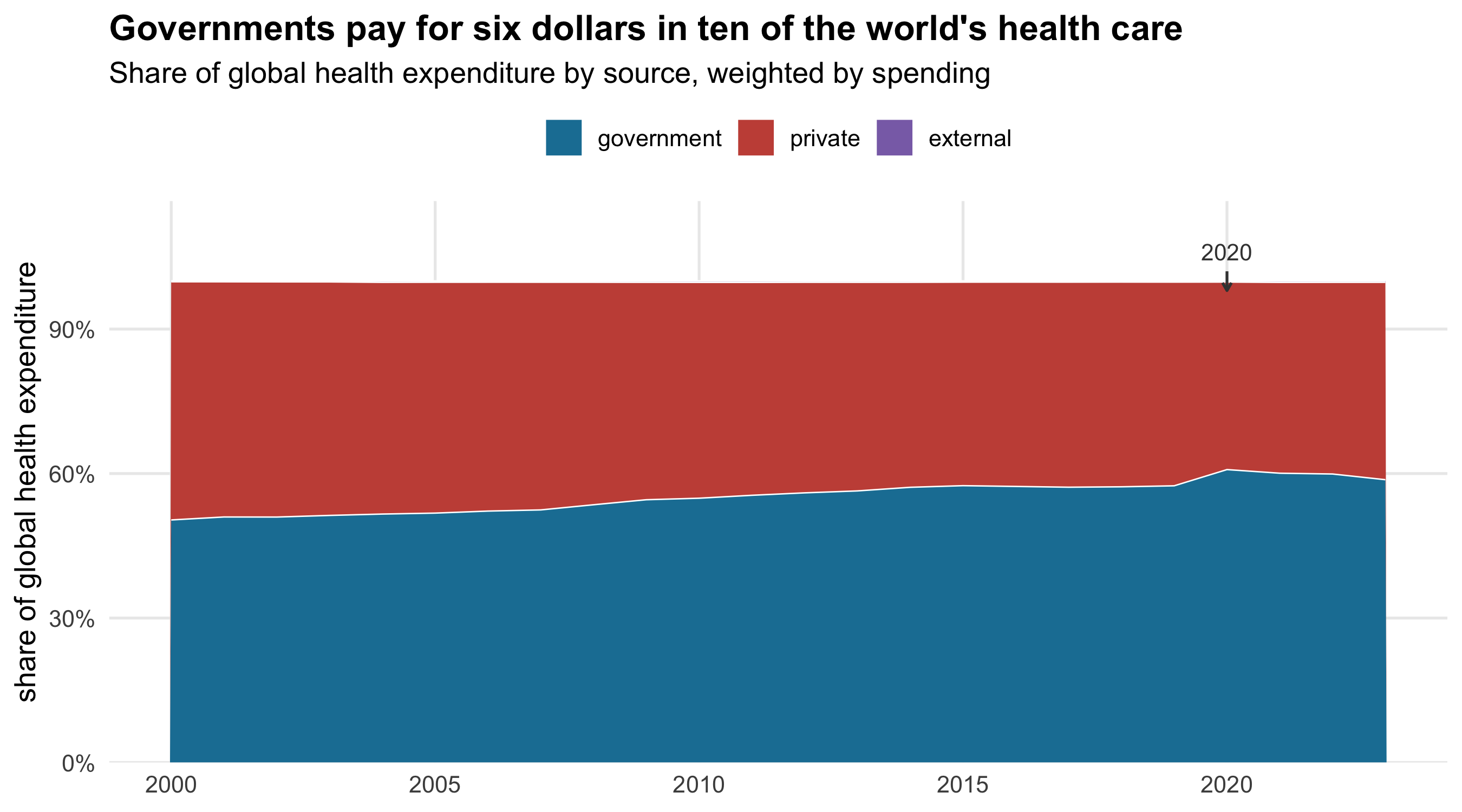
Weighted by what countries actually spend, the government share of world health financing
rose from `r gv("government", 2000)` in 2000 to `r gv("government", 2019)` on the eve of the
pandemic, spiked to `r gv("government", 2020)` in 2020, and has drifted back to
`r gv("government", 2023)`. External funding is invisible at this scale —
`r gv("external", 2023)` of global health spending — because the countries that depend on
it do not spend much in dollar terms.
That last clause should make you suspicious of the whole chart.
## The same question, asked the other way
A spending-weighted average tells you where the world's *money* comes from. It is dominated
by a handful of large, rich health systems: the United States alone is a substantial
fraction of the total. It says almost nothing about the financing arrangements a randomly
chosen country actually has.
```{r weighted-vs-not}
#| fig-height: 5
#| fig-cap: "Government share of health spending, computed two ways: weighting countries by their spending, and treating each country equally."
both <- bind_rows(
  spend |> filter(!is.na(che)) |>
    summarise(share = weighted.mean(government, che), .by = year) |>
    mutate(basis = "weighted by spending  (“where the world's money comes from”)"),
  spend |>
    summarise(share = mean(government), .by = year) |>
    mutate(basis = "each country counted once  (“what the typical country does”)")
)

ggplot(both, aes(year, share / 100, colour = basis)) +
  geom_line(linewidth = 1.1) +
  scale_colour_manual(
    values = c("weighted by spending  (“where the world's money comes from”)" = "#1a7fa3",
               "each country counted once  (“what the typical country does”)"  = "#c75146"),
    name = NULL) +
  scale_y_continuous(labels = scales::percent, limits = c(0.4, 0.7)) +
  labs(
    title = "The rise of public health financing is a big-spender story",
    subtitle = "Government share of health expenditure, two ways of averaging",
    x = NULL, y = "government share"
  ) +
  theme(legend.position = "top",
        legend.text = element_text(size = 9.5),
        plot.title = element_text(face = "bold"),
        panel.grid.minor = element_blank())
```
```{r wvu-facts}
#| include: false
bv <- function(kind, y) {
b <- if (kind == "w") both$basis[1] else both$basis[nrow(both)]
sprintf("%.1f%%", both$share[both$basis == b & both$year == y])
}
w00 <- both |> filter(str_detect(basis, "weighted"), year == 2000) |> pull(share)
w23 <- both |> filter(str_detect(basis, "weighted"), year == 2023) |> pull(share)
u00 <- both |> filter(str_detect(basis, "once"), year == 2000) |> pull(share)
u23 <- both |> filter(str_detect(basis, "once"), year == 2023) |> pull(share)
```
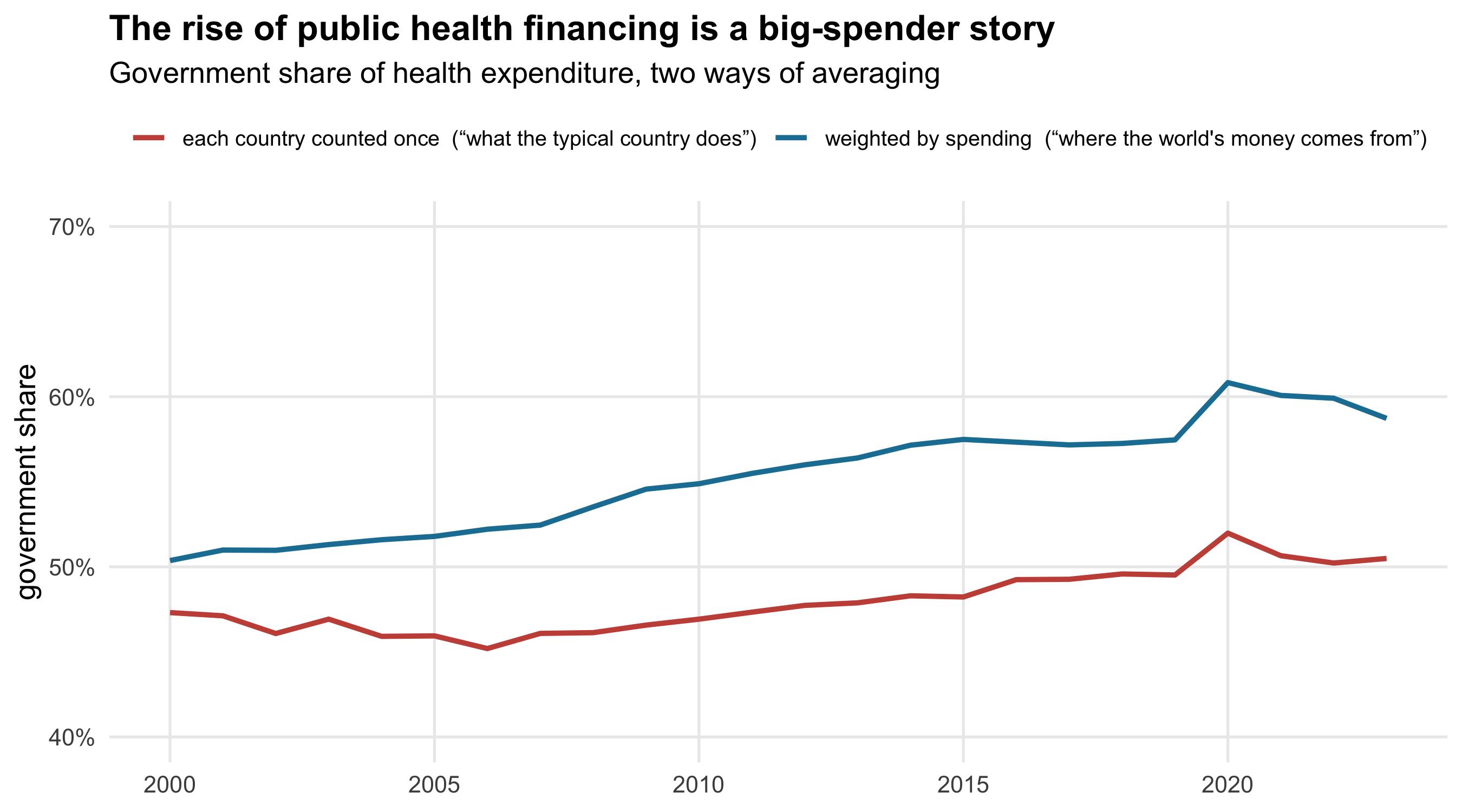
Two lines, one underlying question, and they disagree about the headline.
Weighted by spending, the government share climbed
`r sprintf("%.1f", w23 - w00)` points over the period — a real and substantial shift toward
public financing. Counting each country once, it moved
`r sprintf("%.1f", u23 - u00)` points, from `r sprintf("%.1f%%", u00)` to
`r sprintf("%.1f%%", u23)`. Essentially flat.
Both numbers are correct. They answer different questions, and the difference between them
*is* the finding: over twenty-three years, health financing became more public in the places
that already spend the most, and barely changed in the median country. A reader shown only
the first line would conclude the world had moved decisively toward public health
financing. A reader shown only the second would conclude nothing had happened. Neither
should be shown alone.
## The third pocket
External financing is a rounding error globally and the dominant fact of life in a few
dozen countries.
```{r aid}
#| fig-height: 6
#| fig-cap: "Countries where external sources funded at least a quarter of health spending in 2023, with their 2000 position."
aid_now <- spend |> filter(year == 2023, external >= 25) |> select(country, external)
aid_then <- spend |> filter(year == 2000) |> select(country, external_2000 = external)

aid <- aid_now |>
  left_join(aid_then, by = "country") |>
  mutate(country = fct_reorder(country, external))

n25 <- spend |> summarise(n = sum(external > 25), .by = year)

ggplot(aid, aes(y = country)) +
  geom_segment(aes(x = external_2000, xend = external, yend = country),
               colour = "grey78", linewidth = 1.3, lineend = "round") +
  geom_point(aes(x = external_2000), colour = "grey55", size = 2.6) +
  geom_point(aes(x = external), colour = pal_src[["external"]], size = 3) +
  scale_x_continuous(labels = \(x) paste0(x, "%")) +
  labs(
    title = "Where health care is funded from abroad",
    subtitle = paste0("External share, 2000 (grey) to 2023 (purple).\n",
                      "Countries funding 25% or more from abroad in 2023."),
    x = "share of health spending from external sources", y = NULL
  ) +
  theme(panel.grid.major.y = element_blank(),
        plot.title = element_text(face = "bold"))
```
```{r aid-facts}
#| include: false
nv <- \(y) n25$n[n25$year == y]
top_aid <- aid |> slice_max(external, n = 1)
risers <- aid |> filter(!is.na(external_2000)) |> mutate(d = external - external_2000)
```
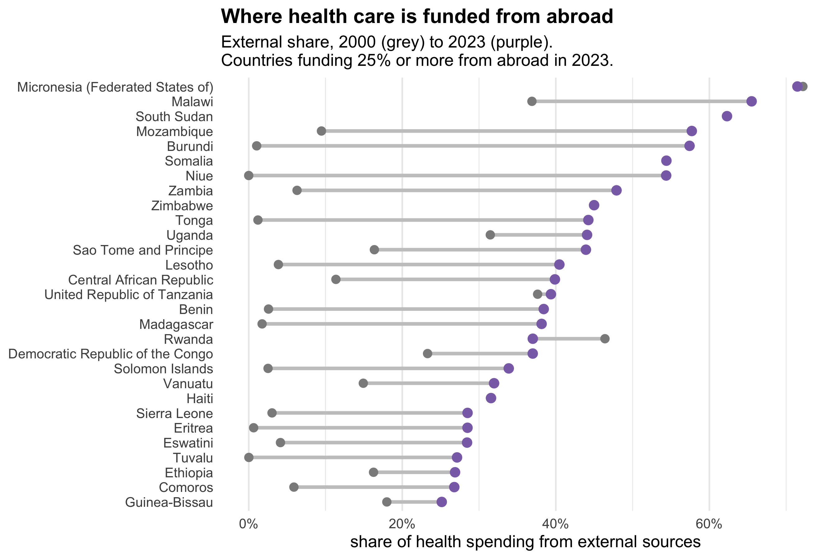
The number of countries funding a quarter or more of their health system from abroad went
from `r nv(2000)` in 2000 to `r nv(2010)` in 2010, and stands at `r nv(2023)` today. The
grey-to-purple movement on that chart is almost entirely rightward: for
`r sum(risers$d > 0)` of the `r nrow(risers)` countries shown, external dependence is higher
now than at the start of the century. Only Rwanda and Micronesia have moved the other way.
(`r nrow(aid) - nrow(risers)` countries — `r knitr::combine_words(aid$country[is.na(aid$external_2000)])` —
have no grey dot at all, having no 2000 observation; South Sudan did not exist. A missing
grey dot means no measurement, not a starting value of zero.)
In `r top_aid$country`, `r sprintf("%.0f%%", top_aid$external)` of all health spending is
externally financed. Seven countries are above half. These are health systems whose funding
is decided, to a first approximation, somewhere else — which makes them acutely exposed to
decisions taken in donor capitals for reasons that have nothing to do with them.
## What the pandemic did
```{r covid}
#| fig-height: 4.6
#| fig-cap: "Change in the government share of health spending between 2019 and 2020, across all countries with both years recorded."
covid <- spend |>
  filter(year %in% c(2019, 2020)) |>
  select(country, year, government) |>
  pivot_wider(names_from = year, values_from = government, names_prefix = "y") |>
  filter(!is.na(y2019), !is.na(y2020)) |>
  mutate(change = y2020 - y2019)

med <- median(covid$change)

ggplot(covid, aes(change)) +
  geom_vline(xintercept = 0, colour = "grey45", linewidth = 0.5) +
  geom_histogram(binwidth = 1, fill = pal_src[["government"]], colour = "white",
                 linewidth = 0.3) +
  geom_vline(xintercept = med, colour = "#c75146", linewidth = 1) +
  annotate("text", x = med + 0.8, y = Inf, vjust = 1.8, hjust = 0, size = 3.9,
           colour = "#c75146", fontface = "bold",
           label = sprintf("median %+.1f points", med)) +
  labs(
    title = sprintf("In 2020, %.0f%% of countries shifted health spending onto the state",
                    100 * mean(covid$change > 0)),
    subtitle = "Change in government share of health expenditure, 2019 to 2020",
    x = "percentage-point change in government share", y = "countries"
  ) +
  theme(plot.title = element_text(face = "bold"),
        panel.grid.minor = element_blank())
```
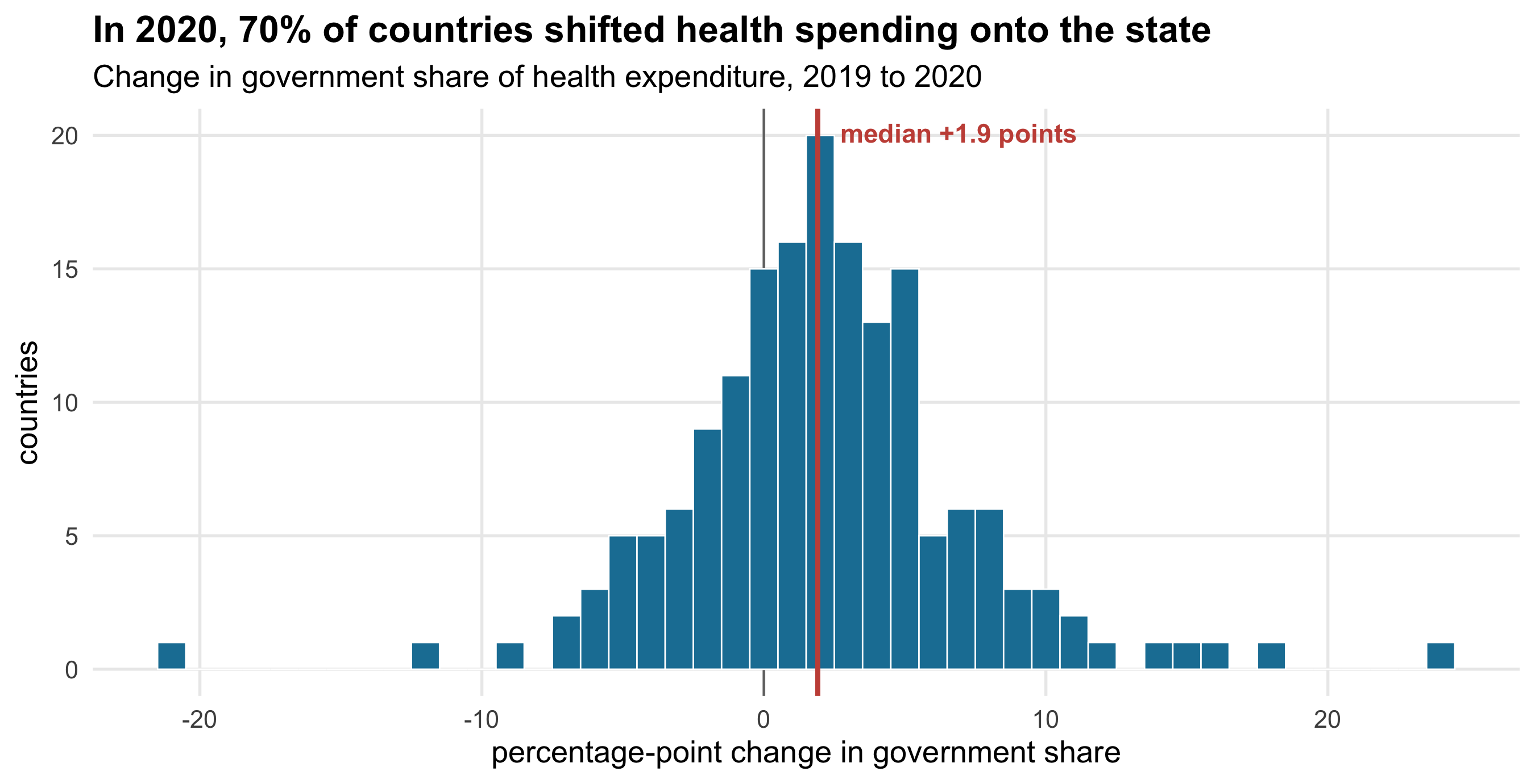
`r sprintf("%.0f%%", 100*mean(covid$change > 0))` of countries increased the government
share of health spending in 2020, by a median of
`r sprintf("%.1f", med)` percentage points. This is the clearest thing in the dataset: a
global shock, an almost universal response in the same direction, visible in nearly every
country at once.
It is also the clearest illustration of what these shares do and don't mean. A rising
government share can mean the state spent more. It can equally mean households spent less —
and in 2020, households spent dramatically less, because elective care stopped and people
stayed away from clinics. A share is a ratio, and a ratio moves when either part moves.
Separating those two stories needs the constant-dollar series, and even then needs a view
about what would have happened otherwise.
::: {.callout-note}
## What this can and cannot say
**These are financing sources, not out-of-pocket costs.** "Private" (PVT-D) bundles
household out-of-pocket payments together with private insurance and employer schemes. A
country with a 40% private share where all of it is prepaid insurance is a completely
different place to live than one where all of it is cash at the counter. This dataset, as
published here, cannot tell those two apart, and no claim on this page rests on the private
share alone.
**No population, so no per-capita anything.** The file carries total expenditure in
constant 2023 US$ but no population, so every level comparison would be a comparison of
country size. That is why this page is about composition throughout: shares are comparable
across countries in a way that totals are not.
**Shares are ratios and move for two reasons.** The COVID section above is the sharpest
case, but it applies everywhere: a rising external share can mean more aid or a collapsing
domestic budget. Directional readings of share changes should be treated as questions, not
answers.
**Health accounts are estimates, and unevenly good ones.** WHO harmonises national health
accounts of very different quality; external financing in particular is often better
recorded by donors than by recipients. The countries with the largest external shares are
generally those with the weakest statistical systems, which is precisely where the numbers
should be trusted least.
**2023 is provisional and coverage is incomplete.** `r n_countries` of 195 countries have
all three shares in at least one year, but coverage varies year to year; the country
composition of the unweighted average is therefore not perfectly constant over time, which
adds a small amount of noise to the flatter of the two lines above.
:::