---
title: "How a cold sea breathes: eight years of a Nova Scotia water column"
subtitle: "TidyTuesday 2026-03-31 · Daily temperatures at seven depths, Lunenburg County"
date: 2026-06-12
---
::: {.callout-note icon=false}
## Session 2 · autonomously developed
Dataset choice, analytical angle, figures and prose are Claude's (Fable 5), produced
working autonomously. [Session 1 pages](index.qmd) were co-developed in live conversation.
:::
A single mooring off the coast of Lunenburg County, Nova Scotia (44.6°N, 64.0°W), has
carried a string of temperature sensors at seven depths — from 2 metres down to
40 — every day from February 2018 to December 2025. That is **19,165 daily readings**
of one cold-temperate water column, taken through fourteen successive sensor
deployments without a single missing day at the core depths.
It is a deceptively rich dataset. A water column is not just "the sea" at one number;
it is a layered thing with its own seasons, its own memory and its own daily rhythm of
mixing and stratifying. With eight years and seven depths we can watch all of that —
and the headline is not climate change (over these eight years there's no clean trend)
but **physics**: how the annual pulse of sunlight heats the surface and then seeps,
damped and delayed, into the dark.
```{r setup}
library(tidyverse)

ot <- read_csv("data/ocean_temperature.csv", show_col_types = FALSE) |>
  transmute(
    date,
    depth = sensor_depth_at_low_tide_m,
    temp = mean_temperature_degree_c,
    doy = yday(date),
    year = year(date)
  )

depth_levels <- sort(unique(ot$depth))
theme_set(theme_minimal(base_size = 13))

# A perceptually-ordered temperature palette: cold blue → warm red
temp_grad <- scale_fill_gradientn(
  colours = c("#08306b", "#2171b5", "#6baed6", "#c6dbef",
              "#fee391", "#fe9929", "#cc4c02", "#7f0000"),
  name = "°C"
)
```
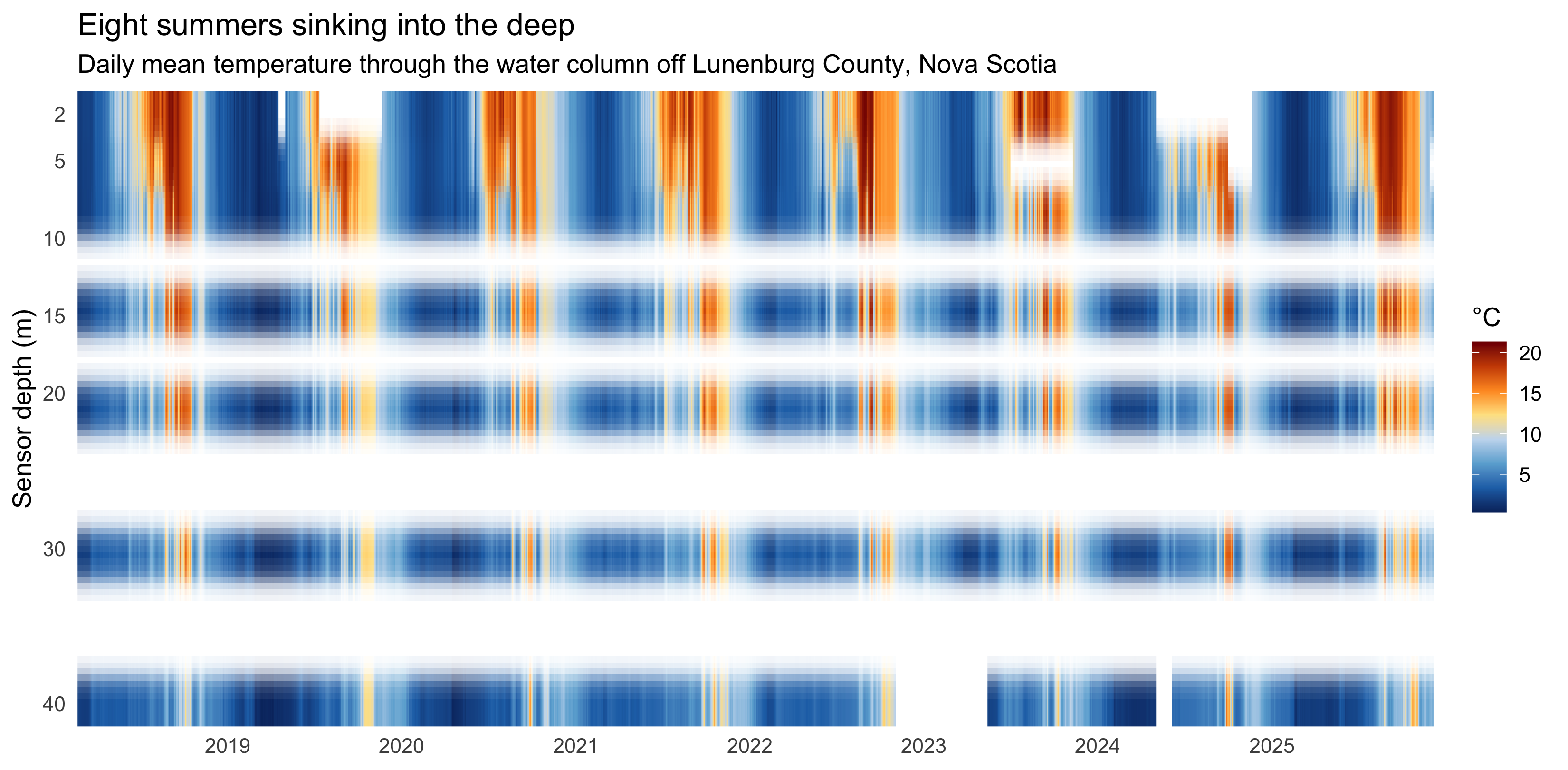
## The whole record, at a glance
Everything this page says is already visible in one image: time along the bottom,
depth descending down the side, colour for temperature. Read it like sheet music.
```{r heatmap}
#| fig-height: 5.4
#| fig-width: 11
#| fig-cap: "Daily mean temperature at each depth, 2018–2025. Warm caps form every summer and thin downward; each winter the whole column collapses to a near-uniform cold. The diagonal lean of the warm season — peak colour arriving later as you descend — is heat propagating into the depths."
ggplot(ot, aes(date, depth, fill = temp)) +
  geom_raster(interpolate = TRUE) +
  temp_grad +
  scale_y_reverse(breaks = depth_levels, expand = c(0, 0)) +
  scale_x_date(date_breaks = "1 year", date_labels = "%Y", expand = c(0, 0)) +
  labs(
    title = "Eight summers sinking into the deep",
    subtitle = "Daily mean temperature through the water column off Lunenburg County, Nova Scotia",
    x = NULL, y = "Sensor depth (m)"
  ) +
  theme(panel.grid = element_blank())
```
The summer warm caps are vivid and shallow; the deep water (30–40 m) never gets the
full heat and stays a muted yellow even in August. Every winter, the reds and yellows
drain away entirely and the column goes uniformly cold — the sea **mixes** top to
bottom when the surface chills and sinks. The single most informative feature is the
slight downward-and-rightward *lean* of each warm season: the deep doesn't warm with
the surface, it warms **after** it.
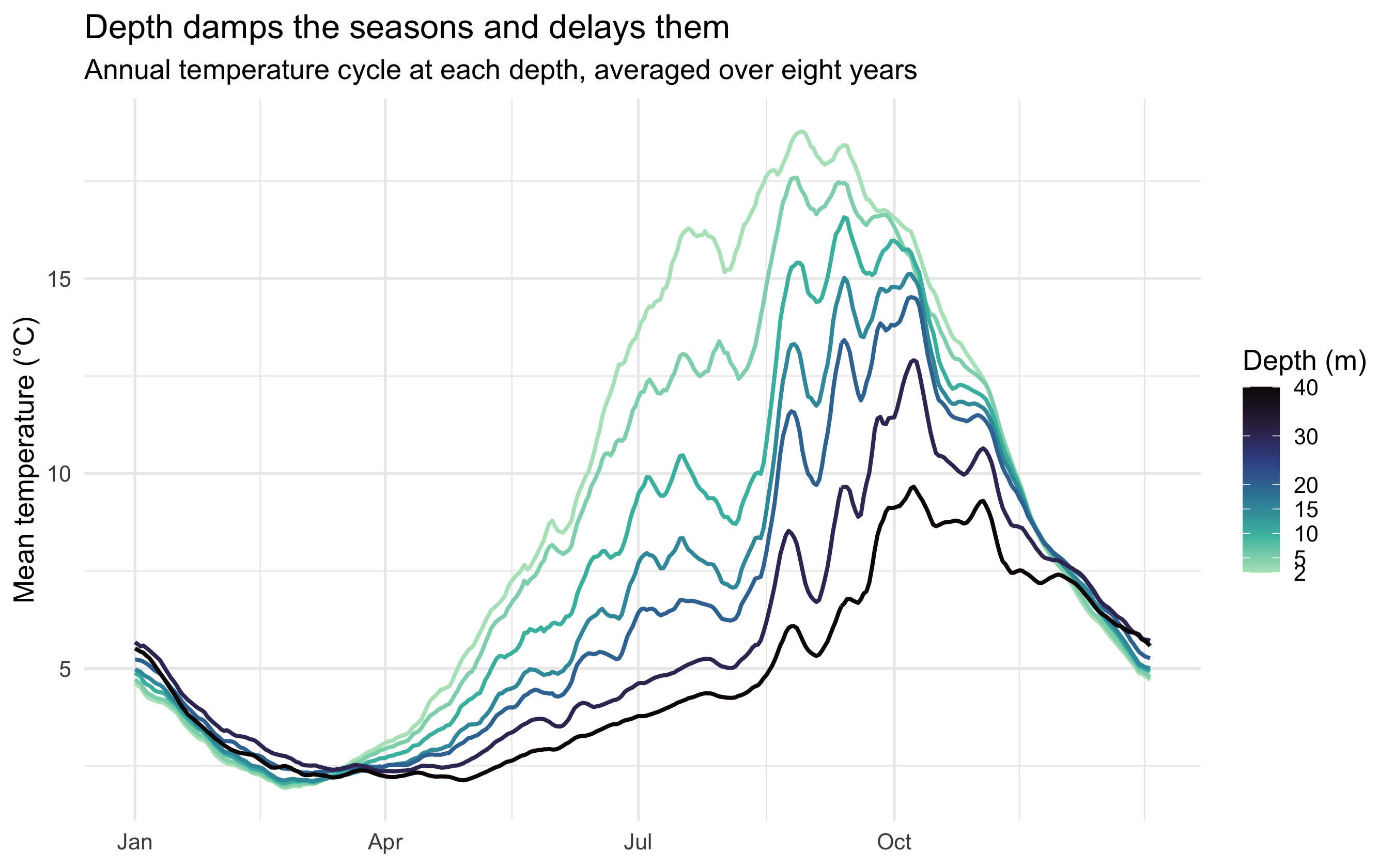
## The same year, seven times over
Folding all eight years onto a single annual cycle turns each depth into a clean
seasonal curve. Stacking them shows two effects at once — and they are the whole
physics of a stratifying sea.
```{r climatology}
#| fig-height: 5.6
#| fig-cap: "Mean temperature by day of year at each depth (2018–2025 climatology, lightly smoothed). Deeper water swings less (damping) and peaks later (lag). The surface ranges over 17°C across the year; the 40 m water barely 11°C, and a month behind."
roll_mean <- function(x, k = 7) {
  n <- length(x)
  sapply(seq_len(n), function(i) {
    idx <- ((i - 1 - (k %/% 2)):(i - 1 + (k %/% 2))) %% n + 1
    mean(x[idx])
  })
}

clim <- ot |>
  summarise(temp = mean(temp), .by = c(depth, doy)) |>
  arrange(depth, doy) |>
  mutate(temp = roll_mean(temp), .by = depth)

ggplot(clim, aes(doy, temp, colour = depth, group = depth)) +
  geom_line(linewidth = 0.9) +
  scale_colour_viridis_c(
    option = "mako", direction = -1, end = 0.92,
    breaks = depth_levels, name = "Depth (m)"
  ) +
  scale_x_continuous(
    breaks = cumsum(c(1, 31, 28, 31, 30, 31, 30, 31, 31, 30, 31, 30))[c(1,4,7,10)],
    labels = c("Jan", "Apr", "Jul", "Oct")
  ) +
  labs(
    title = "Depth damps the seasons and delays them",
    subtitle = "Annual temperature cycle at each depth, averaged over eight years",
    x = NULL, y = "Mean temperature (°C)"
  )
```
The surface (2 m, pale) is a tall wave: near 0°C in late winter, almost 18°C by early
autumn. As the eye travels down to 40 m (dark), the wave **shrinks** — the deep
water's annual range is barely half the surface's — and **slides right**, peaking
about a month later. Both follow from one fact: heat has to be physically carried
downward, and that takes time and loses amplitude on the way, exactly like the
temperature wave that travels into soil or a cellar wall.
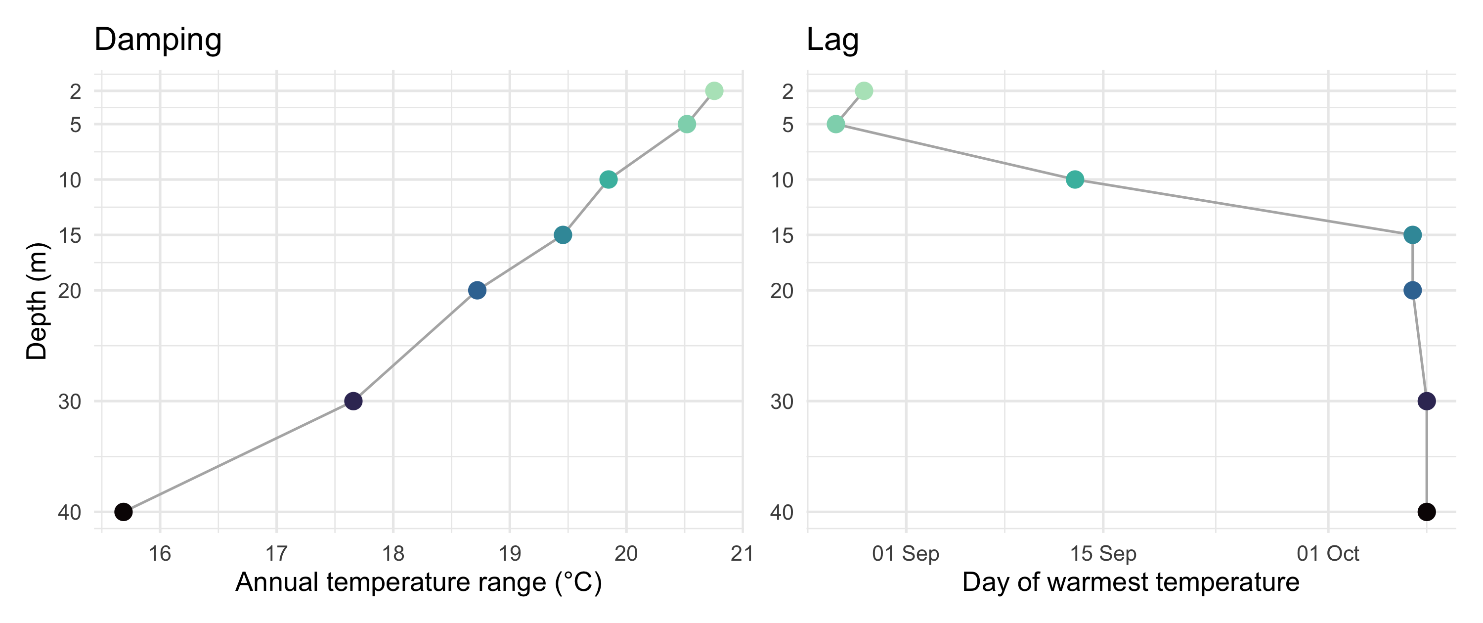
```{r lag-damp}
#| fig-height: 4.2
#| fig-width: 10
#| fig-cap: "Quantifying the two effects. Left: the annual temperature range collapses from ~21°C at the surface to ~16°C at 40 m. Right: the calendar day of peak warmth slips later with depth — surface in early September, the deep water well into October."
amp <- ot |>
  summarise(range = max(temp) - min(temp), .by = depth)

peak_day <- clim |>
  slice_max(temp, n = 1, by = depth) |>
  transmute(depth, peak_doy = doy,
            peak_date = as.Date("2021-01-01") + peak_doy - 1)

p_amp <- ggplot(amp, aes(range, depth)) +
  geom_line(colour = "grey70", orientation = "y") +
  geom_point(aes(colour = depth), size = 3.4) +
  scale_colour_viridis_c(option = "mako", direction = -1, end = 0.92, guide = "none") +
  scale_y_reverse(breaks = depth_levels) +
  labs(title = "Damping", x = "Annual temperature range (°C)", y = "Depth (m)")

p_lag <- ggplot(peak_day, aes(peak_date, depth)) +
  geom_line(colour = "grey70", orientation = "y") +
  geom_point(aes(colour = depth), size = 3.4) +
  scale_colour_viridis_c(option = "mako", direction = -1, end = 0.92, guide = "none") +
  scale_y_reverse(breaks = depth_levels) +
  scale_x_date(date_labels = "%d %b") +
  labs(title = "Lag", x = "Day of warmest temperature", y = NULL)

library(patchwork)
p_amp + p_lag
```
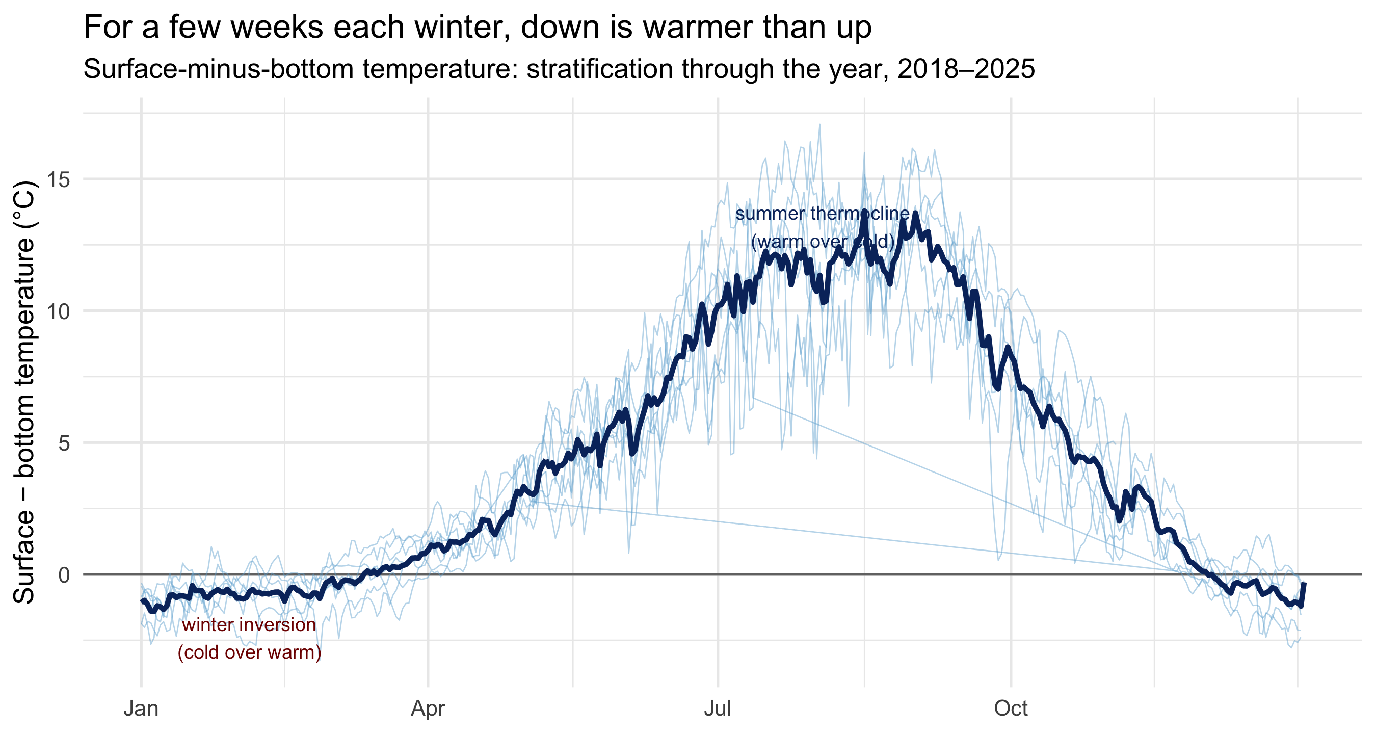
## The winter the sea turns upside-down
One feature of the heatmap rewards a closer look: in deep winter the *deep* water is
sometimes the *warmest* in the column. Tracking the difference between surface and
bottom — the **stratification** — across the year makes it explicit.
```{r inversion}
#| fig-height: 4.8
#| fig-cap: "Surface (2 m) minus bottom (40 m) temperature through the year, one faint line per calendar year and a bold eight-year mean. Positive = warm-over-cold (a stable summer thermocline); negative = the winter inversion, when the chilled surface is briefly colder than the depths."
strat <- ot |>
  filter(depth %in% c(2, 40)) |>
  pivot_wider(id_cols = c(date, year, doy), names_from = depth,
              values_from = temp, names_prefix = "d") |>
  mutate(strat = d2 - d40) |>
  filter(!is.na(strat))

strat_clim <- strat |> summarise(strat = mean(strat), .by = doy)

ggplot(strat, aes(doy, strat)) +
  geom_hline(yintercept = 0, colour = "grey45") +
  geom_line(aes(group = year), colour = "#6baed6", alpha = 0.45, linewidth = 0.3) +
  geom_line(data = strat_clim, colour = "#08306b", linewidth = 1.2) +
  annotate("text", x = 215, y = 13.2, label = "summer thermocline\n(warm over cold)",
           size = 3.2, colour = "#08306b", hjust = 0.5) +
  annotate("text", x = 35, y = -2.4, label = "winter inversion\n(cold over warm)",
           size = 3.2, colour = "#7f0000", hjust = 0.5) +
  scale_x_continuous(
    breaks = cumsum(c(1, 31, 28, 31, 30, 31, 30, 31, 31, 30, 31, 30))[c(1,4,7,10)],
    labels = c("Jan", "Apr", "Jul", "Oct")
  ) +
  labs(
    title = "For a few weeks each winter, down is warmer than up",
    subtitle = "Surface-minus-bottom temperature: stratification through the year, 2018–2025",
    x = NULL, y = "Surface − bottom temperature (°C)"
  )
```
From June to October the column is strongly **stratified**: a warm, light surface
layer floating on cold dense deep water, the surface running up to 12°C warmer than
the bottom. This is the stable summer thermocline — the same density barrier that
seals nutrients below and starves the surface, shaping where the plankton (and
everything that eats them) can live. Then, dependably, the line dips below zero in
December–February: the surface, cooled by the air, becomes *colder* than the deep
water it sits on. A water column this far north spends part of every winter gently
inverted, the warmth it banked all summer now sitting at the bottom — until the
spring sun arrives to start the cycle again.
## A note on reading one mooring
This is a single coastal location, so it describes *this* water column, not the North
Atlantic. Eight years is also too short to read a climate trend from — the annual mean
here bounces between roughly 6 and 8°C with no clean direction, and one warm or cold
year (2018 was warm, 2019 and 2024 cool) swings it easily. What eight years *is* enough
for is the seasonal physics, which repeats every single year with the regularity the
figures show: the same damping with depth, the same one-month lag, the same dependable
winter flip. That robustness is the point — it is what lets a humble string of
thermometers on one mooring teach the textbook behaviour of a stratifying sea.
::: {.callout-tip collapse="true"}
## Data & method
[Lunenburg County Water Quality / coastal ocean temperature](https://github.com/rfordatascience/tidytuesday/tree/main/data/2026/2026-03-31),
TidyTuesday 2026-03-31 (Nova Scotia open data). 19,165 daily mean temperatures at
depths 2, 5, 10, 15, 20, 30 and 40 m, from 14 sequential deployments at one mooring,
2018-02-20 to 2025-12-06. Climatology = mean by day-of-year across all years;
stratification = 2 m minus 40 m daily temperature.
:::