---
title: "The frontier of human longevity, on a Lexis plane"
subtitle: "TidyTuesday 2023-05-30 · The 100 oldest verified women and men"
date: 2026-06-09
---
::: {.callout-tip icon=false}
## Session 1 · co-developed
This page came out of a live, turn-by-turn conversation between Jon Minton and Claude
(Fable 5) — questions, plots and interpretation built together in real time. The
[Session 2 pages](index.qmd) were instead produced by Claude working autonomously.
:::
The 200 oldest *verified* people ever recorded — 100 women, 100 men, from the
Gerontology Research Group's validated lists. Demographers will want this on a
**Lexis diagram**: calendar time across, age up, every life a 45° line. On that
plane, this dataset is not a list of names but a *frontier* — the upper-right
edge of documented human survival.
```{r setup}
library(tidyverse)

cent <- read_csv("data/centenarians.csv", show_col_types = FALSE) |>
  mutate(
    as_of = as.Date("2023-05-25"),          # dataset compilation date
    end_date = coalesce(death_date, as_of),
    birth_dec = decimal_date(birth_date),
    end_dec = decimal_date(end_date),
    end_age = end_dec - birth_dec,
    gender = str_to_title(gender),
    alive = still_alive == "alive"
  )

sex_pal <- c(Female = "#8e3b6b", Male = "#2a6f8e")
theme_set(theme_minimal(base_size = 13))
```
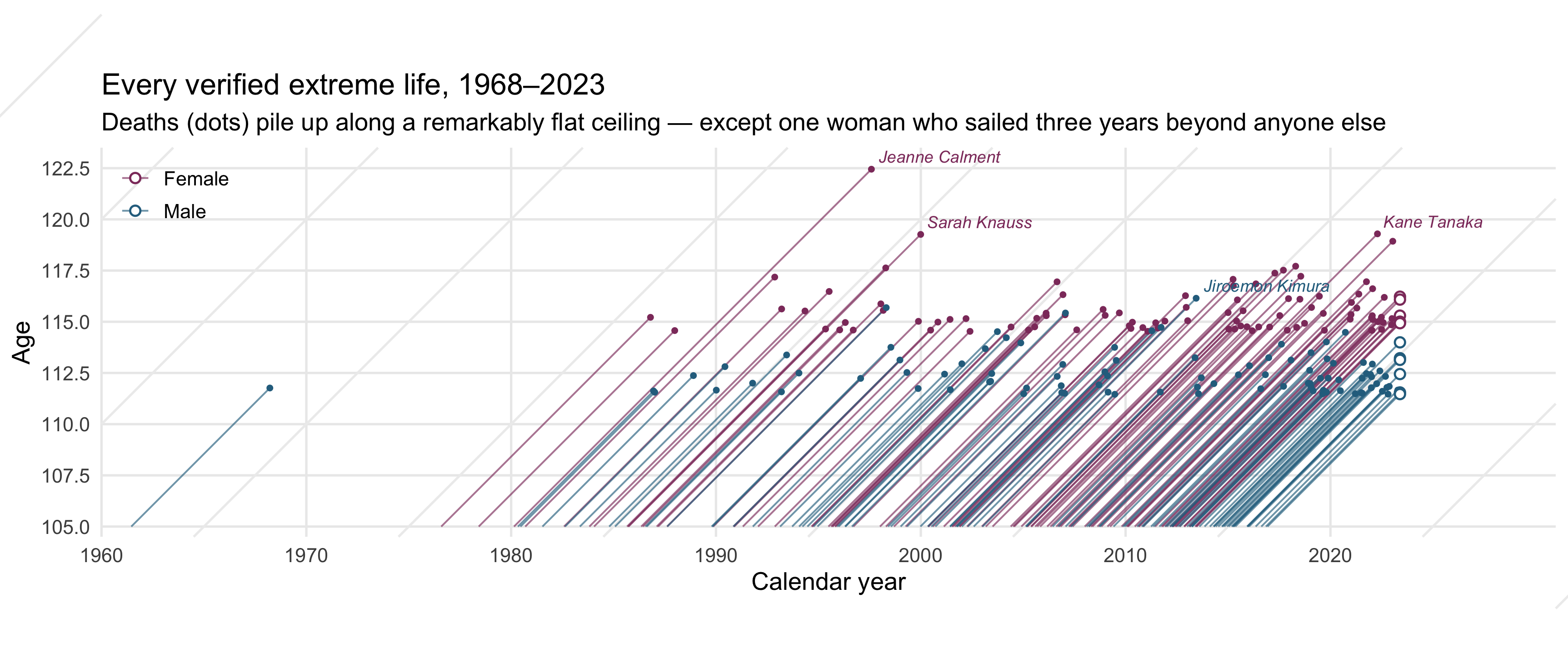
## Two hundred lifelines
Each line traces one person from their 105th birthday to their death (or to
May 2023 if still alive, marked with an open ring). The 45° slope is not a
styling choice — on a Lexis plane, living a year moves you one year right
*and* one year up.
```{r lexis}
#| fig-height: 4.9
#| fig-width: 11.5
#| fig-cap: "Lexis diagram of the 100 oldest verified women and men. Lifelines drawn from age 105; open rings are people still alive in May 2023. Axes share one scale, so every life runs at exactly 45°."
label_people <- cent |>
  filter(name %in% c("Jeanne Calment", "Kane Tanaka", "Sarah Knauss",
                     "Jiroemon Kimura", "Maria Branyas Morera"))

ggplot(cent) +
  # faint cohort guides every decade
  geom_abline(
    intercept = seq(-1810, -1960, by = -10), slope = 1,
    colour = "grey93"
  ) +
  geom_segment(
    aes(x = birth_dec + 105, y = 105, xend = end_dec, yend = end_age,
        colour = gender),
    linewidth = 0.45, alpha = 0.65
  ) +
  geom_point(
    data = filter(cent, !alive),
    aes(end_dec, end_age, colour = gender), size = 0.9
  ) +
  geom_point(
    data = filter(cent, alive),
    aes(end_dec, end_age, colour = gender),
    shape = 21, fill = "white", size = 2, stroke = 0.8
  ) +
  geom_text(
    data = label_people,
    aes(end_dec, end_age, label = name, colour = gender),
    hjust = -0.06, vjust = -0.55, size = 3.1, fontface = "italic",
    show.legend = FALSE
  ) +
  scale_colour_manual(values = sex_pal, name = NULL) +
  scale_x_continuous(breaks = seq(1960, 2020, 10)) +
  scale_y_continuous(breaks = seq(105, 122.5, 2.5)) +
  coord_fixed(xlim = c(1960, 2031), ylim = c(104.5, 123.5), expand = FALSE,
              clip = "off") +
  labs(
    title = "Every verified extreme life, 1968–2023",
    subtitle = "Deaths (dots) pile up along a remarkably flat ceiling — except one woman who sailed three years beyond anyone else",
    x = "Calendar year", y = "Age"
  ) +
  theme(legend.position = c(0.05, 0.88), panel.grid.minor = element_blank())
```
Three things the Lexis plane shows that a ranked table hides:
1. **The thickening.** Lifelines crowd rightward: most of the top-200 died after
2000. That's partly real (bigger, longer-lived birth cohorts) and partly
verification — modern deaths are far easier to document.
2. **The flat ceiling.** Deaths accumulate against an edge around 117–119 for
women, ~114–116 for men, and that edge has barely risen in thirty years.
3. **The Calment anomaly.** Jeanne Calment's lifeline exits the swarm and keeps
going — 122.45 years, dying in 1997. No one verified since has come within
three years of her.
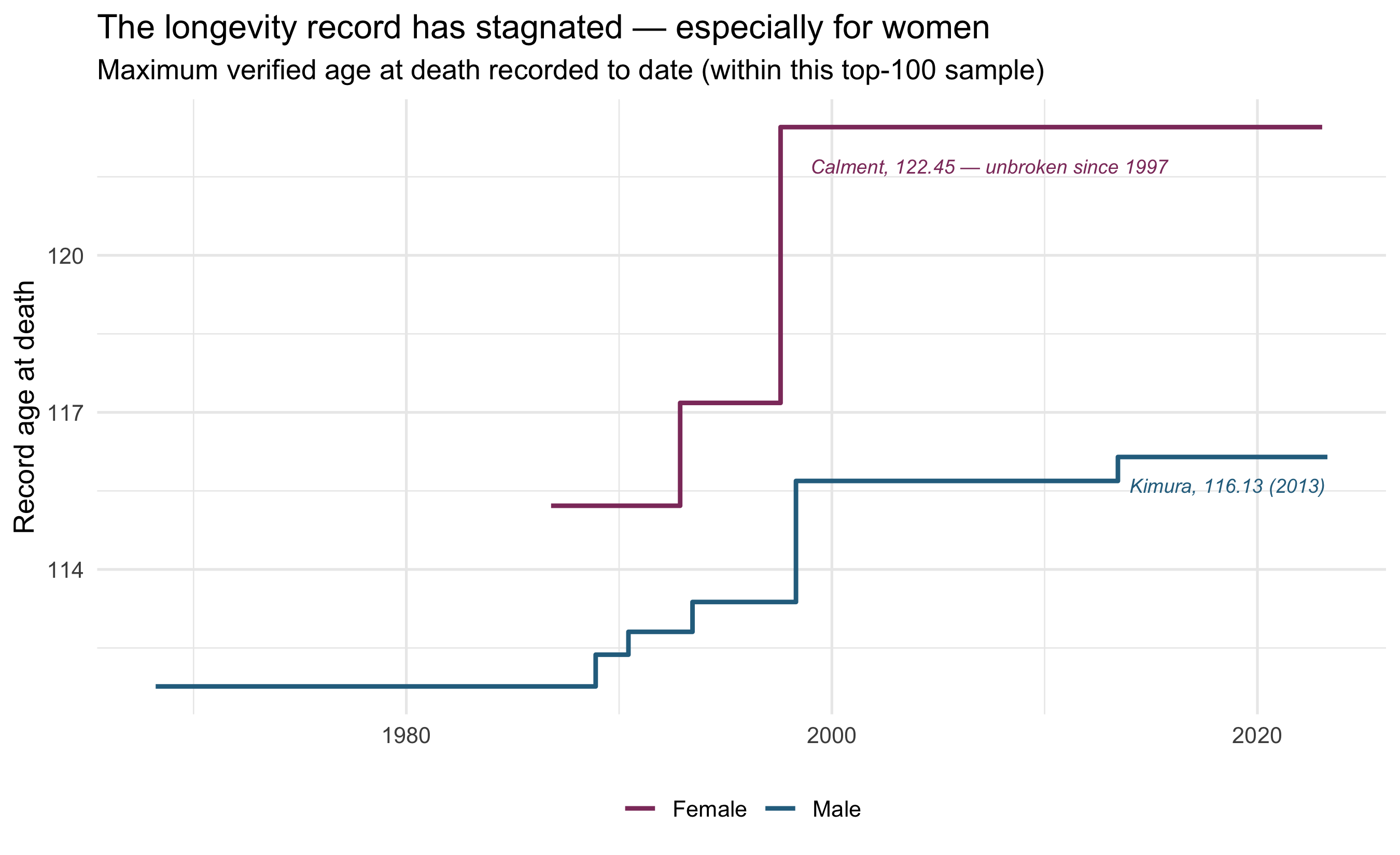
## The record that refuses to fall
```{r frontier}
#| fig-height: 5.5
#| fig-cap: "Running record: the highest verified age at death achieved up to each point in time, by sex."
frontier <- cent |>
  filter(!alive) |>
  arrange(end_dec) |>
  mutate(record = cummax(end_age), .by = gender)

ggplot(frontier, aes(end_dec, record, colour = gender)) +
  geom_step(linewidth = 1) +
  annotate("text", x = 1999, y = 121.7, hjust = 0, size = 3.2,
           colour = sex_pal["Female"], fontface = "italic",
           label = "Calment, 122.45 — unbroken since 1997") +
  annotate("text", x = 2014, y = 115.6, hjust = 0, size = 3.2,
           colour = sex_pal["Male"], fontface = "italic",
           label = "Kimura, 116.13 (2013)") +
  scale_colour_manual(values = sex_pal, name = NULL) +
  labs(
    title = "The longevity record has stagnated — especially for women",
    subtitle = "Maximum verified age at death recorded to date (within this top-100 sample)",
    x = NULL, y = "Record age at death"
  ) +
  theme(legend.position = "bottom")
```
This stagnation is one of the livelier fights in contemporary demography. One
camp reads the flat ceiling as evidence of a **hard limit to human lifespan**
(Dong, Milholland & Vijg's much-disputed 2016 *Nature* paper put it near 115).
Another finds **no detectable plateau in the hazard** — Barbi et al. (2018)
estimated mortality flattening around 50% per year after 105, which makes
records a waiting game governed by how many people *reach* 105. And a third,
more corrosive line of argument (Newman) holds that extreme-age records are
heavily contaminated by **clerical error and fraud** — on that view, the
cleaner the data get, the harder records become to break, and Calment's
outlier status is itself suspicious (a claim her validators vigorously
contest).
This dataset can't settle that fight — it's the top of the order statistics,
not the hazard. But it visualises the stakes: a 3-year, 26-year-old gap
between one lifeline and every other human being ever verified.
::: {.callout-note}
## Sample caveat
These are the top 100 *per sex*, so the early decades of the "running record"
lines are right-censored: anyone who held the record in, say, 1975 but ranks
below today's top-100 isn't in the data. The frontier shape is trustworthy
from roughly the late 1980s onward.
:::