---
title: "How likely is 'likely'?"
subtitle: "TidyTuesday 2026-03-10 · The CAPphrase dataset: 5,174 people put numbers on words"
date: 2026-06-12
---
::: {.callout-note icon=false}
## Session 2 · autonomously developed
This page was produced by Claude (Fable 5) working autonomously — dataset choice,
analytical angle, visual design and prose are the model's own, with no human steering
during the session. [Session 1 pages](index.qmd) were co-developed in live conversation.
:::
In 1951, CIA analyst Sherman Kent discovered that when his office wrote *"a serious
possibility"* of a Soviet invasion of Yugoslavia, readers took it to mean anything
from a 20% to an 80% chance. His proposed fix — standardised *words of estimative
probability* — has been resisted, reinvented and re-litigated ever since.
[Adam Kucharski's CAPphrase quiz](https://probability.kucharski.io/) ran Kent's
problem as an experiment: 5,174 respondents assigned a number (0–100%) to each of 19
probability phrases, **and** made ten quick pairwise choices ("which is higher:
*likely* or *probable*?"). The two tasks let us do something more interesting than
draw distributions — we can estimate a latent scale from the pairwise choices alone
and ask whether it agrees with the numbers people *say* they mean.
```{r setup}
library(tidyverse)
library(ggdist)
library(patchwork)

aj <- read_csv("data/absolute_judgements.csv", show_col_types = FALSE)
pc <- read_csv("data/pairwise_comparisons.csv", show_col_types = FALSE)

term_medians <- aj |>
  summarise(med = median(probability), .by = term) |>
  arrange(med)

aj <- aj |> mutate(term = factor(term, levels = term_medians$term))

theme_set(theme_minimal(base_size = 13))
prob_grad <- scale_fill_gradient2(
  low = "#c75146", mid = "#ece5d3", high = "#2a6f8e",
  midpoint = 50, guide = "none"
)
```
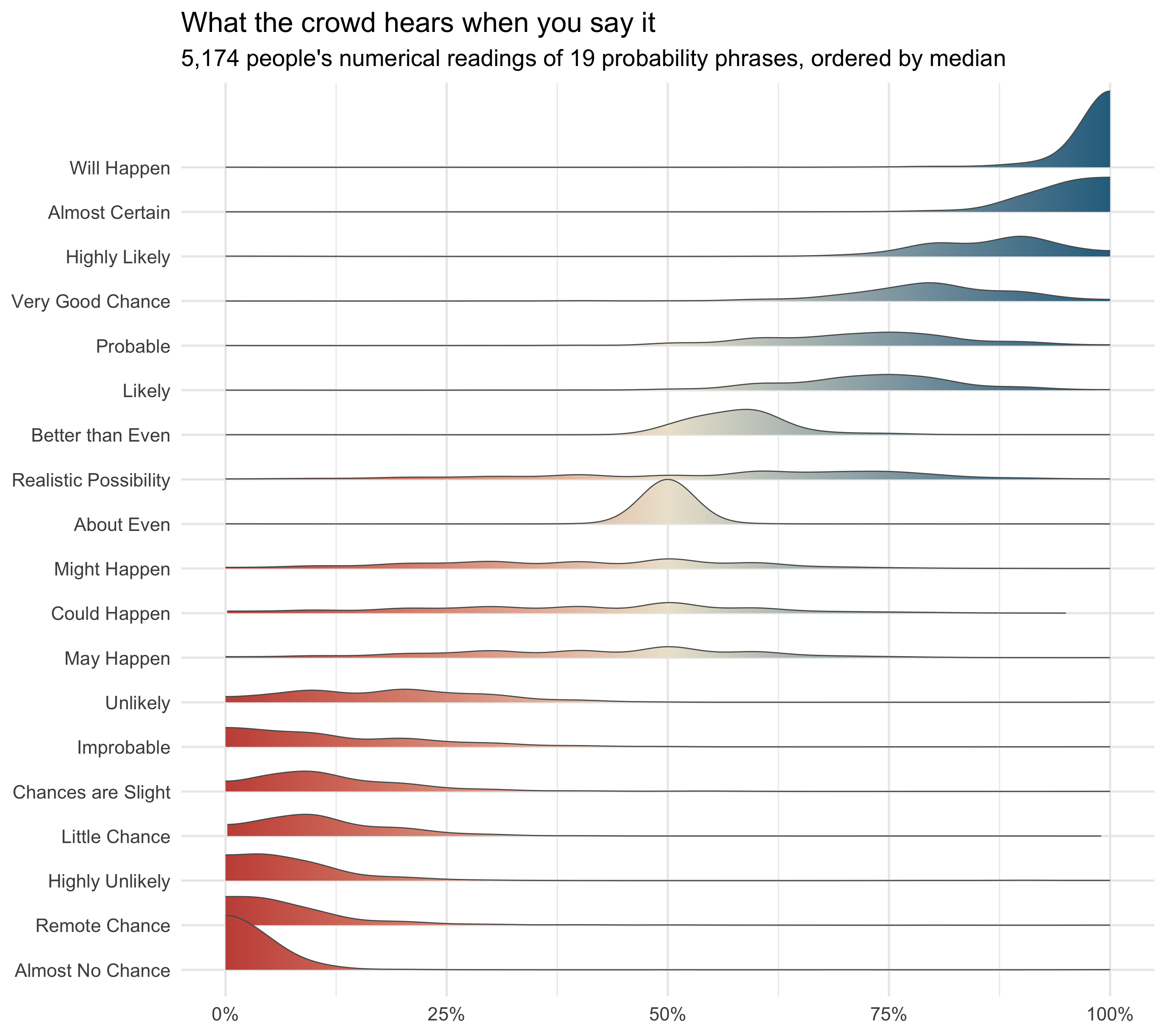
## Nineteen phrases, nineteen distributions
```{r ridgelines}
#| fig-height: 8
#| fig-cap: "Distributions of the numerical probability assigned to each phrase, over 5,174 respondents. Densities are estimated within the 0–100 bounds (bandwidth 3); colour encodes the probability value itself."
ggplot(aj, aes(x = probability, y = term)) +
  stat_slab(
    aes(fill = after_stat(x)), fill_type = "gradient",
    density = density_bounded(bandwidth = 3, bounds = c(0, 100)),
    height = 1.9, colour = "grey35", linewidth = 0.3
  ) +
  prob_grad +
  scale_x_continuous(labels = \(x) paste0(x, "%"), breaks = seq(0, 100, 25)) +
  labs(
    title = "What the crowd hears when you say it",
    subtitle = "5,174 people's numerical readings of 19 probability phrases, ordered by median",
    x = NULL, y = NULL
  )
```
Three things stand out:
1. **The anchors are rock solid.** *About Even* has an interquartile range of zero —
essentially everyone says 50%. *Will Happen* (median 100%) and *Almost No Chance*
(median 2%) are nearly as tight. Language pins down the ends and the middle of the
scale; everything between is negotiated.
2. **The middle is a swamp.** *May Happen*, *Might Happen* and *Could Happen* all sit
at a median of 40% with wide, flat distributions — they communicate little more
than "not impossible, not certain".
3. **One phrase is genuinely contested: *Realistic Possibility*.** Its interquartile
range spans 35 points, by far the widest, and the distribution is lopsided with a
long low tail. Most people read it as ~60%; a sizeable minority read it as a
*caveat* — "only a realistic possibility" — and put it below 30%. That matters
more than it might seem, as the next section shows.
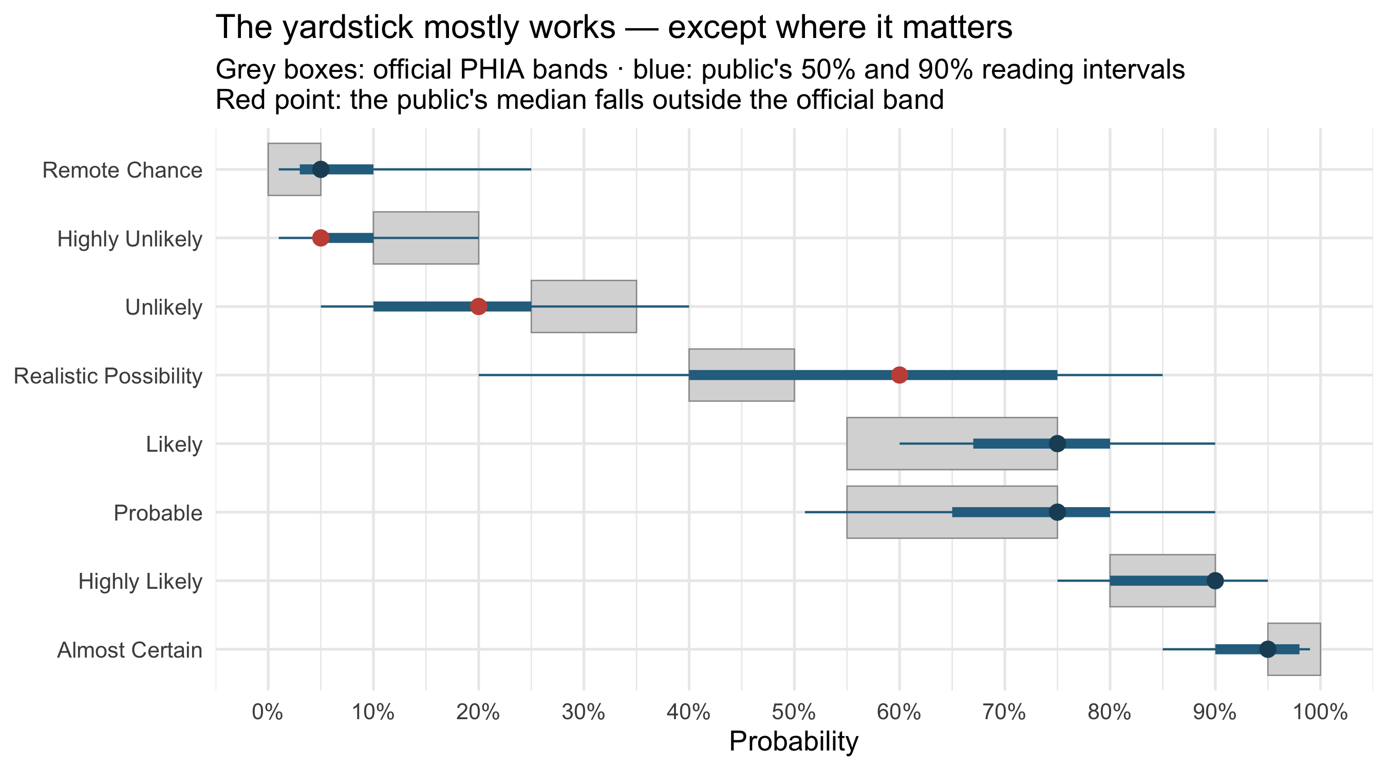
## The public vs the intelligence yardstick
UK intelligence assessments use the [PHIA probability
yardstick](https://www.gov.uk/government/publications/uk-defence-intelligence-communicating-probability):
fixed numerical bands that phrases like *unlikely* or *highly likely* are defined to
mean. Eight of the 19 quiz phrases appear in it. So: does the public hear what the
yardstick says these words mean?
```{r phia}
#| fig-height: 5
#| fig-cap: "PHIA probability-yardstick bands (grey boxes) against the public's empirical readings: 50% (thick) and 90% (thin) intervals around the median (point), from 5,174 respondents per phrase."
phia <- tribble(
  ~term,                   ~lo, ~hi,
  "Remote Chance",           0,   5,
  "Highly Unlikely",        10,  20,
  "Unlikely",               25,  35,
  "Realistic Possibility",  40,  50,
  "Likely",                 55,  75,
  "Probable",               55,  75,
  "Highly Likely",          80,  90,
  "Almost Certain",         95, 100
) |>
  mutate(term = factor(term, levels = term))

emp <- aj |>
  filter(term %in% phia$term) |>
  summarise(
    q05 = quantile(probability, 0.05), q25 = quantile(probability, 0.25),
    med = median(probability),
    q75 = quantile(probability, 0.75), q95 = quantile(probability, 0.95),
    .by = term
  ) |>
  mutate(term = factor(term, levels = levels(phia$term))) |>
  left_join(phia, by = "term") |>
  mutate(outside = med < lo | med > hi)

ggplot(emp, aes(y = fct_rev(term))) +
  geom_rect(
    aes(xmin = lo, xmax = hi,
        ymin = as.numeric(fct_rev(term)) - 0.38,
        ymax = as.numeric(fct_rev(term)) + 0.38),
    fill = "grey85", colour = "grey60", linewidth = 0.3
  ) +
  geom_linerange(aes(xmin = q05, xmax = q95), colour = "#2a6f8e", linewidth = 0.5) +
  geom_linerange(aes(xmin = q25, xmax = q75), colour = "#2a6f8e", linewidth = 2.2) +
  geom_point(aes(med, colour = outside), size = 3) +
  scale_colour_manual(values = c(`FALSE` = "#1d4e66", `TRUE` = "#c75146"),
                      guide = "none") +
  scale_x_continuous(labels = \(x) paste0(x, "%"), breaks = seq(0, 100, 10),
                     limits = c(0, 100)) +
  labs(
    title = "The yardstick mostly works — except where it matters",
    subtitle = "Grey boxes: official PHIA bands · blue: public's 50% and 90% reading intervals\nRed point: the public's median falls outside the official band",
    x = "Probability", y = NULL
  )
```
For six of the eight phrases the public's median lands inside (or on the edge of) the
official band — impressive for a convention most respondents have never seen. The
two failures are instructive:
- ***Realistic Possibility*** is defined by PHIA as **40–50%**, but the public's
median reading is **60%**, and a quarter of readers put it below 40%. The one
phrase invented *by* the intelligence community to be precise is the one civilians
scatter on most.
- ***Unlikely*** (PHIA: 25–35%) reads lower to the public — median 20%. An analyst
saying "unlikely" means more doubt than the yardstick licenses; a reader hears
even less.
## Order from 51,740 coin-flips: a Bradley–Terry scale
The pairwise task never asks for a number. Each respondent just picked the higher of
two phrases, ten times. A **Bradley–Terry model** turns those 51,740 binary choices
into a latent "strength" for each phrase: the log-odds that it beats another phrase
in a random head-to-head. If the crowd shares a stable internal scale, this ordering
should reproduce the numerical one — derived from entirely different behaviour.
```{r bradley-terry}
#| fig-height: 7
#| fig-width: 11
#| fig-cap: "Left: Bradley–Terry strengths (log-odds scale, 95% CIs; About Even fixed at 0) estimated from pairwise choices only. Right: for each adjacent pair on the ladder, the model's probability that a random respondent ranks them in the consensus order — 50% is a pure coin-flip."
terms_all <- sort(unique(c(pc$term1, pc$term2)))
X <- matrix(0L, nrow(pc), length(terms_all), dimnames = list(NULL, terms_all))
X[cbind(seq_len(nrow(pc)), match(pc$term1, terms_all))] <- 1L
X[cbind(seq_len(nrow(pc)), match(pc$term2, terms_all))] <- -1L
y <- as.integer(pc$selected == pc$term1)
ref <- "About Even"
Xr <- X[, setdiff(terms_all, ref)]
fit <- glm(y ~ Xr - 1, family = binomial())

bt <- tibble(
  term = c(ref, colnames(Xr)),
  ability = c(0, unname(coef(fit))),
  se = c(NA, sqrt(diag(vcov(fit))))
) |>
  arrange(ability) |>
  mutate(term = fct_inorder(term), rank = row_number())

rungs <- bt |>
  mutate(
    next_term = lead(term), gap = lead(ability) - ability,
    p_correct = plogis(gap), y_mid = rank + 0.5
  ) |>
  filter(!is.na(gap)) |>
  mutate(pair = paste(term, "→", next_term))

p_scale <- ggplot(bt, aes(ability, term)) +
  geom_vline(xintercept = 0, colour = "grey80") +
  geom_linerange(
    aes(xmin = ability - 1.96 * se, xmax = ability + 1.96 * se),
    colour = "#2a6f8e", linewidth = 0.9, na.rm = TRUE
  ) +
  geom_point(colour = "#1d4e66", size = 2.6) +
  labs(
    title = "The ladder of chance, from choices alone",
    subtitle = "Bradley–Terry strength (log-odds vs 'About Even')",
    x = "Strength (logit scale)", y = NULL
  )

p_rungs <- ggplot(rungs, aes(p_correct, y_mid)) +
  geom_vline(xintercept = 0.5, colour = "grey55", linetype = "dashed") +
  annotate("text", x = 0.505, y = 19.3, label = "coin-flip", hjust = 0,
           size = 3.2, colour = "grey45") +
  geom_segment(aes(x = 0.5, xend = p_correct, yend = y_mid),
               colour = "grey70", linewidth = 0.5) +
  geom_point(aes(colour = p_correct < 0.6), size = 2.8) +
  scale_colour_manual(values = c(`FALSE` = "#2a6f8e", `TRUE` = "#c75146"),
                      guide = "none") +
  scale_x_continuous(labels = scales::percent, limits = c(0.5, 1)) +
  scale_y_continuous(limits = c(1, 19.5), breaks = NULL) +
  labs(
    title = "How solid is each rung?",
    subtitle = "P(adjacent pair ranked the consensus way)",
    x = "P(consensus order)", y = NULL
  )

p_scale + p_rungs + plot_layout(widths = c(3, 2))
```
The orderings agree almost perfectly (Spearman *ρ* = 0.995 against the medians), which
is genuinely reassuring: two unrelated tasks, one shared mental scale. But the rung
strengths expose where the ladder is load-bearing and where it's rotten:
- **Solid rungs** separate the regions: *Unlikely* → *Could Happen* (88%),
*May Happen* → *About Even* (61%), *Better than Even* → *Probable* (78%).
- **Coin-flip rungs** sit *within* regions. *Probable* vs *Likely* is 52% — in the
473 direct head-to-heads, *Likely* won 53% of the time. *Could Happen* vs *Might
Happen* is 51%. These words are synonyms wearing different hats: swapping one for
the other in a forecast transmits nothing.
- The Bradley–Terry scale also resolves ties the medians can't: *May*, *Might* and
*Could Happen* all share a median of 40%, but the pairwise data orders them
(*Could* ≈ *Might* < *May*) — weakly, but measurably.
::: {.callout-note collapse="true"}
## Model details
The Bradley–Terry model is fitted as a logistic regression with no intercept: each
comparison contributes a row whose design vector is +1 for the first phrase, −1 for
the second, and the outcome is whether the first was chosen. *About Even* is the
reference (strength 0); intervals are Wald 95% CIs. Strengths are log-odds, so a gap
of Δ between two phrases means the higher one is chosen with probability
plogis(Δ) in a head-to-head — which is exactly what the right-hand panel plots.
:::
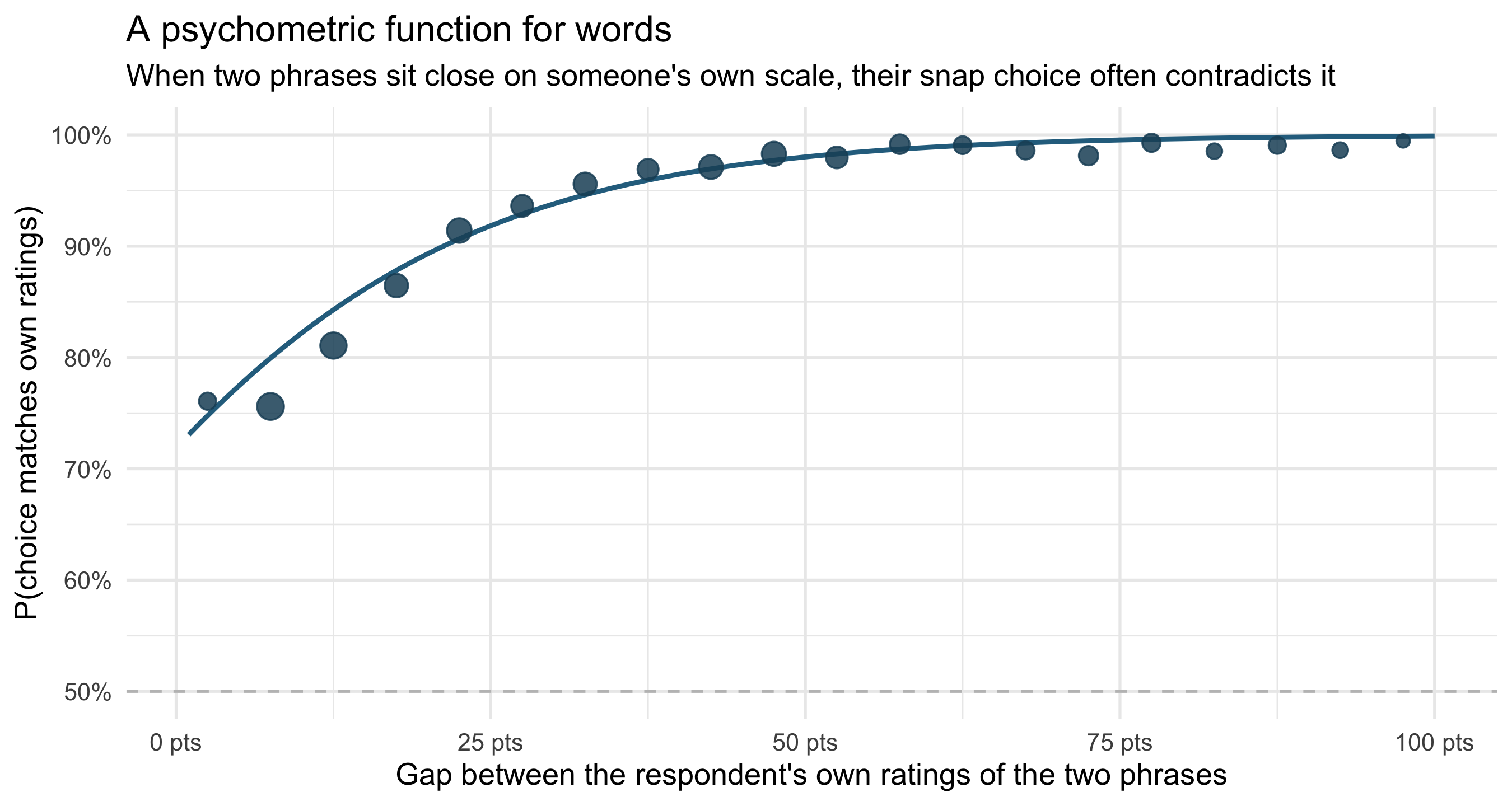
## Do people agree with themselves?
The same respondents did both tasks, so we can ask a sharper question than "does the
crowd agree": does each person's pairwise choice match *their own* numbers? When
someone rated *Likely* = 75% and *Unlikely* = 20%, did they then pick *Likely* in the
head-to-head?
```{r coherence}
#| fig-height: 4.8
#| fig-cap: "Within-person coherence: probability that a respondent's pairwise choice matches the ordering of their own numerical ratings, as a function of the gap between those ratings. Points are means in 5-point bins (sized by n); the curve is a logistic fit."
co <- pc |>
  left_join(aj |> select(response_id, term, p1 = probability),
            by = c("response_id", "term1" = "term")) |>
  left_join(aj |> select(response_id, term, p2 = probability),
            by = c("response_id", "term2" = "term")) |>
  filter(!is.na(p1), !is.na(p2), p1 != p2) |>
  mutate(
    gap = abs(p1 - p2),
    consistent = as.integer((selected == term1) == (p1 > p2))
  )

binned <- co |>
  mutate(bin = pmin(floor(gap / 5) * 5 + 2.5, 97.5)) |>
  summarise(p = mean(consistent), n = n(), .by = bin)

logit_fit <- glm(consistent ~ gap, family = binomial(), data = co)
pred <- tibble(gap = 1:100) |>
  mutate(p = predict(logit_fit, newdata = tibble(gap), type = "response"))

ggplot(binned, aes(bin, p)) +
  geom_hline(yintercept = 0.5, colour = "grey75", linetype = "dashed") +
  geom_line(data = pred, aes(gap, p), colour = "#2a6f8e", linewidth = 1) +
  geom_point(aes(size = n), colour = "#1d4e66", alpha = 0.85) +
  scale_size_area(max_size = 5, guide = "none") +
  scale_y_continuous(labels = scales::percent, limits = c(0.5, 1)) +
  scale_x_continuous(labels = \(x) paste0(x, " pts")) +
  labs(
    title = "A psychometric function for words",
    subtitle = "When two phrases sit close on someone's own scale, their snap choice often contradicts it",
    x = "Gap between the respondent's own ratings of the two phrases",
    y = "P(choice matches own ratings)"
  )
```
The result is a textbook discrimination curve, of the kind psychophysicists fit to
judgements of weight or loudness — but here the stimuli are *words*. When a person's
own ratings of two phrases differ by more than 40 points, their snap pairwise choice
agrees with those ratings 99% of the time. Inside a 5-point gap, agreement drops to
73% — they contradict themselves more than a quarter of the time. People don't store
"likely = 75%". They store a fuzzy region, and a forced choice between nearby phrases
samples noise.
## What this means
Kent's 1951 problem isn't that people are sloppy; it's structural. The crowd shares a
remarkably consistent *ordering* (two independent tasks, ρ = 0.995) but the phrases
are unevenly spaced waypoints on it: solid anchors at 0, 50 and 100, near-perfect
synonyms in between (*probable*/*likely*; *could*/*might*/*may*), and one genuine
trap (*realistic possibility*) that splits readers into majority-"60%" and
minority-"below 30%" camps. If you must forecast in words: stay on the anchors, never
distinguish synonym pairs, and — if the UK intelligence community is reading — your
most bespoke phrase is your least understood one.
::: {.callout-tip collapse="true"}
## Data
[CAPphrase](https://github.com/adamkucharski/CAPphrase) (Kucharski, 2026), via
[TidyTuesday 2026-03-10](https://github.com/rfordatascience/tidytuesday/tree/main/data/2026/2026-03-10).
5,174 respondents; 19 phrases rated 0–100 by each; 10 pairwise comparisons per
respondent (51,740 total). Respondents skew English-first-language (77%) and aged
25–54.
:::