This session [was]… led by Dr Brittany Blankinship and Dr Kasia Banas, two academics from the Data Driven Innovation for Health and Social Care Talent Team, based at the Usher Institute. Brittany and Kasia are avid R programmers and data science educators.
The link to the dataset and exercise description is here
There are two datasets. We are looking at one related to Madrid (and maybe why we shouldn’t go there as it’s polluted?!)
About the data
The data for this tutorial were collected under the instructions from Madrid’s City Council and are publicly available on their website. In recent years, high levels of pollution during certain dry periods has forced the authorities to take measures against the use of cars and act as a reasoning to propose certain regulations. These data include daily and hourly measurements of air quality from 2001 to 2008. Pollutants are categorized based on their chemical properties.
There are a number of stations set up around Madrid and each station’s data frame contains all particle measurements that such station has registered from 01/2001 - 04/2008. Not every station has the same equipment, therefore each station can measure only a certain subset of particles. The complete list of possible measurements and their explanations are given by the website:
SO_2: sulphur dioxide level measured in μg/m³. High levels can produce irritation in the skin and membranes, and worsen asthma or heart diseases in sensitive groups.
CO: carbon monoxide level measured in mg/m³. Carbon monoxide poisoning involves headaches, dizziness and confusion in short exposures and can result in loss of consciousness, arrhythmias, seizures or even death.
NO_2: nitrogen dioxide level measured in μg/m³. Long-term exposure is a cause of chronic lung diseases, and are harmful for the vegetation.
PM10: particles smaller than 10 μm. Even though they cannot penetrate the alveolus, they can still penetrate through the lungs and affect other organs. Long term exposure can result in lung cancer and cardiovascular complications.
NOx: nitrous oxides level measured in μg/m³. Affect the human respiratory system worsening asthma or other diseases, and are responsible of the yellowish-brown color of photochemical smog.
O_3: ozone level measured in μg/m³. High levels can produce asthma, bronchitis or other chronic pulmonary diseases in sensitive groups or outdoor workers.
TOL: toluene (methylbenzene) level measured in μg/m³. Long-term exposure to this substance (present in tobacco smoke as well) can result in kidney complications or permanent brain damage.
BEN: benzene level measured in μg/m³. Benzene is a eye and skin irritant, and long exposures may result in several types of cancer, leukaemia and anaemias. Benzene is considered a group 1 carcinogenic to humans.
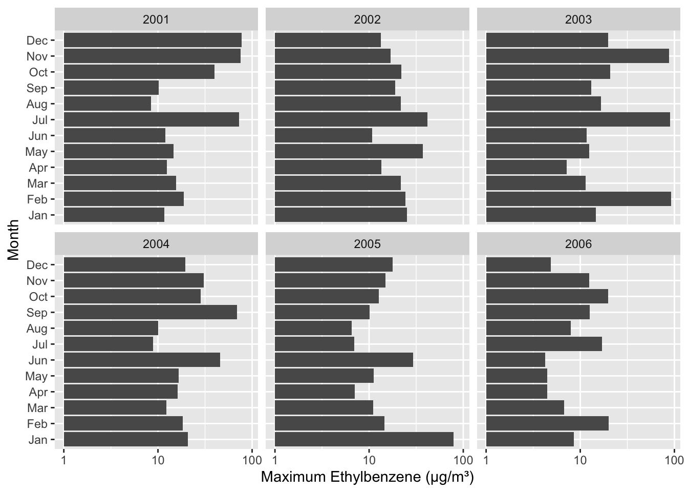
EBE: ethylbenzene level measured in μg/m³. Long term exposure can cause hearing or kidney problems and the IARC has concluded that long-term exposure can produce cancer.
MXY: m-xylene level measured in μg/m³. Xylenes can affect not only air but also water and soil, and a long exposure to high levels of xylenes can result in diseases affecting the liver, kidney and nervous system.
PXY: p-xylene level measured in μg/m³. See MXY for xylene exposure effects on health.
OXY: o-xylene level measured in μg/m³. See MXY for xylene exposure effects on health.
TCH: total hydrocarbons level measured in mg/m³. This group of substances can be responsible of different blood, immune system, liver, spleen, kidneys or lung diseases.
NMHC: non-methane hydrocarbons (volatile organic compounds) level measured in mg/m³. Long exposure to some of these substances can result in damage to the liver, kidney, and central nervous system. Some of them are suspected to cause cancer in humans.
Tutorial goals
The goal of this tutorial is to see if pollutants are decreasing (is air quality improving) and also compare which pollutant has decreased the most over the span of 5 years (2001 - 2006).
High-level summary of tasks
First do a plot of one of the pollutants (EBE).
Next, group it by month and year; calculate the maximum value and plot it (to see the trend through time).
Now we will look at which pollutant decreased the most. Repeat the same thing for every column - to speed up the process, use the map() function. First we will look at pollution in 2001 (get the maximum value for each of the pollutants). And then do the same for 2006.
Packages
We will be using the tidyverse set of packages:
library(tidyverse)
── Attaching core tidyverse packages ──────────────────────── tidyverse 2.0.0 ──
✔ dplyr     1.1.4     ✔ readr     2.1.6
✔ forcats   1.0.1     ✔ stringr   1.6.0
✔ ggplot2   4.0.0     ✔ tibble    3.3.0
✔ lubridate 1.9.4     ✔ tidyr     1.3.1
✔ purrr     1.2.0
── Conflicts ────────────────────────────────────────── tidyverse_conflicts() ──
✖ dplyr::filter() masks stats::filter()
✖ dplyr::lag()    masks stats::lag()
ℹ Use the conflicted package (<http://conflicted.r-lib.org/>) to force all conflicts to become errors
Exercises
Remember to switch the driver after each task.
Task 1
To begin with, load the madrid_pollution.csv data set into your R environment. Assign the data to an object called madrid.
Rows: 51864 Columns: 17
── Column specification ────────────────────────────────────────────────────────
Delimiter: "\t"
chr   (1): mnth
dbl  (15): BEN, CO, EBE, MXY, NMHC, NO_2, NOx, OXY, O_3, PM10, PXY, SO_2, TC...
dttm  (1): date

ℹ Use `spec()` to retrieve the full column specification for this data.
ℹ Specify the column types or set `show_col_types = FALSE` to quiet this message.
Now that the data is loaded in R, create a scatter plot that compares ethylbenzene (EBE) values against the date they were recorded. This graph will showcase the concentration of ethylbenzene in Madrid over time. As usual, label your axes:
x = Date
y = Ethylbenzene (μg/m³)
Assign your answer to an object called EBE_pollution.
What is your conclusion about the level of EBE over time?
Looks like it has a seasonal pattern.
Task 3
The question above asks you to write out code that allows visualization of all EBE recordings in the dataset - which are taken every single hour of every day. Consequently the graph consists of many points and appears densely plotted. In this question, we are going to clean up the graph and focus on max EBE readings from each month. Create a new data set with maximum EBE reading from each month in each year. Save your new data set as madrid_pollution.
NOTE: This worksheet has been adapted from Data Science: First Introduction Worksheets, by Tiffany Timbers, Trevor Campbell and Melissa Lee, available at https://worksheets.datasciencebook.ca/