Tidy Tuesday: Solar Eclipses

R
Tidy Tuesday
Authors

Myriam Scansetti

Nick Christofides

Wei Fan

Kennedy Owusu-Afriyie

Jon Minton

Published

April 11, 2024

The most recent TidyTuesday session looked at data about solar eclipses in the USA, and was led by Myriam. The repo readme is here

Loading the data

library(tidyverse)
── Attaching core tidyverse packages ──────────────────────── tidyverse 2.0.0 ──
✔ dplyr     1.1.4     ✔ readr     2.1.5
✔ forcats   1.0.0     ✔ stringr   1.5.1
✔ ggplot2   3.5.0     ✔ tibble    3.2.1
✔ lubridate 1.9.3     ✔ tidyr     1.3.1
✔ purrr     1.0.2     
── Conflicts ────────────────────────────────────────── tidyverse_conflicts() ──
✖ dplyr::filter() masks stats::filter()
✖ dplyr::lag()    masks stats::lag()
ℹ Use the conflicted package (<http://conflicted.r-lib.org/>) to force all conflicts to become errors
# Let's use the tidytuesdayR load package

all_data <- tidytuesdayR::tt_load('2024-04-09')
--- Compiling #TidyTuesday Information for 2024-04-09 ----
--- There are 4 files available ---
--- Starting Download ---

    Downloading file 1 of 4: `eclipse_annular_2023.csv`
    Downloading file 2 of 4: `eclipse_total_2024.csv`
    Downloading file 3 of 4: `eclipse_partial_2023.csv`
    Downloading file 4 of 4: `eclipse_partial_2024.csv`
--- Download complete ---

Tidying the data

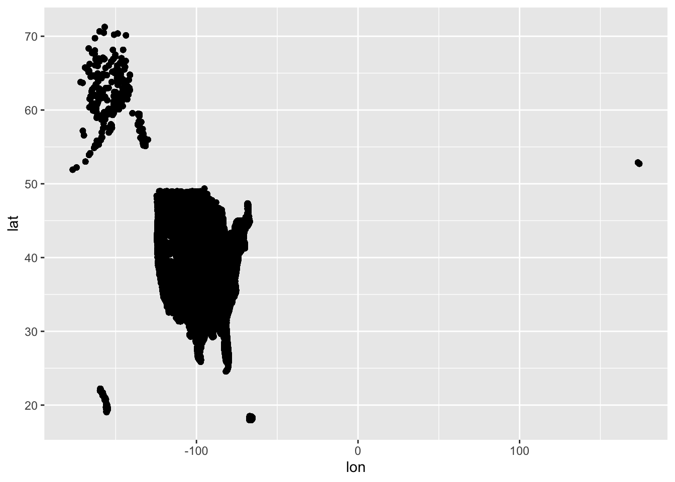
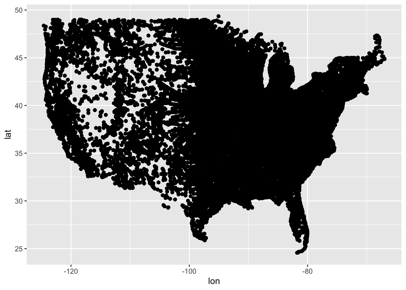
The data are a list of dataframes. Each dataframe has a similar data structure. We decided to spend some time tidying these dataframes, then combining them again into a single dataframe with additional attributes

eclipse_annular_2023 <- all_data$eclipse_annular_2023 |>
    mutate(year = 2023, type = "annular") |>
    pivot_longer(contains("eclipse"), names_to = "event_number", values_to = "event_datetime")
eclipse_total_2024 <- all_data$eclipse_total_2024 |>
    mutate(year = 2024, type = "total") |>
    pivot_longer(contains("eclipse"), names_to = "event_number", values_to = "event_datetime")
eclipse_partial_2023 <- all_data$eclipse_partial_2023 |>
    mutate(year = 2023, type = "partial") |>
    pivot_longer(contains("eclipse"), names_to = "event_number", values_to = "event_datetime")
eclipse_partial_2024 <- all_data$eclipse_partial_2024 |>
    mutate(year = 2024, type = "partial") |>
    pivot_longer(contains("eclipse"), names_to = "event_number", values_to = "event_datetime")

data_tidied <- bind_rows(
    list(eclipse_annular_2023, eclipse_partial_2023, eclipse_total_2024, eclipse_partial_2024)
) |>
    mutate(event_number = str_remove(event_number, "eclipse_") %>% as.numeric())

data_tidied
# A tibble: 325,881 × 8
   state name           lat   lon  year type    event_number event_datetime
   <chr> <chr>        <dbl> <dbl> <dbl> <chr>          <dbl> <time>        
 1 AZ    Chilchinbito  36.5 -110.  2023 annular            1 15:10:50      
 2 AZ    Chilchinbito  36.5 -110.  2023 annular            2 15:56:20      
 3 AZ    Chilchinbito  36.5 -110.  2023 annular            3 16:30:29      
 4 AZ    Chilchinbito  36.5 -110.  2023 annular            4 16:33:31      
 5 AZ    Chilchinbito  36.5 -110.  2023 annular            5 17:09:40      
 6 AZ    Chilchinbito  36.5 -110.  2023 annular            6 18:02:10      
 7 AZ    Chinle        36.2 -110.  2023 annular            1 15:11:10      
 8 AZ    Chinle        36.2 -110.  2023 annular            2 15:56:50      
 9 AZ    Chinle        36.2 -110.  2023 annular            3 16:31:21      
10 AZ    Chinle        36.2 -110.  2023 annular            4 16:34:06      
# ℹ 325,871 more rows

Graphing the data

As we do not expect cities/towns to move between years, we thought if we plotted the lon and lat as points we will get an impression of the USA

data_tidied |> 
    ggplot(aes(lon, lat)) + 
    geom_point()

Indeed we do! Though we thought it might be more straightforward to focus on the main US territory

data_tidied |>
    filter(
        between(lon, -150, -50),
        between(lat, 22, 50)
    ) |>
    ggplot(aes(lon, lat)) + 
    geom_point()

We now have an indirect map/signal of population density in the USA!

Eclipse type in 2024

We explored the four different datasets using filtering. For 2024 the types were total and partial. They look as follows:

data_tidied |>
    filter(
        between(lon, -150, -50),
        between(lat, 22, 50)
    ) |>
    filter(year == 2024) |>
    filter(event_number == 1) |>
    ggplot(aes(lon, lat)) + 
    geom_point() + 
    facet_wrap(~type)

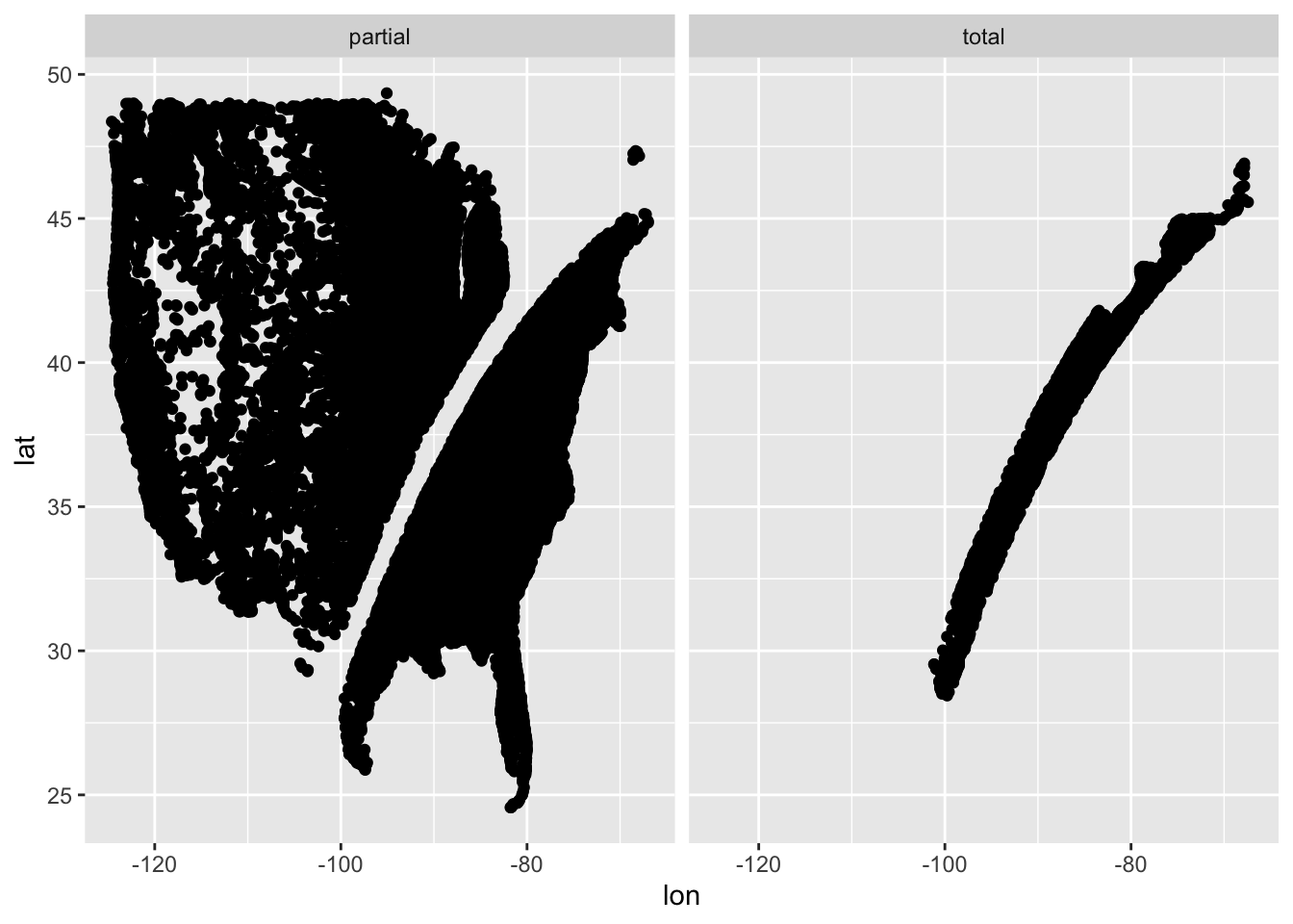
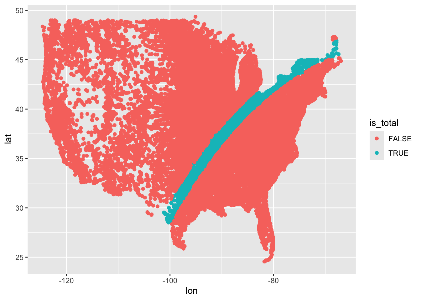
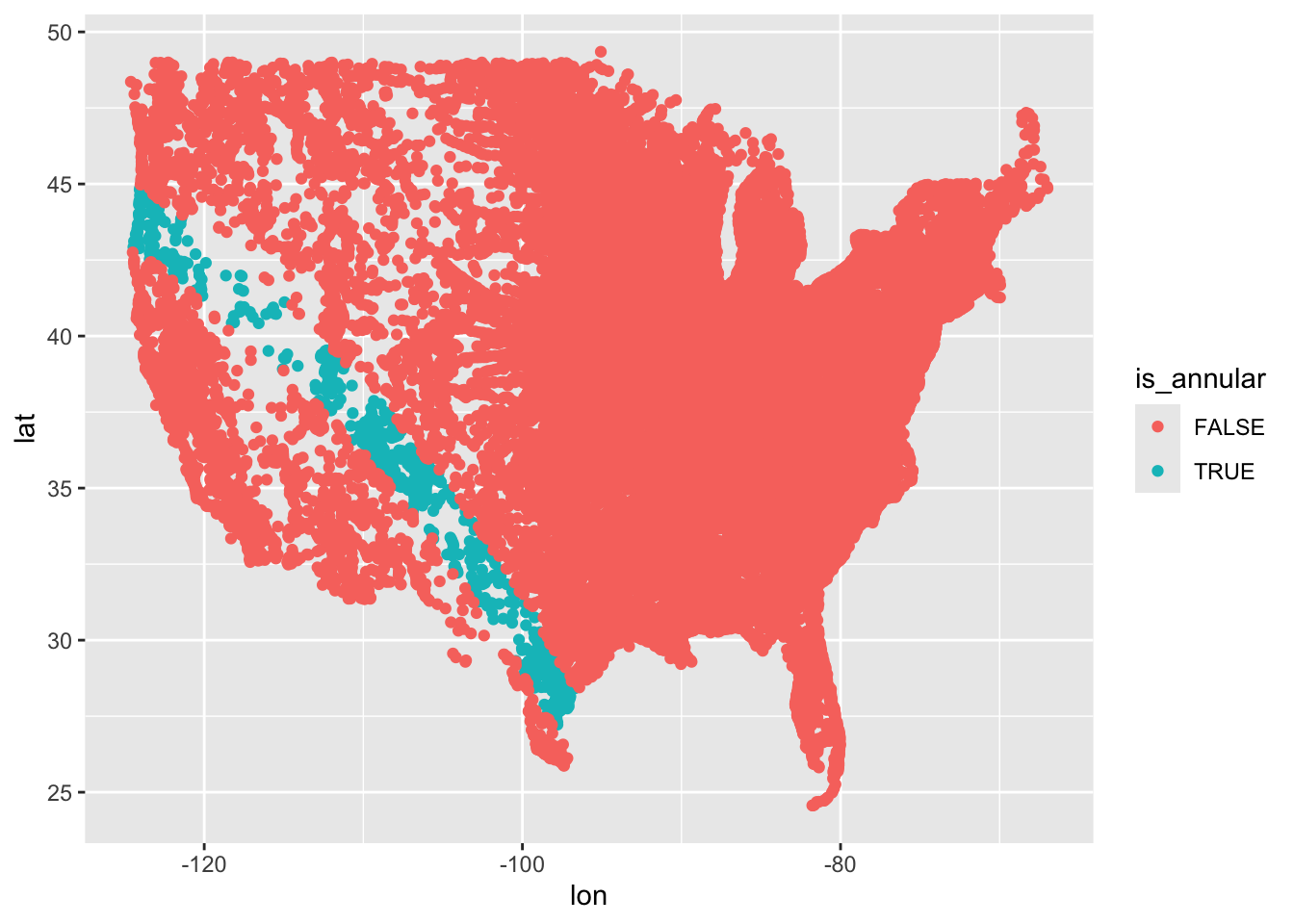
We realised total is a swathe of locations cut through the rest of the USA. We therefore thought it might be good to show the points coloured by whether they are flagged as total or partial in eclipse type

data_tidied |>
    filter(
        between(lon, -150, -50),
        between(lat, 22, 50)
    ) |>
    filter(year == 2024) |>
    filter(event_number == 1) |>
    mutate(is_total = type == "total") |>
    ggplot(aes(lon, lat)) + 
    geom_point(aes(colour = is_total))

And that’s where we got to. We recombined two datasets to show which parts of the USA were in the path of the total eclipse. (Nick mentioned that he’d seen data suggesting AirBnB prices were especially high for properties in this swathe!)

Going further

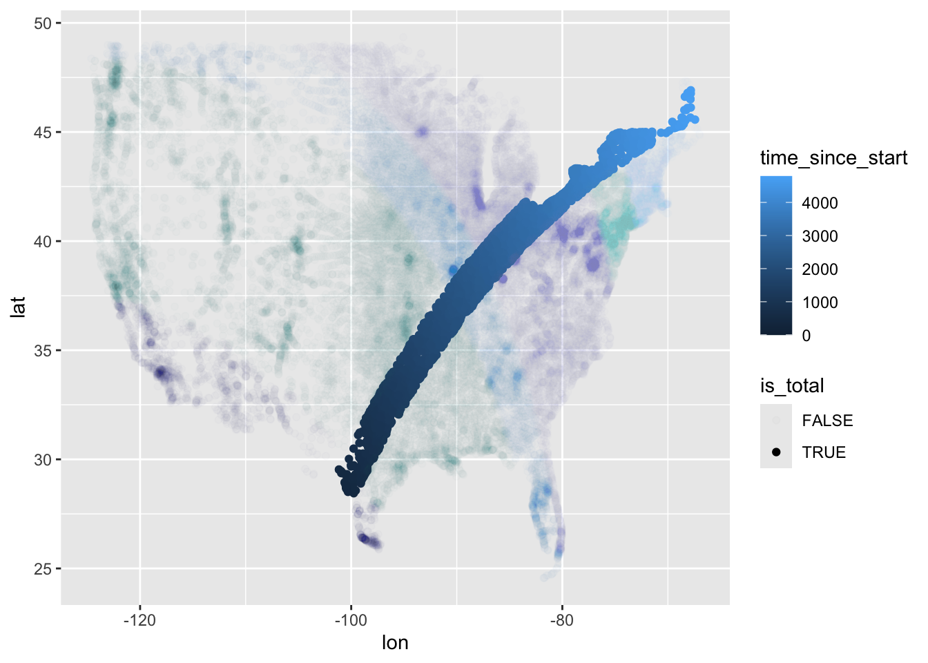
We could have looked at doing something similar with the annular and partial data for 2023:

data_tidied |>
    filter(
        between(lon, -150, -50),
        between(lat, 22, 50)
    ) |>
    filter(year == 2023) |>
    filter(event_number == 1) |>
    mutate(is_annular = type == "annular") |>
    ggplot(aes(lon, lat)) + 
    geom_point(aes(colour = is_annular))

This shows how the swathe the 2023 eclipse epicentre cut through the USA was different to the 2024 eclipse path.

We could also have made use of the datetime column to show how the eclipse happened at different times in different parts of the USA:

data_tidied |>
    filter(
        between(lon, -150, -50),
        between(lat, 22, 50)
    ) |>
    filter(year == 2024) |>
    filter(event_number == 1) |>
    mutate(is_total = type == "total") |>
    mutate(start_time = min(event_datetime)) |>
    mutate(time_since_start = event_datetime - start_time) |>
    ggplot(aes(lon, lat)) + 
    geom_point(aes(colour = time_since_start, alpha = is_total)) + 
    scale_alpha_manual(values = c(`FALSE` = 0.01, `TRUE` = 1))
Don't know how to automatically pick scale for object of type <difftime>.
Defaulting to continuous.

We can see from this that the event seemed to start on the west coast and move east.

Finally, we could have looked at adding a basemap.

I tried following this tutorial to get a basemap using ggmap. Unfortunately, ggmap now requires registering API keys (and credit card details) with Google. So this exercise is as yet incomplete!