Rows: 13
Columns: 10
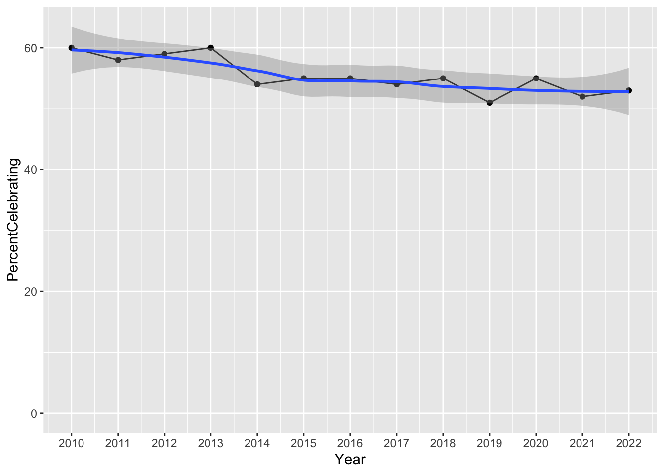
$ Year <dbl> 2010, 2011, 2012, 2013, 2014, 2015, 2016, 2017, 201…
$ PercentCelebrating <dbl> 60, 58, 59, 60, 54, 55, 55, 54, 55, 51, 55, 52, 53
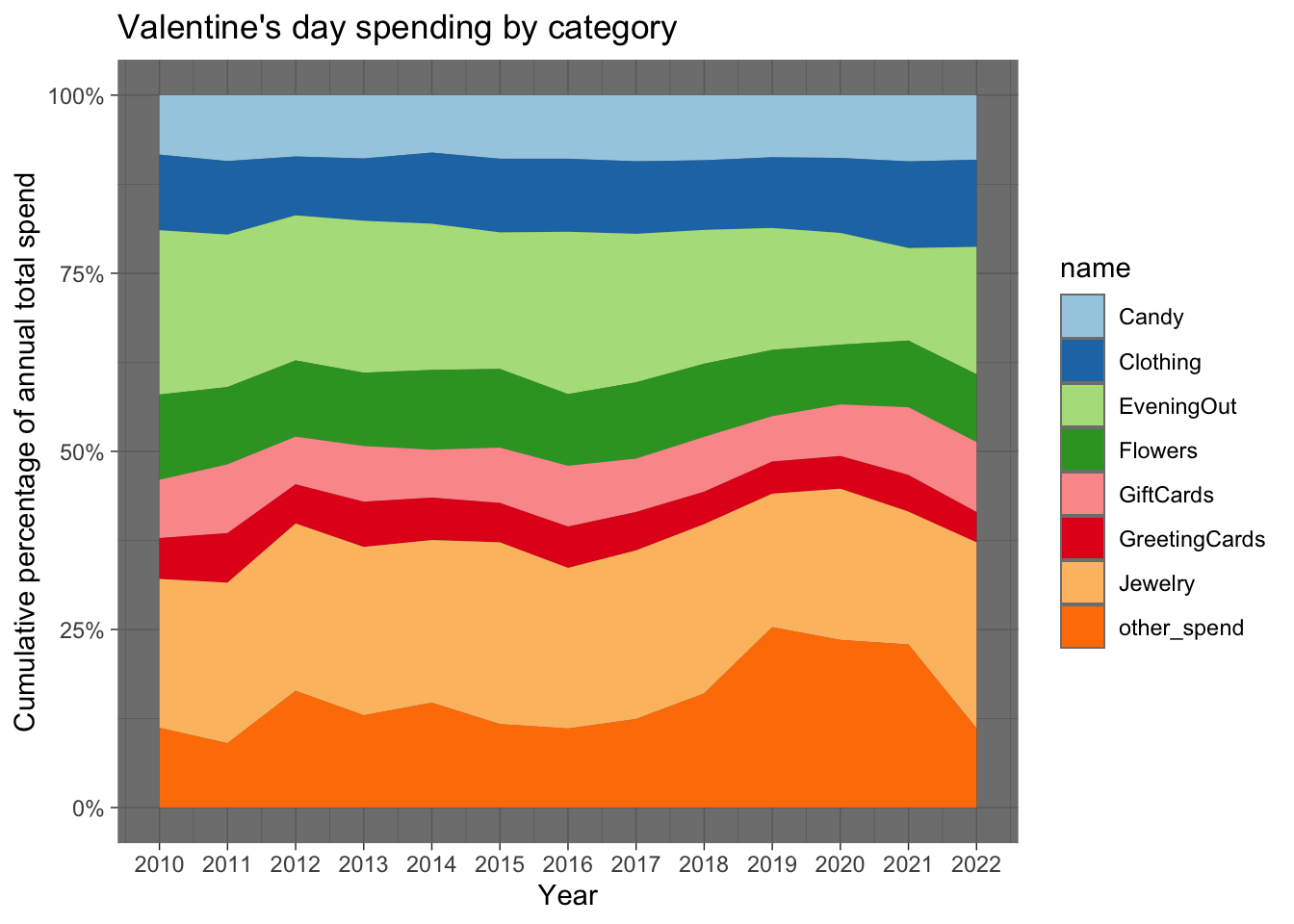
$ PerPerson <dbl> 103.00, 116.21, 126.03, 130.97, 133.91, 142.31, 146…
$ Candy <dbl> 8.60, 10.75, 10.85, 11.64, 10.80, 12.70, 13.11, 12.…
$ Flowers <dbl> 12.33, 12.62, 13.49, 13.48, 15.00, 15.72, 14.78, 14…
$ Jewelry <dbl> 21.52, 26.18, 29.60, 30.94, 30.58, 36.30, 33.11, 32…
$ GreetingCards <dbl> 5.91, 8.09, 6.93, 8.32, 7.97, 7.87, 8.52, 7.36, 6.5…
$ EveningOut <dbl> 23.76, 24.86, 25.66, 27.93, 27.48, 27.27, 33.46, 28…
$ Clothing <dbl> 10.93, 12.00, 10.42, 11.46, 13.37, 14.72, 15.05, 13…
$ GiftCards <dbl> 8.42, 11.21, 8.43, 10.23, 9.00, 11.05, 12.52, 10.23…
Rows: 13
Columns: 10
$ Year <dbl> 2010, 2011, 2012, 2013, 2014, 2015, 2016, 2017, 201…
$ PercentCelebrating <dbl> 60, 58, 59, 60, 54, 55, 55, 54, 55, 51, 55, 52, 53
$ PerPerson <dbl> 103.00, 116.21, 126.03, 130.97, 133.91, 142.31, 146…
$ Candy <dbl> 8.60, 10.75, 10.85, 11.64, 10.80, 12.70, 13.11, 12.…
$ Flowers <dbl> 12.33, 12.62, 13.49, 13.48, 15.00, 15.72, 14.78, 14…
$ Jewelry <dbl> 21.52, 26.18, 29.60, 30.94, 30.58, 36.30, 33.11, 32…
$ GreetingCards <dbl> 5.91, 8.09, 6.93, 8.32, 7.97, 7.87, 8.52, 7.36, 6.5…
$ EveningOut <dbl> 23.76, 24.86, 25.66, 27.93, 27.48, 27.27, 33.46, 28…
$ Clothing <dbl> 10.93, 12.00, 10.42, 11.46, 13.37, 14.72, 15.05, 13…
$ GiftCards <dbl> 8.42, 11.21, 8.43, 10.23, 9.00, 11.05, 12.52, 10.23…