This post continues a short series on resampling methods, sometimes also known as ‘Hacker Stats’, for hypothesis testing. To recap: resampling with replacement is known as bootstrapping. Resampling without replacement can be used for permutation tests: testing whether apparent patterns in the data, including apparent associations between variables in the data, could likely have emerged from the Null distribution.
In a previous post introducing bootstrapping, I showed how the approach can be used to perform something like hypothesis tests for quantities of interest that aren’t as easily amenable as means to being assessed parametrically, such as differences in medians. In the next post, on resampling and permutation tests, I described the intuition and methodology behind resampling with replacement to produce Null distributions, and how to implement the procedure using base R.
In this post, I show how the infer package, can be used to perform both bootstrapping and permutation testing in a way that’s slightly easier, and more declarative in the context of a general hypothesis testing framework.
Setting up
Let’s install the infer packge and try a couple of examples from the documentation.
# install.packages("infer") # First time aroundlibrary(tidyverse)
── Attaching core tidyverse packages ──────────────────────── tidyverse 2.0.0 ──
✔ dplyr     1.1.4     ✔ readr     2.1.6
✔ forcats   1.0.1     ✔ stringr   1.6.0
✔ ggplot2   4.0.0     ✔ tibble    3.3.0
✔ lubridate 1.9.4     ✔ tidyr     1.3.1
✔ purrr     1.2.0
── Conflicts ────────────────────────────────────────── tidyverse_conflicts() ──
✖ dplyr::filter() masks stats::filter()
✖ dplyr::lag()    masks stats::lag()
ℹ Use the conflicted package (<http://conflicted.r-lib.org/>) to force all conflicts to become errors
library(infer)
The infer package
From the vignette page we can see that infer’s workflow is framed around four verbs:
specify() allows you to specify the variable, or relationship between variables, that you’re interested in.
hypothesize() allows you to declare the null hypothesis.
generate() allows you to generate data reflecting the null hypothesis.
calculate() allows you to calculate a distribution of statistics from the generated data to form the null distribution.
The package describes the problem of hypothesis testing as being somewhat generic, regardless of the specific test, hypothesis, or dataset being used:
Regardless of which hypothesis test we’re using, we’re still asking the same kind of question: is the effect/difference in our observed data real, or due to chance? To answer this question, we start by assuming that the observed data came from some world where “nothing is going on” (i.e. the observed effect was simply due to random chance), and call this assumption our null hypothesis. (In reality, we might not believe in the null hypothesis at all—the null hypothesis is in opposition to the alternate hypothesis, which supposes that the effect present in the observed data is actually due to the fact that “something is going on.”) We then calculate a test statistic from our data that describes the observed effect. We can use this test statistic to calculate a p-value, giving the probability that our observed data could come about if the null hypothesis was true. If this probability is below some pre-defined significance level \(\alpha\), then we can reject our null hypothesis.
The gss dataset
Let’s look through - and in some places adapt - the examples used. These mainly make use of the gss dataset.
Example 1: Categorical Predictor; Continuous Response
Let’s go slightly off piste and say we are interested in seeing if there is a relationship between age, a cardinal variable, and sex, a categorical variable. We can start by stating our null and alternative hypotheses explicitly:
Null hypothesis: There is no difference between age and sex
Alt hypothesis: There is a difference between age and sex
Let’s see if we can start by just looking at the data to see if, informally, it looks like it might better fit the Null or Alt hypothesis.
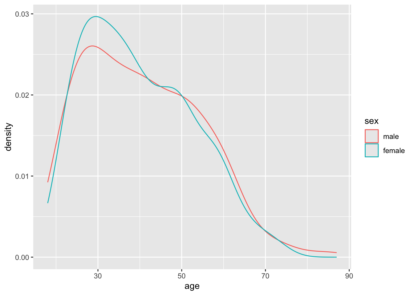
gss |>ggplot(aes(x=age, group = sex, colour = sex)) +geom_density()
It looks like the densities of age distributions are similar for both sexes. However, they’re not identical. Are the differences more likely to be due to chance, or are they more structural?
We can start by calculating, say, the differences in average ages between males and females:
# A tibble: 2 × 3
  sex        n mean_age
  <fct>  <int>    <dbl>
1 male     263     40.6
2 female   237     39.9
Our first testable hypothesis (using permutation testing/sampling without replacement)
The mean age is 40.6 for males and 39.9 for females, a difference of about 0.7 years of age. Could this have occurred by chance?
There are 263 male observations, and 237 female observations, in the dataset. Imagine that the ages are values, and the sexes are labels that are added to these values.
One approach to operationalising the concept of the Null Hypothesis is to ask: If we shifted around the labels assigned to the values, so there were still as many male and female labels, but they were randomly reassigned, what would the difference in mean age between these two groups be? What would happen if we did this many times?
This is the essence of building a Null distribution using a permutation test, which is similar to a bootstrap except it involves resampling with replacement rather than without replacement.
We can perform this permutation test using the infer package as follows:
model <- gss |>specify(age ~ sex) |>hypothesize(null ='independence') |>generate(reps =10000, type ='permute')model
Response: age (numeric)
Explanatory: sex (factor)
Null Hypothesis: independence
# A tibble: 5,000,000 × 3
# Groups:   replicate [10,000]
     age sex    replicate
   <dbl> <fct>      <int>
 1    34 male           1
 2    31 female         1
 3    33 male           1
 4    62 male           1
 5    70 male           1
 6    50 female         1
 7    50 female         1
 8    42 female         1
 9    44 female         1
10    27 female         1
# ℹ 4,999,990 more rows
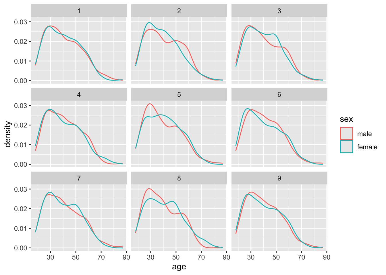
The infer package has now arbitrarily shifted around the labels assigned to the age values 10000 times. Each time is labelled with a different replicate number. Let’s take the first nine replicates and show what the densities by sex look like:
model |>filter(replicate <=9) |>ggplot(aes(x=age, group = sex, colour = sex)) +geom_density() +facet_wrap(~replicate)
What if we now look at the differences in means apparent in each of these permutations
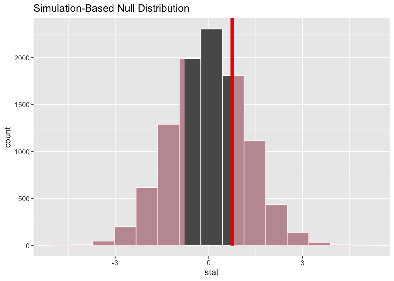
model |>calculate(stat ="diff in means", order =c("male", "female")) |>visualize()
Here we can see the distribution of differences in means follows broadly a normal distribution, which appears to be centred on 0.
Let’s now calculate and save the observed difference in means.
Let’s now show where the observed difference in means falls along the distribution of differences in means generated by this permutation-based Null distribution:
model |>calculate(stat ="diff in means", order =c("male", "female")) |>visualize() +shade_p_value(obs_stat = diff_means, direction ="two-sided")
The observed difference in means appears to be quite close to the centre of mass for the distribution of differences in means generated by the Null distribution. So it appears very likely that this observed difference could be generated from a data generating process in which there’s no real difference in mean ages between the two groups. We can formalise this slightly by calcuating a p-value:
model |>calculate(stat ="diff in means", order =c("male", "female")) |>get_p_value(obs_stat = diff_means, direction ="two-sided")
# A tibble: 1 × 1
  p_value
    <dbl>
1   0.544
The p value is much, much greater than 0.05, suggesting there’s little evidence to reject the Null hypothesis, that in this dataset age is not influenced by sex.
Example 2: Categorical Predictor; Categorical Response
Now let’s look at the two variables college and partyid:
college: Can be degree or no degree
partyid: Can be indrep, dem, other
The simplest type of hypothesis to state is probably something like:
Null Hypothesis: There is no relationship between partyid and college
Alt Hypothesis: There is a relationship between partyid and college
We can then consider more specific and targetted hypotheses at a later date.
Let’s see how we could use infer to help decide between these hypotheses, using a permutation test:
model <- gss |>specify(partyid ~ college) |>hypothesize(null ='independence') |>generate(reps =10000, type ='permute')
Dropping unused factor levels DK from the supplied response variable 'partyid'.
model
Response: partyid (factor)
Explanatory: college (factor)
Null Hypothesis: ind...
# A tibble: 5,000,000 × 3
# Groups:   replicate [10,000]
   partyid college   replicate
   <fct>   <fct>         <int>
 1 rep     degree            1
 2 dem     no degree         1
 3 dem     degree            1
 4 ind     no degree         1
 5 ind     degree            1
 6 dem     no degree         1
 7 rep     no degree         1
 8 ind     degree            1
 9 dem     degree            1
10 dem     no degree         1
# ℹ 4,999,990 more rows
Let’s visualise the relationship between partyid and college in the first nine replicates:
model |>filter(replicate <=9) |>ggplot(aes(x = college, fill = partyid)) +geom_bar(position ="fill") +facet_wrap(~replicate) +labs(title ="Permuted (fake) datasets")
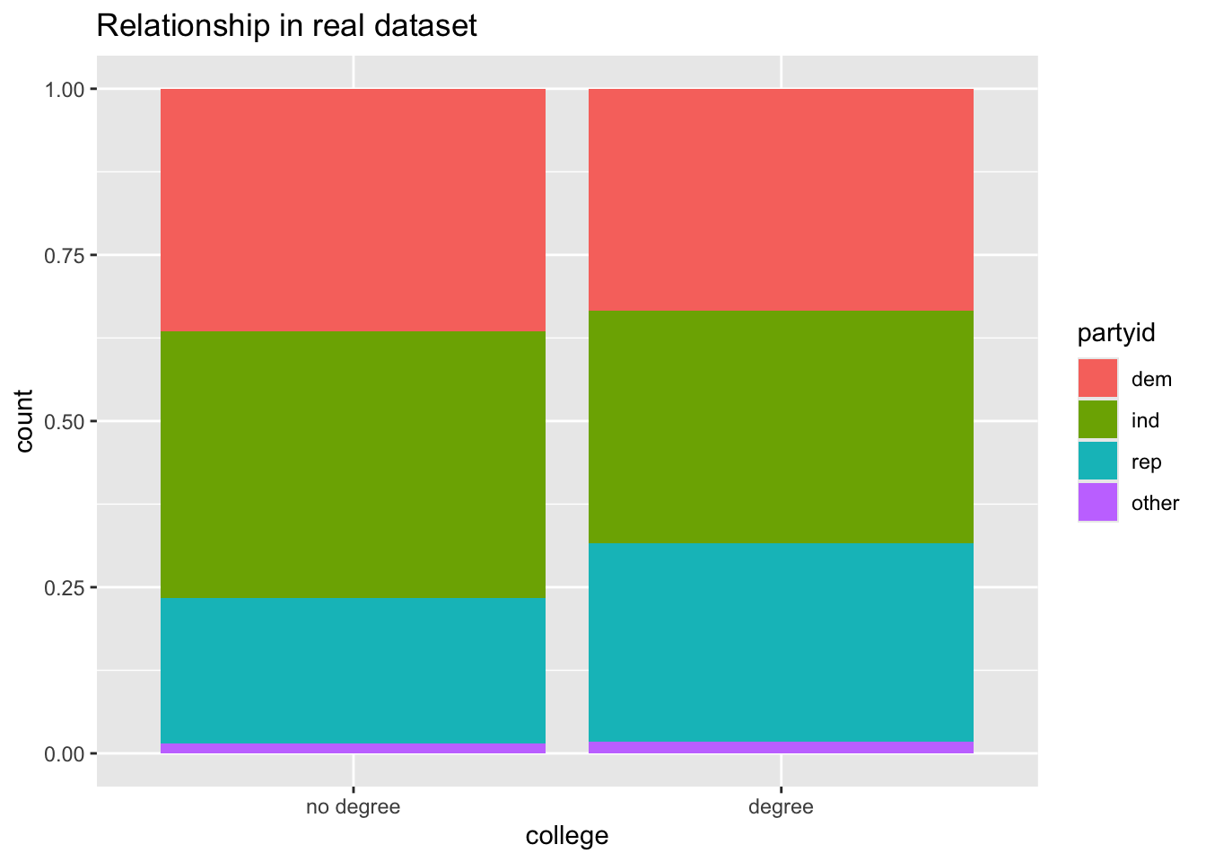
And how does this compare with the observed dataset?
gss |>ggplot(aes(x = college, fill = partyid)) +geom_bar(position ="fill") +labs(title ="Relationship in real dataset")
But what summary statistic can we use for comparing the observed level of extremeness of any apparent association between the two variables, with summary statistics under the Null hypothesis (i.e. using permutation testing)? The standard answer is to calculate the Chi-squared statistic, as detailed here.
First, what’s the Chi-squared value we get from the observed data?
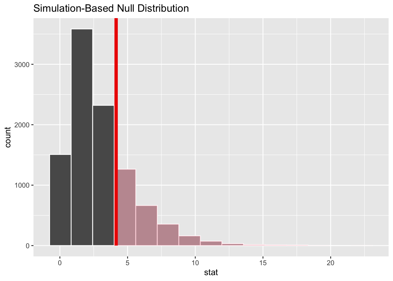
So, is the observed value something that could have been plausibly generated from the Null distribution? We can answer this by seeing how extreme the observed Chi-squared value is compared with the distribution of values under the Null:
visualise(chi_dist_null) +shade_p_value(obs_stat = Chisq_obs, direction ="greater")
So, it looks like it’s fairly likely that the value we observed could have been observed under the Null, a scenario in which there’s no true relationship between the variables. But how likely?
chi_dist_null |>get_p_value(obs_stat = Chisq_obs, direction ="greater")
# A tibble: 1 × 1
  p_value
    <dbl>
1   0.245
Around a quarter of Chi-squared values under the Null are as greater or greater than that observed in the real dataset. So there’s not great evidence of there being a relationship between having a degree and distribution of party affiliations.
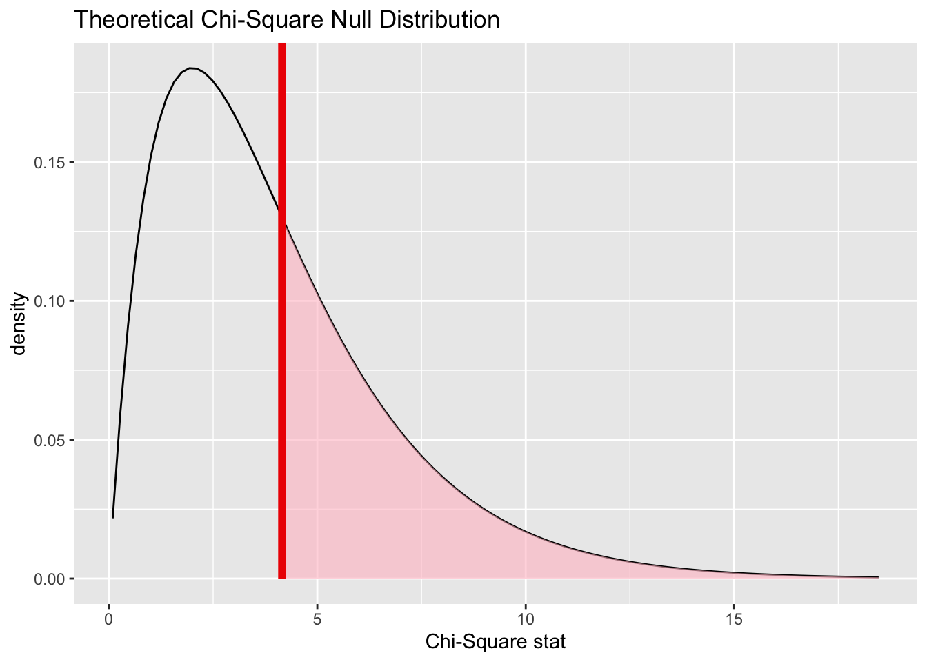
Infer makes it fairly straightforward to calculate the extremeness of our observed test statistic using the analytic/theoretical approach too, using the assume() verb:
Dropping unused factor levels DK from the supplied response variable 'partyid'.
visualize(null_dist_theory) +shade_p_value(obs_stat = Chisq_obs, direction ="greater")
null_dist_theory |>get_p_value(obs_stat = Chisq_obs, direction ="greater")
# A tibble: 1 × 1
  p_value
    <dbl>
1   0.386
Here the theoretical distribution suggests the observed value is even more likely to have been observed by chance under the Null, than using the permutation-based approach.
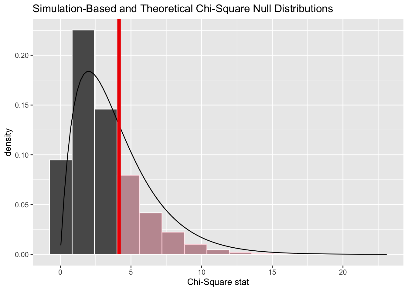
And we can show both approaches together:
chi_dist_null |>visualise(method ="both") +shade_p_value(obs_stat = Chisq_obs, direction ="greater")
Warning: Check to make sure the conditions have been met for the theoretical method.
infer currently does not check these for you.
Here we can see the resampling-based distribution (the histogram) has more values lower than the observed value, and fewer values higher than the observed value, than the theoretical distribution (the density line), which helps to explain the difference in p-values calculated.
Summing up
So, that’s a brief introduction to the infer package. It provides a clear and opinionated way of thinking about and constructing hypothesis tests using a small series of verbs, and as part of this handles a lot of the code for performing permutation tests, visualising data, and comparing resampling-based estimates of the Null distribution with theoretical estimates of the same quantities. And, though both of the examples I’ve shown above are about permutation testing, it also allows for bootstrapped calculations to be performed too.
In some ways, infer seems largely intended as a pedagogic/teaching tool, for understanding the intuition behind the concept of the Null hypothesis and distribution, and so what a p-value actually means. However you can see that it does abstract away some of the computational complexity involved in producing Null distributions using both resampling and ‘traditional’ approaches. In previous posts we showed that it’s not necessarily too difficult to produce resampled distributions without this, but there’s still potentially some quality-of-life benefits to using it.