In the main course I’ve returned many times to the same ‘mother formula’ for a generalised linear model:
Stochastic Component
\[
Y_i \sim f(\theta_i, \alpha)
\]
Systematic Component
\[
\theta_i = g(X_i, \beta)
\]
So, we have a system that takes a series of inputs, \(X\), and returns an output, \(Y\), and we have two sets of parameters, \(\beta\) in \(g(.)\) and \(\alpha\) in \(f(.)\), which are calibrated based on the discrepancy between what the model predicted output \(Y\) and the observed output \(y\).
There are two important things to note: Firstly, that the choice of parts of the data go into the inputs \(X\) and the output(s) \(Y\) is ultimately our own. A statistical model won’t ‘know’ when we’re trying to predict the cause of something based on its effect, for example. Secondly, that although the choice of input and output for the model are ultimately arbitrary, they cannot be the same. i.e., we cannot do this:
\[
Y_i \sim f(\theta_i, \alpha)
\]
\[
\theta_i = g(Y_i, \beta)
\]
This would be the model calibration equivalent of telling a dog to chase, or a snake to eat, its own tail. It doesn’t make sense, and so the parameter values involved cannot be calculated.
For time series data, however, this might appear to be a fundamental problem, given our observations may comprise only of ‘outcomes’, which look like they should be in the output slot of the formulae, rather than determinants, which look like they should be in the input slot of the formulae. i.e. we might have data that looks as follows:
\(i\)
\(Y_{T-2}\)
\(Y_{T-1}\)
\(Y_{T}\)
1
4.8
5.0
4.9
2
3.7
4.1
4.3
3
4.3
4.1
4.3
Where \(T\) indicates an index time period, and \(T-k\) a fixed difference in time ahead of or behind the index time period. For example, \(T\) might be 2019, \(T-1\) might be 2018, \(T-2\) might be 2017, and so on.
Additionally, for some time series data, the dataset will be much more wide than long, perhaps with just a single observed unit, observed at many different time points:
\(i\)
\(Y_{T-5}\)
\(Y_{T-4}\)
\(Y_{T-3}\)
\(Y_{T-2}\)
\(Y_{T-1}\)
\(Y_{T}\)
1
3.9
5.1
4.6
4.8
5.0
4.9
Given all values are ‘outcomes’, where’s the candidate for an ‘input’ to the model, i.e. something we should consider putting into \(X\)?
Doesn’t the lack of an \(X\) mean time series is an exception to the ‘rule’ about what a statistical model looks like, and so everything we’ve learned so far is no longer relevant?
The answer to the second question is no. Let’s look at why.
Autoregression
Instead of looking at the data in the wide format above, let’s instead rearrange it in long format, so the time variable is indexed in its own column:
# A tibble: 6 × 3
i t y
<dbl> <dbl> <dbl>
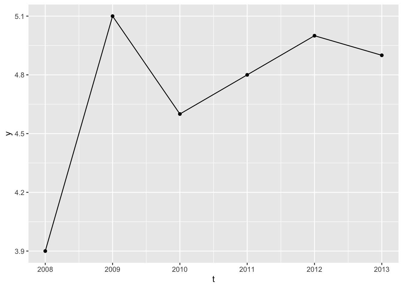
1 1 2008 3.9
2 1 2009 5.1
3 1 2010 4.6
4 1 2011 4.8
5 1 2012 5
6 1 2013 4.9
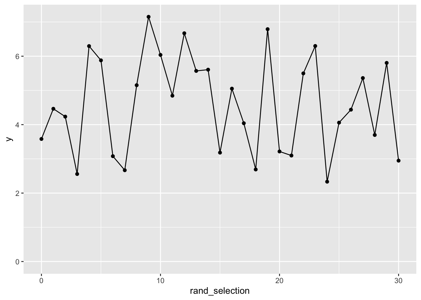
As there’s only one type of observational unit, \(i=1\) in all cases, there’s no variation in this variable, so it can’t provide any information in a model. Let’s look at the series and think some more:
Code
df |>ggplot(aes(t, y)) +geom_line() +geom_point()
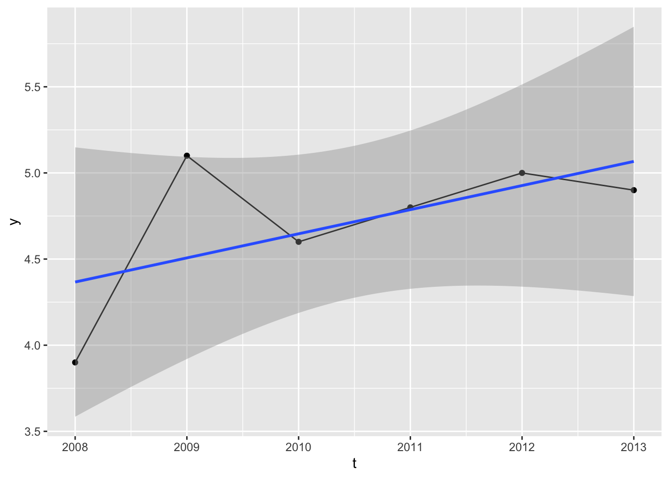
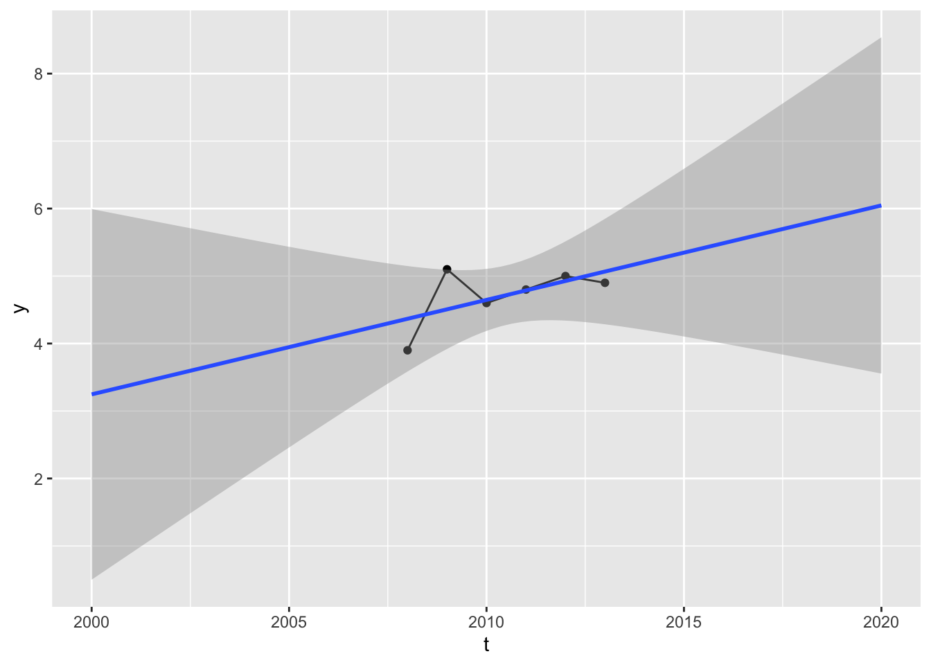
We could, of course, regress the outcome against time:
Is this reasonable? It depends on the context. We obviously don’t have that many observations, but the regression slope appears to have a positive gradient, meaning values projected into the future will likely be higher than the observed values, and values projected into the past will likely have lower than the observed values.
Maybe this kind of extrapolation is reasonable. Maybe it’s not. As usual it depends on context. Although it’s a model including time as a predictor, it’s not actually a time series model. Here’s an example of a time series model:
Code
lm_ts_ar0 <-lm(y ~1, data = df)summary(lm_ts_ar0)
Call:
lm(formula = y ~ 1, data = df)

Residuals:
       1        2        3        4        5        6
-0.81667  0.38333 -0.11667  0.08333  0.28333  0.18333

Coefficients:
            Estimate Std. Error t value Pr(>|t|)
(Intercept)   4.7167     0.1778   26.53 1.42e-06 ***
---
Signif. codes:  0 '***' 0.001 '**' 0.01 '*' 0.05 '.' 0.1 ' ' 1

Residual standard error: 0.4355 on 5 degrees of freedom
This is an example of a time series model, even though it doesn’t have a time component on the predictor side. In fact, it doesn’t have anything as a predictor. Its formula is y ~ 1, meaning there’s just an intercept term. It’s saying “assume new values are just like old values: all just drawn from the same normal distribution”.
I called this model ar0. Why? Well, let’s look at the following:
Call:
lm(formula = y ~ y_lag1, data = .)

Residuals:
        2         3         4         5         6
-0.005066 -0.158811 -0.103084  0.154626  0.112335

Coefficients:
            Estimate Std. Error t value Pr(>|t|)
(Intercept)   6.2304     0.7661   8.132  0.00389 **
y_lag1       -0.2885     0.1630  -1.770  0.17489
---
Signif. codes:  0 '***' 0.001 '**' 0.01 '*' 0.05 '.' 0.1 ' ' 1

Residual standard error: 0.1554 on 3 degrees of freedom
  (1 observation deleted due to missingness)
Multiple R-squared:  0.5108,    Adjusted R-squared:  0.3477
F-statistic: 3.133 on 1 and 3 DF,  p-value: 0.1749
For this model, I included one new predictor: y_lag1. For this, I created a new column in the dataset:
Code
df |>arrange(t) |>mutate(y_lag1 =lag(y, 1))
# A tibble: 6 × 4
      i     t     y y_lag1
  <dbl> <dbl> <dbl>  <dbl>
1     1  2008   3.9   NA
2     1  2009   5.1    3.9
3     1  2010   4.6    5.1
4     1  2011   4.8    4.6
5     1  2012   5      4.8
6     1  2013   4.9    5
The lag() operator takes a column and a lag term parameter, in this case 11. For each row, the value of y_lag1 is the value of y one row above. 2
The first simple model was called AR0, and the second AR1. So what does AR stand for?
If you’re paying attention to the section title, you already have the answer. It means autoregressive. The AR1 model is the simplest type of autoregressive model, by which I don’t mean this is a type of regression model that formulates itself, but do mean it includes its own past states (at time T-1) as predictors of its current state (at time T).
And what does \(T\) and \(T-1\) refer to in the above? Well, for row 6 \(T\) refers to \(t\), which is 2013; and so \(T-1\) refers to 2012. But for row 5 \(T\) refers to 2012, so \(T-1\) refers to 2011. This continues back to row 2, where \(T\) is 2009 so \(T-1\) must be 2008. (The first row doesn’t have a value for y_lag1, so can’t be included in the regression).
Isn’t this a bit weird, however? After all, we only have one real observational unit, \(i\), but for the AR1 model we’re using values from this unit five times. Doesn’t this violate some kind of rule or expectation required for model outputs to be legitimate?
Well, it might. A common shorthand when describing the assumptions that we make when applying statistical models is \(IID\), which stands for ‘independent and identically distributed’. As with many unimaginative discussions of statistics, we can illustrate something that satifies both of these properties, independent and identically distributed by looking at some coin flips:
The above series of coin flips is identically distributed because the order in which the flips occur doesn’t matter to the value generated. The dataframe could be permutated in any order and it wouldn’t matter to the data generation process at all. The series is independent because the probability of getting, say, a sequence of three heads is just the product of getting one head, three times, i.e. i.e. \(\frac{1}{2} \frac{1}{2} \frac{1}{2}\) or \([\frac{1}{2}]^{3}\). Without going into too much detail, both of these assumptions are necessary to make in order for likelihood estimation, which relies on multiplying sequences of numbers 3 to ‘work’.
The central assumption and hope with an autoregressive model specification is that, conditional on the autoregressive terms being included on the predictor side of the model, the data can assumed to have been generated from an IID data generating process (DGP).
The intuition behind this is something like the following: say you wanted to know if I’ll have the flu tomorrow. It would obviously be useful to know if I have the flu today, because symptoms don’t change very quickly. 4 Maybe it would also be good to know if I had the flu yesterday too, maybe even two days ago as well. But would it be good to know if I had the flu two weeks ago, or five weeks ago? Probably not. At some point, i.e. some number of lag terms from a given time, more historical data stops being informative. i.e., beyond a certain number of lag periods, the data series can be assumed to be IID (hopefully).
When building autoregressive models, it is common to look at a range of specifications, each including different numbers of lag terms. I.e. we can build a series of AR specification models as follows:
AR(0): \(Y_T \sim 1\)
AR(1): \(Y_T \sim Y_{T-1}\)
AR(2): \(Y_T \sim Y_{T-1} + Y_{T-2}\)
AR(3): \(Y_T \sim Y_{T-1} + Y_{T-2} + Y_{T-3}\)
And so on. Each successive AR(.) model contains more terms than the last, so is a more complicated and data hungry model than the previous one. We should already by this point in the series be familiar with standard approaches for trying to find the best trade off between model complexity and model fit. The above models are in a sense nested, so for example F-tests can be used to compare these models. Another approach, which ‘works’ for both nested and non-nested model specifications, is AIC, and indeed this is commonly used to select the ‘best’ number of autoregressive terms to include.
For future reference, the number of AR terms is commonly denoted with the letter ‘p’, meaning that if p is 3, for example, then we are talking about an AR(3) model specification.
Summing up
The other important thing to note is that autoregression is a way of fitting time series data within the two component ‘mother formulae’ at the start of this post (and many others), by operating on the systematic component of the model framework, \(g(.)\). At this stage, nothing unusual is happening with the stochastic component of the model framework \(f(.)\).
With autoregression, denoted by the formula shorthand \(AR(.)\) and the parameter shorthand \(p\), we now have one of the three main tools in the modeller’s toolkit for handling time series data.
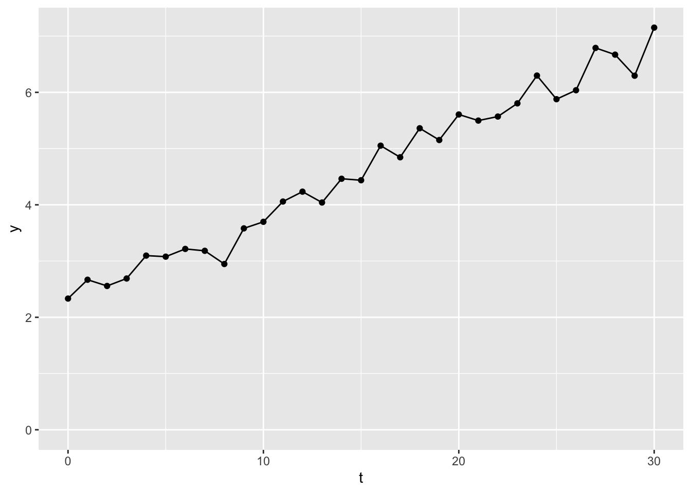
This time series data is an example of a non-stationary time series. This term means that its value drifts in a particular direction over time. In this case, upwards, meaning values towards the end of the series tend to be higher than values towards the start of the series.
What this drift means is that the order of the observations matters, i.e. if we looked at the same observations, but in a random order, we wouldn’t see something that looks similar to what we’re seeing here.
As it’s clear the order of the sequence matters, the standard simplifying assumptions for statistical models of IID (independent and identically distributed) does not hold, so the extent to which observations from the same time series dataset can be treated like new pieces of information for the model is doubtful. We need a way of making the observations that go into the model (though not necessarily what we do with the model after fitting it) more similar to each other, so these observations can be treated as IID. How do we do this?
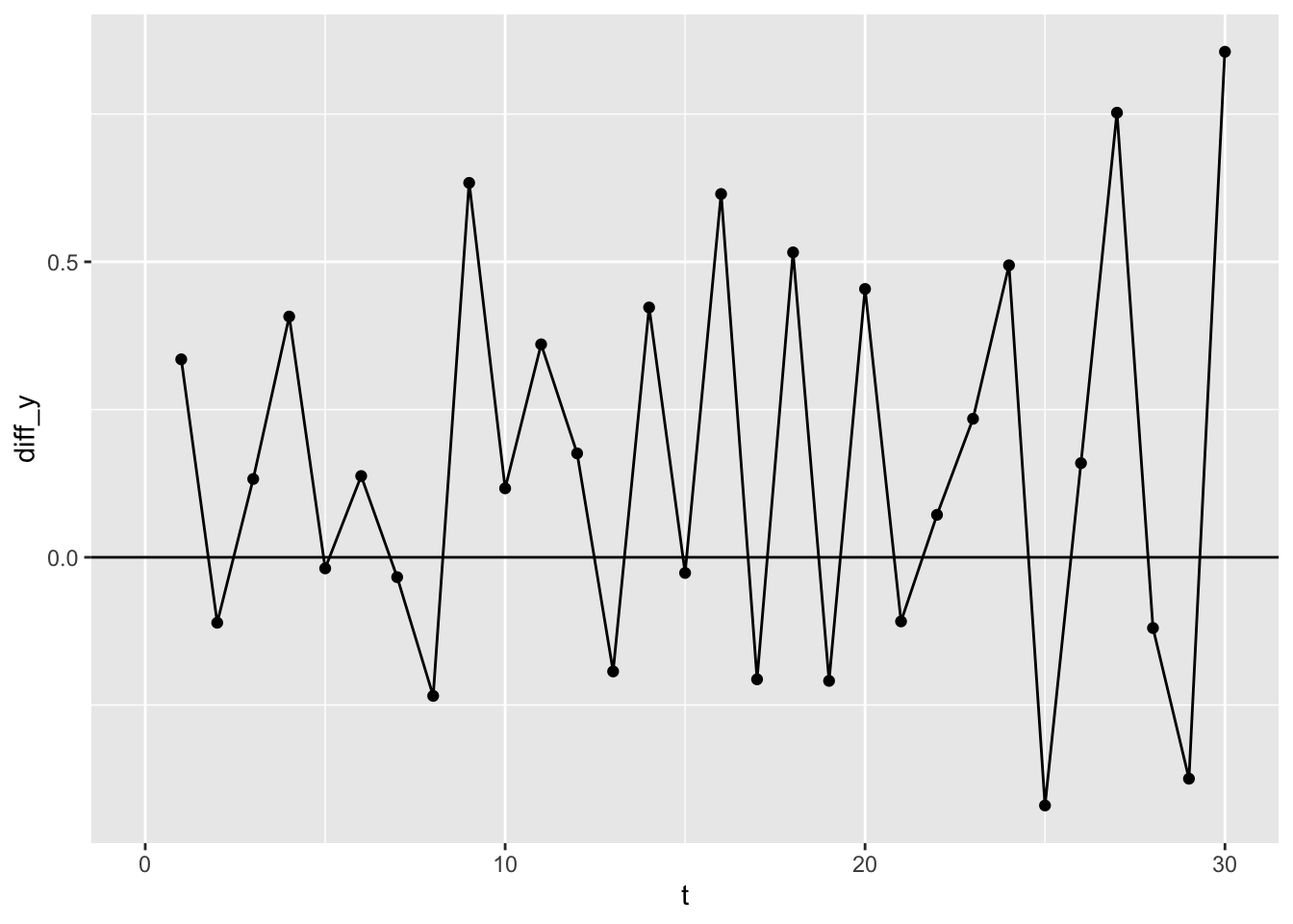
The answer is something that’s blindingly obvious in retrospect. We can transform the data that goes into the model by taking the differences between consecutive values. So, if the first ten values of our dataset look like this:
So, as with autoregression (AR), with integration we’ve arranged the data in order, then used the lag operator. The difference between the use of lagging as a tool for AR, and lagging as a tool for integration (I), is that, whereas for autoregression, we’re using lagging to construct one or more variables to use as predictor terms for the model, within integration we’re using lagging to construct new variables for use in either the response or the predictor sides of the model equation.
In the above I’ve added a reference line at y=0. Note that the average of this series appears to be above the zero line. Let’s check this assumption:
Code
dy <- df |>arrange(t) |>mutate(diff_y = y -lag(y, 1)) |>pull(diff_y) print(paste0("The mean dy is ", mean(dy, na.rm =TRUE) |>round(2)))
[1] "The mean dy is 0.16"
Code
print(paste0("The corresponding SE is ", (sd(dy, na.rm=TRUE) /sqrt(length(dy)-1)) |>round(2)))
[1] "The corresponding SE is 0.06"
This mean value of the differences values, \(dy\), is about 0.16. This is the intercept of the differenced data. As we made up the original data, we also know that its slope is 0.15, i.e. except for estimation uncertainty, the intercept of the differenced data is the slope of the original data. 5
Importantly, when it comes to time series, whereas our original data were not stationary, our differenced data are. This means they are more likely to meet the IID conditions, including that the order of observations no longer really matters as to its value.
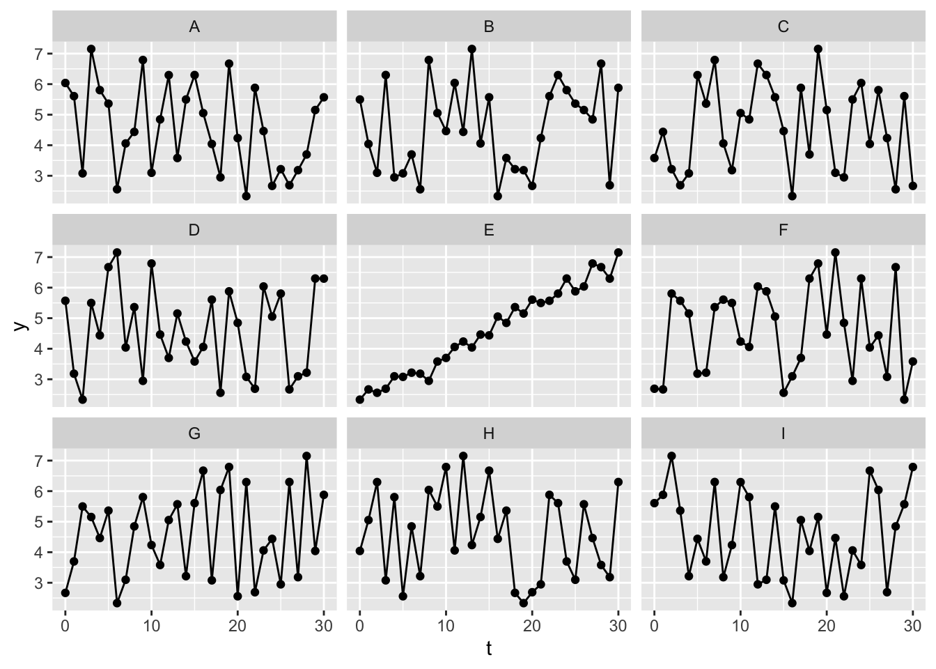
One way of demonstrating this is with a statistical identity parade.
Here are nine versions of the undifferenced data, eight of which have been randomly shuffled. Can you tell which is the original, unshuffled data?
Here it seems fairly obvious which dataset is the original, unshuffled version of the data, again illustrating that the original time series are not IID, and not a stationary series.
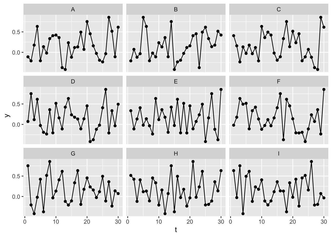
By contrast, let’s repeat the same exercise with the differenced data:
Here it’s much less obvious which of the series is the original series, rather than a permuted/shuffled version of the same series. This should give some reassurance that, after differencing, the data are now IID.
Why is integration called integration not differencing?
In the above we have performed what in time series parlance would be called an I(1) operation, differencing the data once. But why is this referred to as integration, when we’re doing the opposite?
Well, when it comes to transforming the time series data into something with IID properties, we are differentiating rather than integrating. But the flip side of this is that, if using model outputs based on differenced data for forecasting, we have to sum up (i.e. integrate) the values we generate in the order in which we generate them. So, the model works on the differenced data, but model forecasts work by integrating the random variables generated by the model working on the differenced data.
Let’s explore what this means in practice. Let’s generate 10 new values from a model calibrated on the mean and standard deviation of the differenced data:
Code
new_draws <-rnorm(10, mean =mean(d_df$y, na.rm =TRUE),sd =sd(d_df$y, na.rm =TRUE))new_draws
So we can see that the forecast sequence of values looks quite similar to the differenced observations before it.
In order to use this for forecasting values, rather than differences, we therefore have to take the last observed value, and keep adding the consecutive forecast values.
So, after integrating (accumulating or summing up) the modelled differenced values, we now see the forecast values continuing the upwards trend observed in the original data.
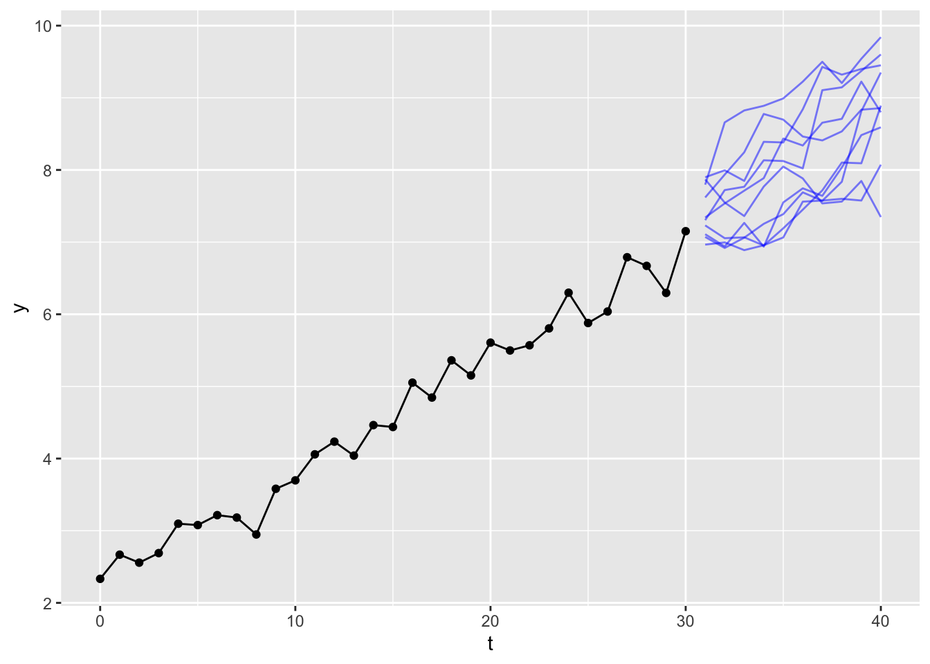
Of course, there’s nothing special about the specific sequence of draws generated from the model. We could run the same exercise multiple times and each time get a different sequence of model draws, and so a different forecast path. Let’s see ten draws, for example:
This gives a sense of the kinds of upwards-drifting walks are compatible with the amount of variation observed in the original data series. If we ran the experiment another 10 times, we would get another ten paths.
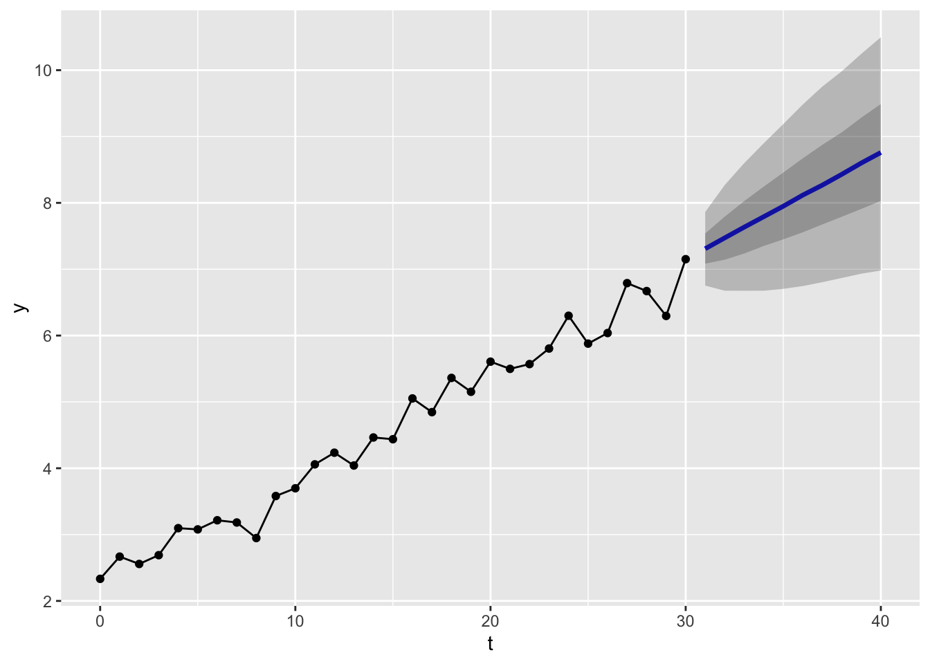
In fact, we could generate a much larger number of simulations, say 10,000, and then report the range of values within which (say) 50% or 90% of the values for each time period are contained:
These produce the kinds of ‘fans of uncertainty’ we might be used to seeing from a time series forecast. Because of the large numbers of simulations run, the shape of the fans appear quite smooth, and close to the likely analytical solution.
Summing up
In this post we’ve explored the second of the three main tools in the most common time series analytical toolkit: Integration. We’ve differenced our data once, which in time series parlance is represented by the shorthand d=1. Then we’ve integrated estimates we’ve produced from a model after differencing to represent random paths projecting forward from the observed data into a more uncertain future. Doing this multiple times has allowed us to represent uncertainty about these projections, and the ways that uncertainty increases the further we move from the observed data.
The Moving Average Model in context of ARIMA
As with the post on autoregression, it’s worth returning to what I’ve been calling The Mother Model (a general way of thinking about statistical models), and how AR and I relate to it:
Stochastic Component
\[
Y_i \sim f(\theta_i, \alpha)
\]
Systematic Component
\[
\theta_i = g(X_i, \beta)
\]
To which we might also imagine adding a transformation or preprocessing step, \(h(.)\) on the dataset \(D\)
\[
Z = h(D)
\]
The process of differencing the data is the transformation step employed most commonly in time series modelling. This changes the types of values that go into both the data input slot of the mother model, \(X\), and the output slot of the mother model, \(Y\). The type of data transformer, however, is deterministic, hence the use of the \(=\) symbol. This means an inverse transform function, \(h^{-1}(.)\) can be applied to the transformed data to convert it back to the original data:
\[
D = h^{-1}(Z)
\]
The process of integrating the differences, including a series of forecast values from the time series models, constitutes this inverse transform function in the context of time series modelling, as we saw in the previous section on integration.
Autoregression is a technique for working with either the untransformed data, \(D\), or the transformed data \(Z\), which operates on the systematic component of the mother model. For example, an AR(3) autoregressive model, working on data which have been differenced once (\(Z_t = Y_t - Y_{t-1}\)), may look as follows:
Note that these two approaches, AR and I, have involved operating on the systematic component and the preprocessing step, respectively. This gives us a clue about how the Moving Average (MA) modelling strategy is fundamentally different. Whereas AR models work on the systematic component (\(g(.)\)), MA models work on the stochastic component (\(f(.)\)). The following table summarises the distinct roles each technique plays in the general time series modelling strategy:
AR, I, and MA in the context of ‘the Mother Model’
Technique
Works on…
ARIMA letter shorthand
Integration (I)
Data Preprocessing \(h(.)\)
d
Autoregression (AR)
Systematic Component \(g(.)\)
p
Moving Average (MA)
Stochastic Component \(f(.)\)
q
In the above, I’ve spoiled the ending! The Autoregressive (AR), Integration (I), and Moving Average (MA) strategies are commonly combined into a single model framework, called ARIMA. ARIMA is a framework for specifying a family of models, rather than a single model, which differ by the amount of differencing (d), or autoregression terms (p), or moving average terms (q) which the model contains.
Although in the table above, I’ve listed integration/differencing first, as it’s the data preprocessing step, the more conventional way of specifying an ARIMA model is in the order indicated in the acronym:
AR: p
I: d
MA: q
This means ARIMA models are usually specified with a three value shorthand ARIMA(p, d, q). For example:
ARIMA(1, 1, 0): AR(1) with I(1) and MA(0)
ARIMA(0, 2, 2): AR(0) with I(2) and MA(2)
ARIMA(1, 1, 1): AR(1) with I(1) and MA(1)
Each of these models is fundamentally different. But each is a type of ARIMA model.
With this broader context, about how MA models fit into the broader ARIMA framework, let’s now look at the Moving Average model:
The sound of a Moving Average
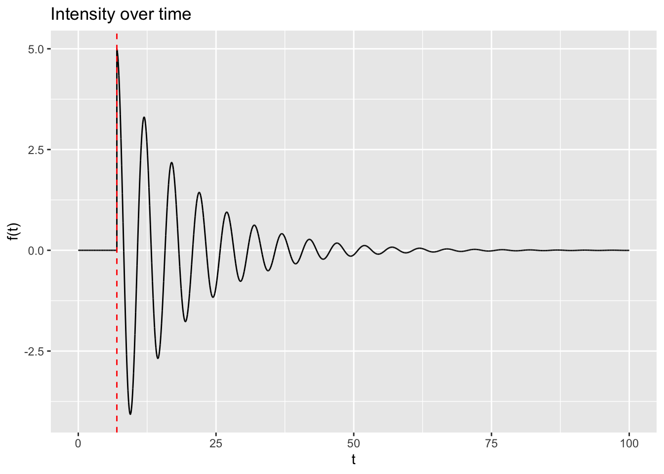
The intuition of a MA(q) model is in some ways easier to develop by starting not with the model equations, but with the following image:
Tibetan Singing Bowl
This is a Tibetan Singing Bowl, available from all good stockists (and Amazon), whose product description includes:
Ergonomic Design: The 3 inch singing bowl comes with a wooden striker and hand-sewn cushion which flawlessly fits in your hand. The portability of this bowl makes it possible to carry it everywhere you go.
Holistic Healing : Our singing bowls inherently produces a deep tone with rich quality. The resonance emanated from the bowl revitalizes and rejuvenates all the body, mind and spirit. It acts as a holistic healing tool for overall well-being.
Notwithstanding the claims about health benefits and ergonomics, the bowl is something meant to be hit by a wooden striker, and once hit makes a sound. This sound sustains over time (‘sings’), but as time goes on the intensity decays. As a sound wave, this might look something like the following:
In this figure, the red dashed line indicates when the wooden striker strikes the bowl. Before this time, the bowl makes no sound. Directly after the strike, the bowl is loudest, and over time the intensity of the sound waves emanating from the bowl decays. The striker can to some extent determine the maximum amplitude of the bowl, whereas it’s largely likely to be the properties of the bowl itself which determines how quickly or slowly the sound decays over time.
How does this relate to the Moving Average model? Well, if we look at the Interpretation section of the moving average model wikipedia page, we see the cryptic statement “The moving-average model is essentially a finite impulse response filter applied to white noise”. And if we then delve into the finite impulse response page we get the definition “a finite impulse response (FIR) filter is a filter whose impulse response (or response to any finite length input) is of finite duration, because it settles to zero in finite time”. Finally, if we go one level deeper into the wikirabbit hole, and enter the impulse response page, we get the following definition:
[The] impulse response, or impulse response function (IRF), of a dynamic system is its output when presented with a brief input signal, called an impulse.
In the singing bowl example, the striker is the impulse, and the ‘singing’ of the bowl is its response.
The moving average equation
Now, finally, let’s look at the general equation for a moving average model:
Here is something like the fundamental value or quality of the time series system. For the singing bowl, \(\mu = 0\), but it can take any value. \(\epsilon_t\) is intended to capture something like a ‘shock’ or impulse now which would cause its manifested value to differ from its fundamental, \(\epsilon_{t-1}\) a ‘shock’ or impulse one time unit ago, and \(\epsilon_{t-2}\) a ‘shock’ or impulse two time units ago.
The values \(\theta_i\) are similar to the way the intensity of the singing bowl’s sound decays over time. They are intended to represent how much influence past ‘shocks’, from various recent points in history, have on the present value manifested. Larger values of \(\theta\) indicate past ‘shocks’ that have larger influence on the present value, and smaller \(\theta\) values less influence.
Autoregression and moving average: the long and the short of it
Autoregressive and moving average models are intended to be complementary in their function in describing a time series system: whereas Autoregressive models allow for long term influence of history, which can change the fundamentals of the system, Moving Average models are intended to represent transient, short term disturbances to the system. For an AR model, the system evolves in response to its past states, and so to itself. For a MA model, the system, fundamentally, never changes. It’s just constantly being ‘shocked’ by external events.
Concluding remarks
So, that’s the basic intuition and idea of the Moving Average model. A system fundamentally never changes, but external things keep ‘happening’ to it, meaning it’s almost always different to its true, fundamental value. A boat at sea will fundamentally have a height of sea level. But locally sea level is always changing, waves from every direction, and various intensities, buffetting the boat up and down - above and below the fundamental sea level average at every moment.
And the ‘sound’ of a moving average model is almost invariably likely to be less sonorous than that of a singing bowl. Instead of a neat sine wave, each shock is a random draw from a noisemaker (typically the Normal distribution). In this sense a more accurate analogy might not be a singing bowl, but a guitar amplifier, with a constant hum, but also with dodgy connections, constantly getting moved and adjusted, with each adjustment causing a short belt of white noise to be emanated from the speaker. A moving average model is noise layered upon noise.
Full ARIMA Examples
The last three sections have covered three of the main techniques - autoregression, integration, and moving average modelling - which combine to form the ARIMA model framework for time series analysis.
We’ll now look at an example (or maybe two) showing how ARIMA models - including AR, I, and MA components - are fit and employed in practice.
Setup
For this post I’ll make use of R’s forecast package.
Code
library(tidyverse)library(forecast)
Dataset used: Airmiles
The dataset I’m going to use is airmiles, an example dataset from the datasets package, which is included in most R sessions by default
The first thing we notice with this dataset is that it is not in the kind of tabular format we may be used to. Let’s see what class the dataset is:
Code
class(airmiles)
[1] "ts"
The dataset is of class ts, which stands for time series. A ts data object is basically a numeric vector with various additional pieces of metadata attached. We can see these metadata fields are start date, end date, and frequency. The documentation for ts indicates that if frequency is 1, then the data are annual. As the series are at fixed intervals, with the start date and frequency specified, along with the length of the numeric vector, the time period associated with each value in the series can be inferred.6
Visual inspection of airmiles
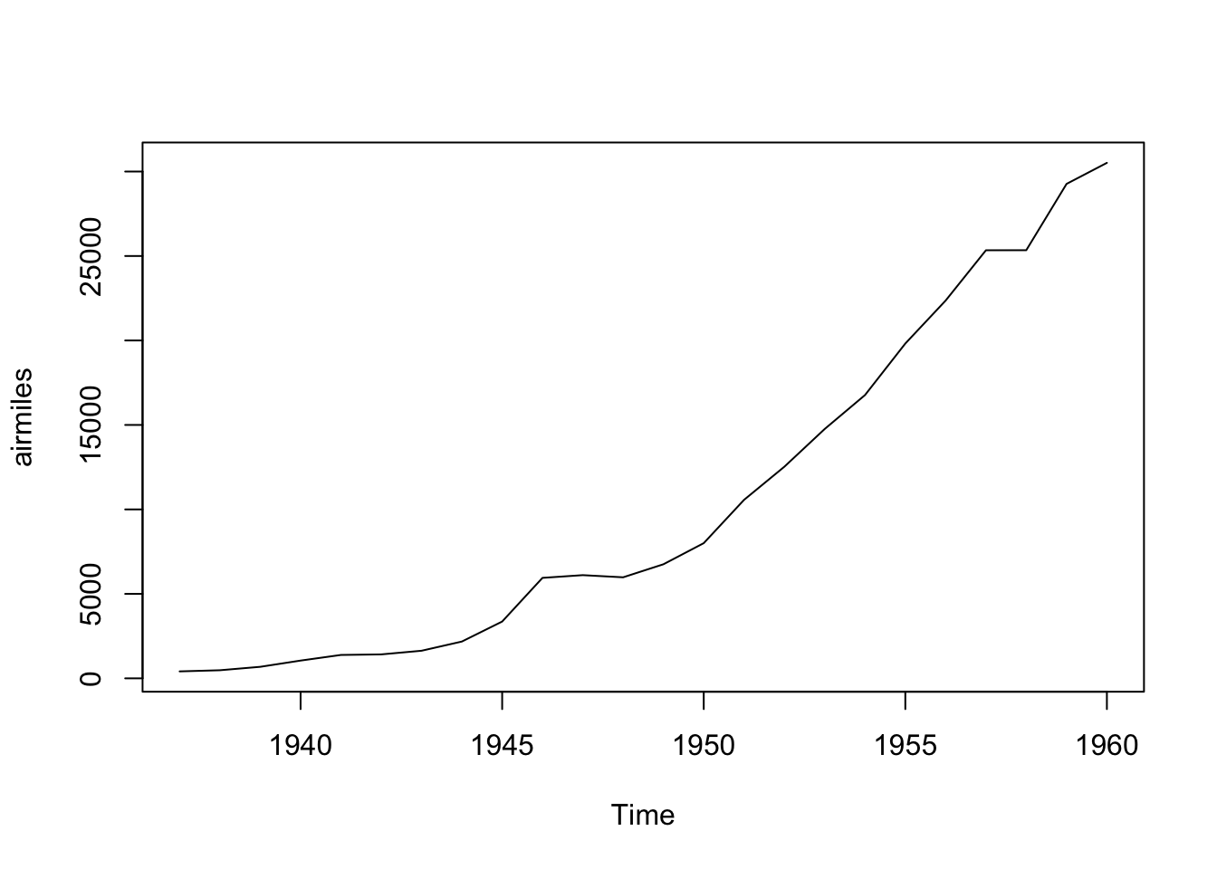
We can look at the data using the base graphics plot function:
Code
plot(airmiles)
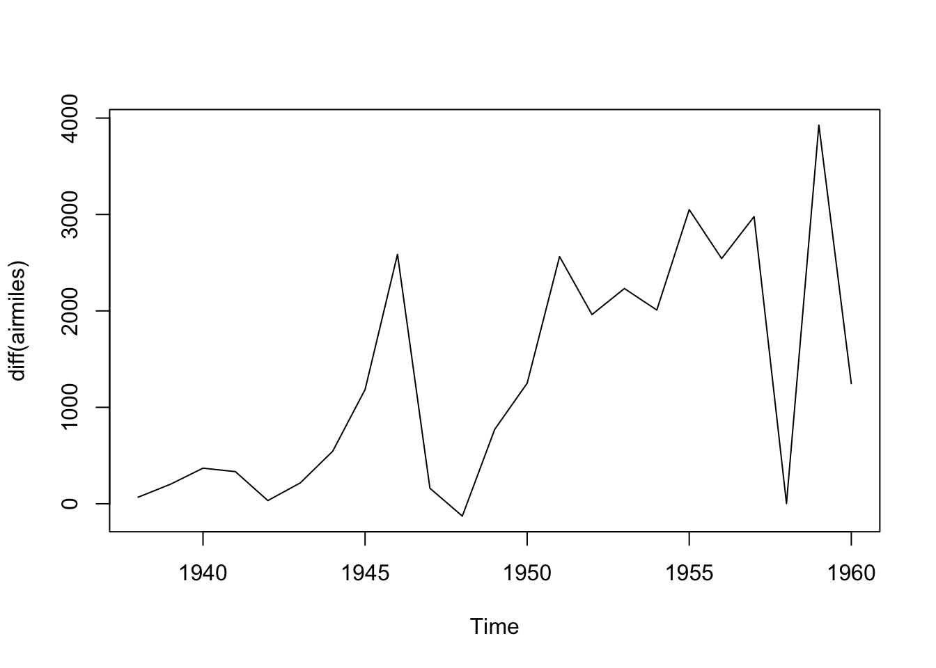
We can see this dataset is far from stationary, being much higher towards the end of the series than at the start. This implies we should consider differencing the data to make it stationery. We can use the diff() function for this:
Code
plot(diff(airmiles))
This differenced series still doesn’t look like IID data. Remember that differencing is just one of many kinds of transformation (data pre-processing) we could consider. Also we can difference more than once.
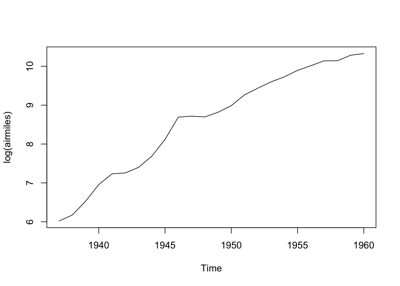
As there cannot be negative airmiles, and the series looks exponential since the start of the series, we can can consider using a log transform:
Code
plot(log(airmiles))
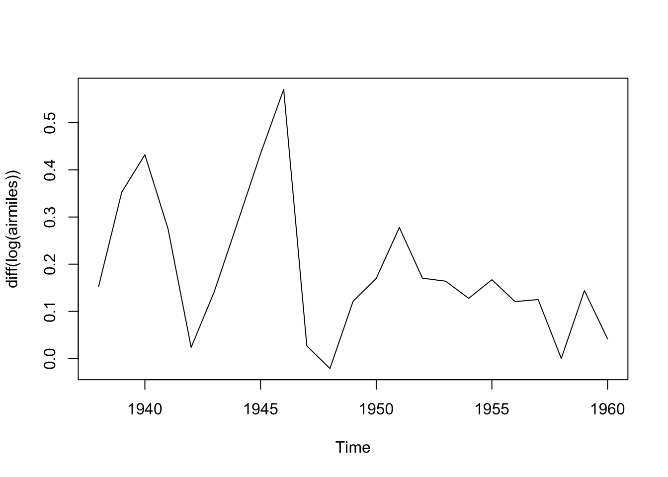
Here the data look closer to a straight line. Differencing the data now should help us get to something closer to stationary:
Code
plot(diff(log(airmiles)))
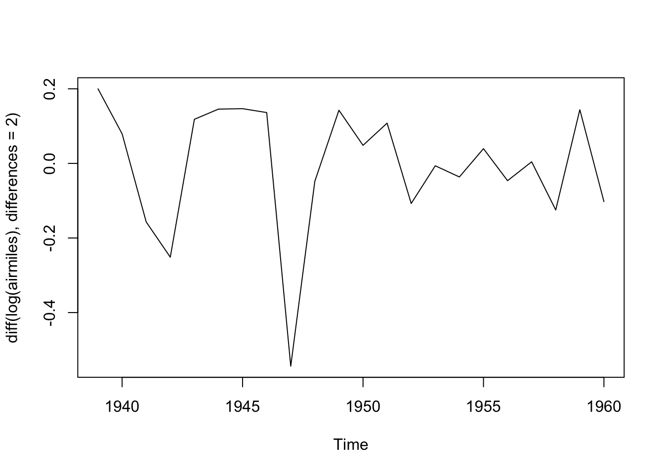
Maybe we should also look at differencing the data twice:
Code
plot(diff(log(airmiles), differences =2))
Maybe this is closer to the kind of stationary series that ARIMA works best with?
ARIMA fitting for airmiles
The visual inspection above suggested the dataset definitely needs at least one differencing term applied to it, and might need two; and might also benefit from being pre-transformed by being logged. With the forecast package, we can pass the series to the auto.arima() function, which will use an algorithm to attempt to identify the best combination of p, d and q terms to use. We can start by asking auto.arima() to determine the best ARIMA specification if the only transformation allowed is that of differencing the data, setting the trace argument to TRUE to learn more about which model specifications the algorithm has considered:
Series: airmiles
ARIMA(0,2,1)

Coefficients:
          ma1
      -0.7031
s.e.   0.1273

sigma^2 = 1234546:  log likelihood = -185.33
AIC=374.67   AICc=375.3   BIC=376.85

Training set error measures:
                   ME    RMSE      MAE      MPE     MAPE      MASE       ACF1
Training set 268.7263 1039.34 758.5374 4.777142 10.02628 0.5746874 -0.2848601
We can see from the trace that a range of ARIMA specifications were considered, starting with the ARIMA(2,2,2). The selection algorithm used is detailed here, and employs a variation of AIC, called ‘corrected AIC’ or AICc, in order to compare the model specifications.
The algorithm arrives at ARIMA(0, 2, 1) as the preferred specification. That is: no autorgression (p=0), twice differenced (d=2), and with one moving average term (MA=1).
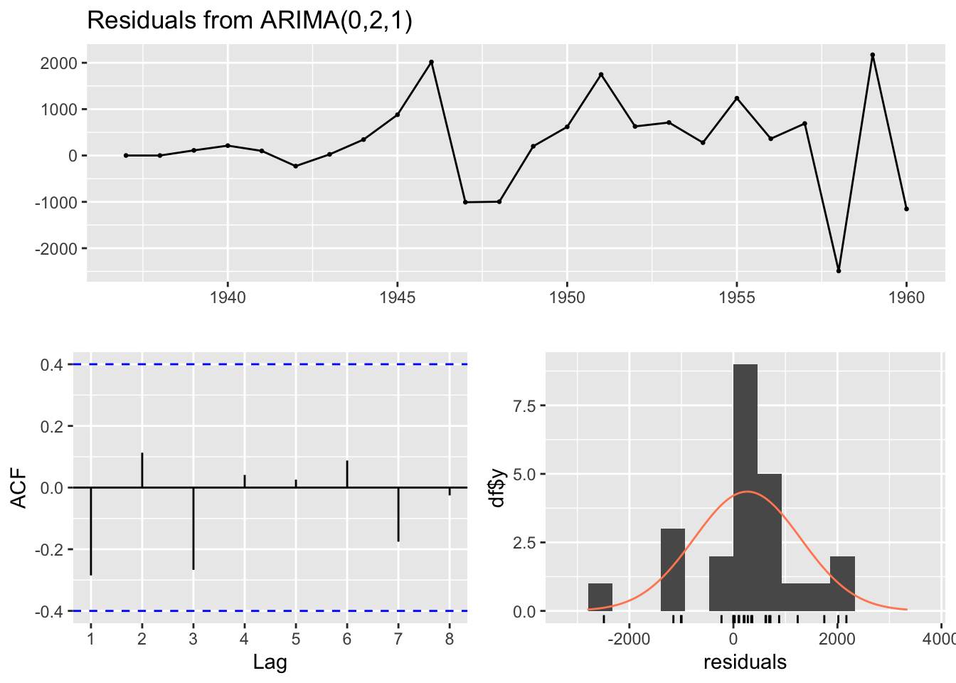
The Forecasting book linked to above also has a recommended modelling procedure for ARIMA specifications, and cautions that the auto.arima() function only performs part of this proceudure. In particular, it recommends looking at the residuals
Code
checkresiduals(best_arima_nolambda)
    Ljung-Box test

data:  Residuals from ARIMA(0,2,1)
Q* = 4.7529, df = 4, p-value = 0.3136

Model df: 1.   Total lags used: 5
The three plots show the model residuals as a function of time (top), the distribution of residuals (bottom right), and the auto-correlation function, ACF (bottom-left), which indicates how the errors at different lags are correlated with each other. It also returns a test score, where high P-values (substantially above 0.05) should be considered evidence that the residuals appear like white noise, and so (something like) no further substantial systematic information in the data exists to be represented in the model.
In this case, the test statistic p-value is 0.31, which should be reassuring as to the appropriateness of the model specification identified.
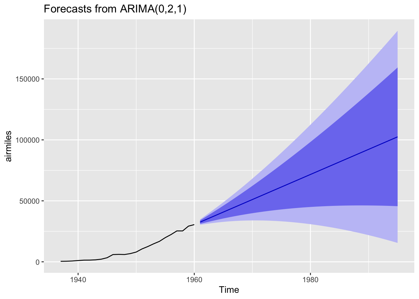
Finally, we can use this model to forecast a given number of periods ahead. Let’s take this data to the 1990s, even though this is a dangerously long projection.
Code
best_arima_nolambda |>forecast(h=35) |>autoplot()
The central projection (dark blue line) is almost linear, but the projection intervals are wide and growing, and include projection scenarios where the number of flights in the 1990s are somewhat lower than those in the 1960s. These wide intervals should be considered a feature rather than a bug with the approach, as the further into the future we project, the more uncertain we should become.
ARIMA modelling with an additional transformation.
Another option to consider within the auto.arima() function is to allow another parameter to be estimated. This is known as the lambda parameter and represents an additional possible transformation of the data before the differencing step. This lambda parameter is used as part of a Box-Cox Transformation, intended to stabilise the variance of the series. If the lambda parameter is 0, then this becomes equivalent to logging the data. We can allow auto.arima to select a Box-Cox Transformation by setting the parameter lambda = "auto"
 ARIMA(2,1,2) with drift         : Inf
 ARIMA(0,1,0) with drift         : 190.0459
 ARIMA(1,1,0) with drift         : 192.1875
 ARIMA(0,1,1) with drift         : 192.1483
 ARIMA(0,1,0)                    : 212.0759
 ARIMA(1,1,1) with drift         : 195.1062

 Best model: ARIMA(0,1,0) with drift
Code
summary(best_arima_lambda)
Series: airmiles
ARIMA(0,1,0) with drift
Box Cox transformation: lambda= 0.5375432

Coefficients:
        drift
      18.7614
s.e.   2.8427

sigma^2 = 194.3:  log likelihood = -92.72
AIC=189.45   AICc=190.05   BIC=191.72

Training set error measures:
                   ME     RMSE      MAE       MPE     MAPE      MASE      ACF1
Training set 123.1317 934.6956 724.6794 -5.484572 12.91378 0.5490357 -0.169863
In this case, a lambda value of about 0.54 has been identified, and a different ARIMA model specification selected. This specification is listed as ARIMA(0,1,0) with drift. This with drift term means the series are recognised as non-stationary, but where (after transformation) there is an average (in this case) constant amount upwards drift in the values as we progress through the series. 7 Let’s check the residuals for this model:
Code
checkresiduals(best_arima_lambda)
    Ljung-Box test

data:  Residuals from ARIMA(0,1,0) with drift
Q* = 3.9064, df = 5, p-value = 0.563

Model df: 0.   Total lags used: 5
The test P-value is even higher in this case, suggesting the remaining residuals appear to behave even more like white noise than in the previous specification.
Now to look at projections from the model into the 1990s:
Code
best_arima_lambda |>forecast(h=35) |>autoplot()
Using this specification we get a qualitatively different long-term projection with, on the identity scale of the data itself, a much narrower long-term projection interval.
Comparing model specifications
So, the two different ARIMA specifications arrived at - one with additional pre-transformation of the data before differencing; the other without - lead to qualitatively different long-term projections. Do we have any reason to presume one specification is better than the other?
I guess we could look at the AIC and BIC of the two models:
Here the lower scores for the model with a Box-Cox transformation suggest it should be preferred. However, as both functions warn, the number of observations differ between the two specifications. This is likely because the no-lambda version differences the data twice, whereas the with-lambda specification differences the data once, and so the no-lambda version should have one fewer observation. Let’s check this:
Code
n_obs_nolambda <-summary(best_arima_nolambda)$nobsn_obs_lambda <-summary(best_arima_lambda)$nobsprint(paste("Observations for no lambda:", n_obs_nolambda))
[1] "Observations for no lambda: 22"
Code
print(paste("Observations for with-lambda:", n_obs_lambda))
[1] "Observations for with-lambda: 23"
Yes. This seems to be the cause of the difference.
Another way of comparing the models is by using the accuracy() function, which reports a range of accuracy measures:
Code
print("No lambda specification: ")
[1] "No lambda specification: "
Code
accuracy(best_arima_nolambda)
                   ME    RMSE      MAE      MPE     MAPE      MASE       ACF1
Training set 268.7263 1039.34 758.5374 4.777142 10.02628 0.5746874 -0.2848601
Code
print("With-lambda specification: ")
[1] "With-lambda specification: "
Code
accuracy(best_arima_lambda)
                   ME     RMSE      MAE       MPE     MAPE      MASE      ACF1
Training set 123.1317 934.6956 724.6794 -5.484572 12.91378 0.5490357 -0.169863
What’s returned by accuracy() comprises one row (labelled Training set) and seven columns, each for a different accuracy metric. A common (and relatively easy-to-understand) accuracy measure is RMSE, which stands for (square) root mean squared error. According to this measure, the Box-Cox transformed ARIMA model outperforms the untransformed (by double-differenced) ARIMA model, so perhaps it should be preferred.
However, as the act of transforming the data in effect changes (by design) the units of the data, perhaps RMSE is not appropriate to use for comparison. Instead, there is a measure called MAPE, which stands for “mean absolute percentage error”, that might be more appropriate to use because of the differences in scales. According to this measure, the Box-Cox transformed specification has a higher error score than the no-lambda specification (around 13% instead of around 10%), suggesting instead the no-lambda specification should be preferred instead.
So what to do? Once again, the ‘solution’ is probably just to employ some degree of informed subjective judgement, along with a lot of epistemic humility. The measures above can help inform our modelling decisions, but they cannot make these decisions for us.
Discussion and coming up
For the first three posts in this time-series miniseries, we looked mainly at the theory of the three components of the ARIMA time series modelling approach. This is the first approach where we’ve used ARIMA in practice. Hopefully you got a sense of two different things:
That because of packages like forecast, getting R to produce and forecast from an ARIMA model is relatively quick and straightforward to do in practice.
That even in this brief applied example of applied time series, we started to learn about a range of concepts - such as the auto-correlation function (ACF), the Box-Cox transformation, and alternative measures of accuracy - which were not mentioned in the previous three posts on ARIMA.
Indeed, if you review the main book associated with the forecasting package, you can see that ARIMA comprises just a small part of the overall time series toolkit. There’s a lot more that can be covered, including some methods that are simpler to ARIMA, some methods (in particular SARIMA) which are further extensions of ARIMA, some methods that are alternatives to ARIMA, and some methods that are decidedly more complicated than ARIMA. By focusing on the theory of ARIMA in the last three posts, I’ve aimed to cover something in the middle-ground of the overall toolbox.
Seasonal Time Series
In previous posts on time series, we decomposed then applied a common general purpose modelling strategy for working with time series data called ARIMA. ARIMA model can involve autoregressive components (AR(p)), integration/differencing components I(d), and moving average components (MA(q)). As we saw, the time series data can also be pre-transformed, in ways other than just differencing; the example of this we saw was the application of the Box-Cox transformation for regularising the variance of the outcome, and includes logging of values as one possible transformation within the framework.
The data we used previous was annual data, showing the numbers of airmiles travelled in the USA by year up to the 1960s. Of course, however, many types of time series data are sub-annual, reported not just by year, but by quarter, or month, or day as well. Data disaggregated into sub-annual units often exhibit seasonal variation, patterns that repeat themselves at regular intervals within a 12 month cycle. 8
In this post we will look at some seasonal data, and consider two strategies for working with this data: STL decomposition; and Seasonal ARIMA (SARIMA).
An example dataset
Let’s continue to use the examples and convenience functions from the forecast package used in the previous post, and for which the excellent book Forecasting: Principles and Practice is available freely online.
# Using this example dataset: https://otexts.com/fpp3/components.htmldata(us_employment)us_retail_employment <- us_employment |>filter(Title =="Retail Trade")us_retail_employment
# A tsibble: 969 x 4 [1M]
# Key:       Series_ID [1]
      Month Series_ID     Title        Employed
      <mth> <chr>         <chr>           <dbl>
 1 1939 Jan CEU4200000001 Retail Trade    3009
 2 1939 Feb CEU4200000001 Retail Trade    3002.
 3 1939 Mar CEU4200000001 Retail Trade    3052.
 4 1939 Apr CEU4200000001 Retail Trade    3098.
 5 1939 May CEU4200000001 Retail Trade    3123
 6 1939 Jun CEU4200000001 Retail Trade    3141.
 7 1939 Jul CEU4200000001 Retail Trade    3100
 8 1939 Aug CEU4200000001 Retail Trade    3092.
 9 1939 Sep CEU4200000001 Retail Trade    3191.
10 1939 Oct CEU4200000001 Retail Trade    3242.
# ℹ 959 more rows
There are two differences we can see with this dataset compared with previous time series data we’ve looked at.
Firstly, the data looks like a data.frame object, or more specifically a tibble() (due to the additional metadata at the top). In fact they are of a special type of tibble called a tsibble, which is basically a modified version of a tibble optimised to work with time series data. We can check this by interrogating the class attributes of us_employment:
Code
class(us_retail_employment)
[1] "tbl_ts" "tbl_df" "tbl" "data.frame"
These class attributes go broadly from the most specific type of object class: tbl_ts (the tsibble); to the most general type of object class: the data.frame.
Secondly, we can see that the data are disaggregated not by year as in the last post’s example, but also by month. So, what does this monthly data actually look like?
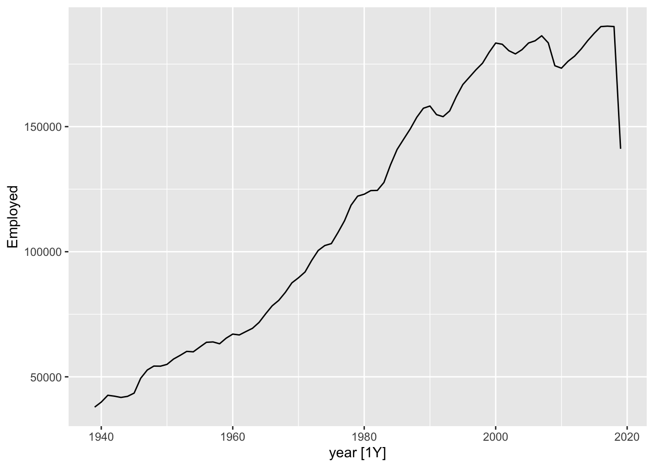
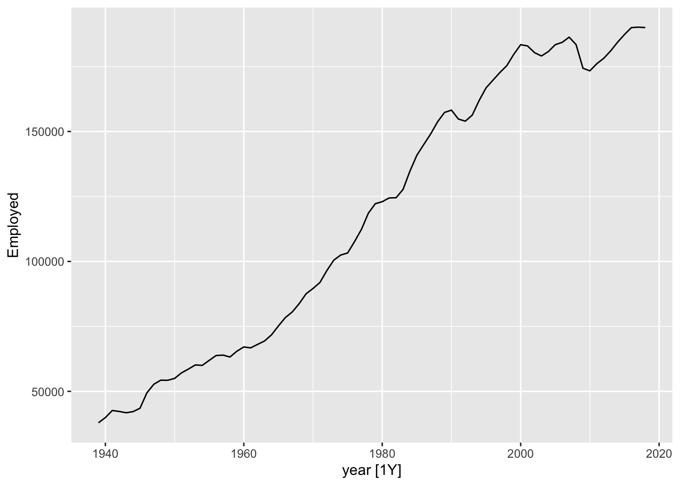
Code
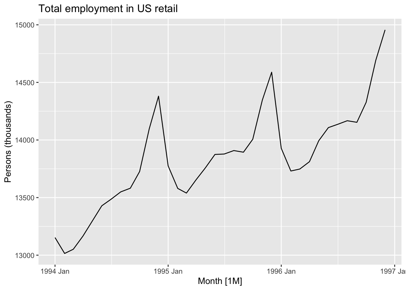
autoplot(us_retail_employment, Employed) +labs(y ="Persons (thousands)",title ="Total employment in US retail")
This data looks… spikey. There’s clearly both a long-term trend - including periods of faster and slower growth, and occasionally some falls - but there’s also what looks like a series of near-vertical spikes along this trend, at what may be regular intervals. What happens if we zoom into a smaller part of the time series?
Code
autoplot( us_retail_employment |>filter(year(Month) >=1990), Employed) +labs(y ="Persons (thousands)",title ="Total employment in US retail")
Here we can start to see there’s not just a single repeating ‘vertical spike’, but a pattern that appears to repeat within each year, for each year. Let’s zoom in even further, for just three years:
Code
autoplot( us_retail_employment |>filter(between(year(Month), 1994, 1996)), Employed) +labs(y ="Persons (thousands)",title ="Total employment in US retail")
Although each of these three years is different in terms of the average number of persons employed in retail, they are similar in terms of having a spike in employment towards the end of the year, then a drop off at the start of the year, then a relative plateau for the middle of the year.
This is an example of a seasonal pattern, information that gets revealed about a time series when we use a sub-annual resolution that might not be apparent it we used only annual data. How do we handle this kind of data?
Approach one: reannualise
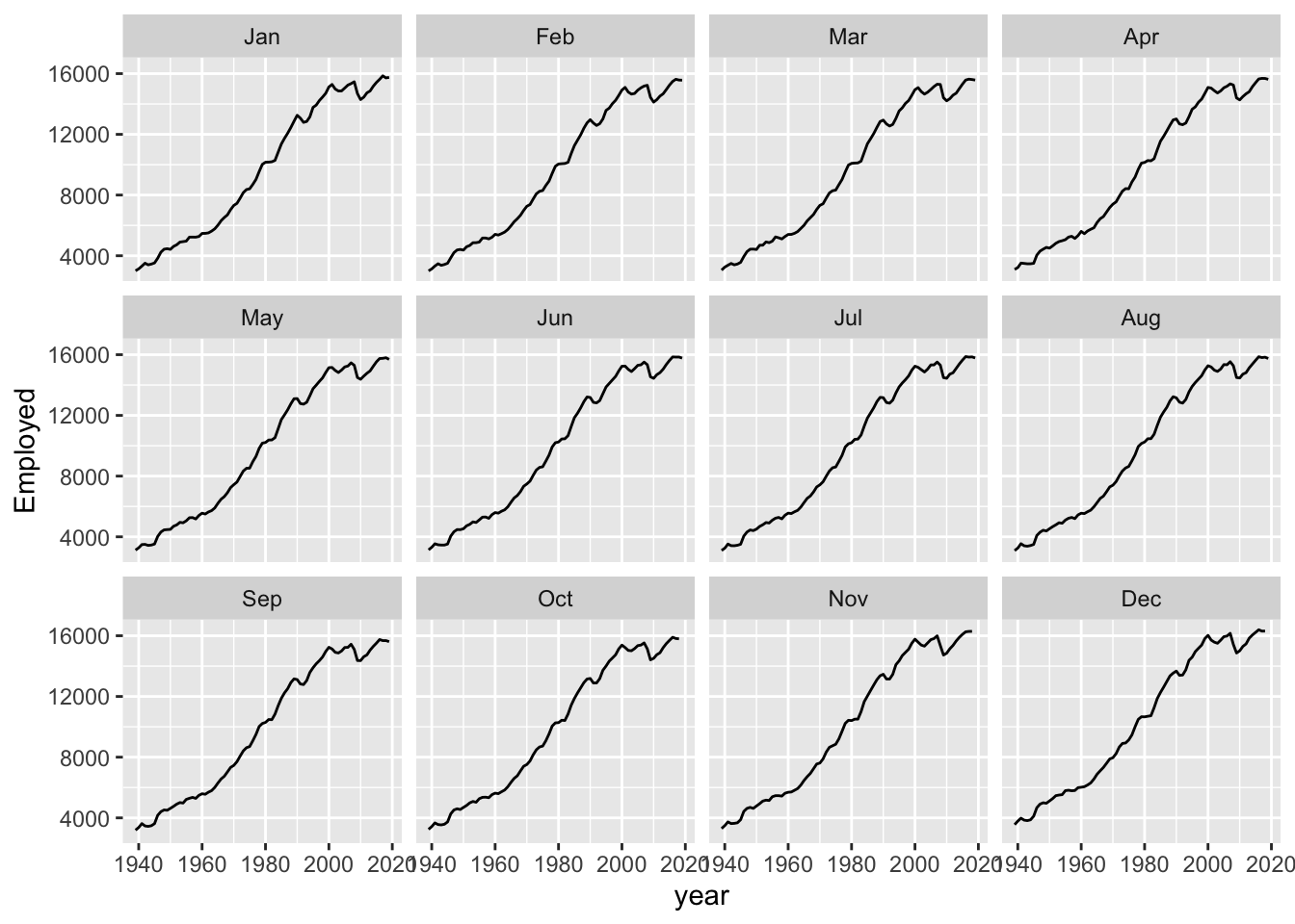
Of course we could simply reaggregate the data to an annual series:
One thing we can notice with this is that there appears to be a big drop in total employment for the last year. This is likely because the last year is incomplete, so whereas previous years are summing up 12 months’ observations, for the last year a smaller number of months are being summed up. We could then drop the last year:
But then we are losing some data that we really have. Even if we don’t have the full year, we might be able to get a sense from just the first few months worth of data whether the overall values for the last year are likely to be up or down compared to the same month in the previous years. We could even turn this single annual time series into 12 separate series: comparing Januaries with Januaries, Februaries with Februaries, and so on.
Here we can see that comparing annual month-by-month shows a very similar trend overall. It’s as if each month’s values could be thought of as part of an annual ‘signal’ (an underlying long-term trend) plus a seasonal adjustment up or down: compared with the annual trend, Novembers and Decembers are likely to be high, and Januaries and Februaries to be low; and so on.
It’s this intuition - That we have a trend component, and a seasonal component - which leads us to our second strategy: decomposition.
Approach Two: Seasonal Composition
The basic intuition of decomposition is to break sub-annual data into a series of parts: The underling long term trend component; and repeating (usually) annual seasonal component.
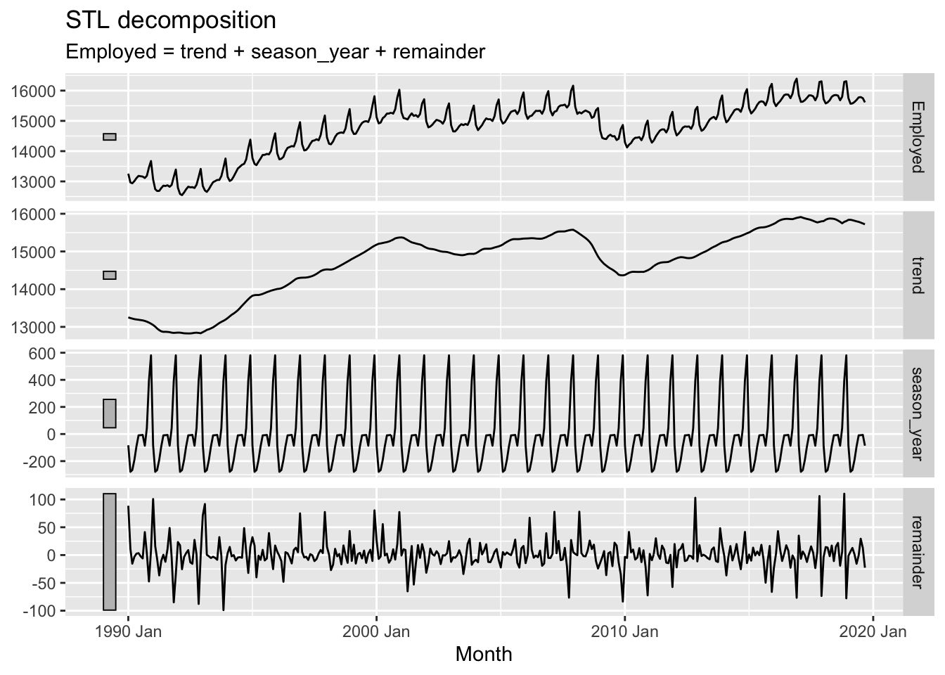
A common method for performing this kind of decomposition is known as STL. This actually stands for Seasonal and Trend Decomposition using Loess (Where Loess is itself another acronym). However it’s heuristically easier to imagine it stands for Season-Trend-Leftover, as it tends to generate three outputs from a single time-series input that correspond to these three components. Let’s regenerate the example in the forecasting book and then consider the outputs further:
The plotted output contain four rows. These are, respectively:
Top Row: The input data from the dataset
Second Row: The trend component from STL decomposition
Third Row: The seasonal component from the STL decomposition
Bottom Row: The remainder (or leftover) component from the STL decomposition.
So, what’s going on?
STL uses an algorithm to find a repeated sequence (the seasonal component) in the data that, once subtracted from a long term trend, leaves a remainder (set of errors or deviations from observations) that is minimised in some way, and ideally random like white noise.
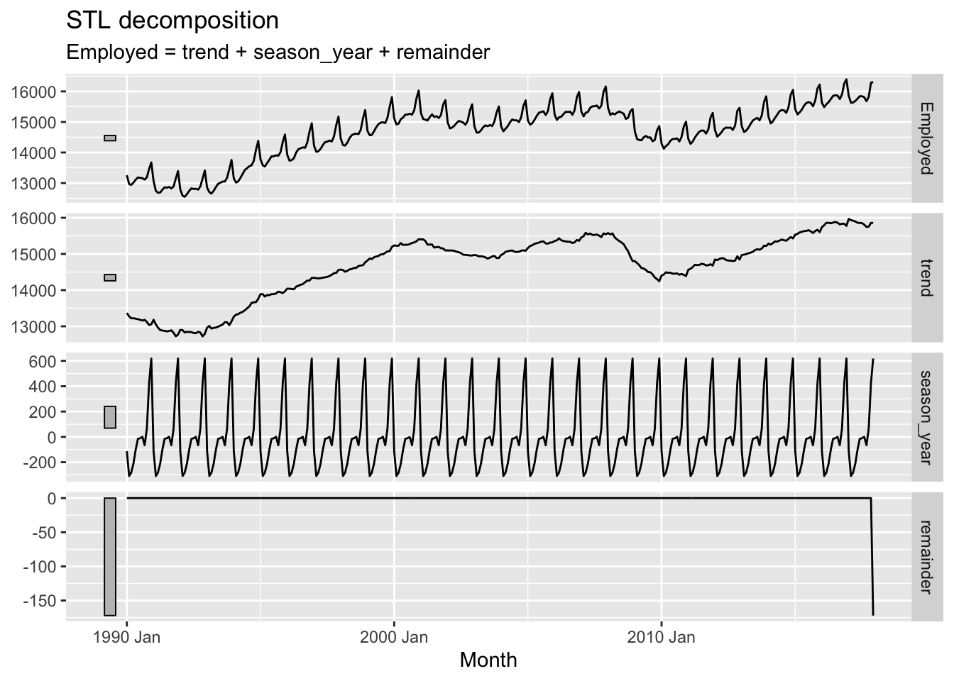
If you expanded the code chunk above, you will see two parameters as part of the STL model: the window argument for a trend() function; and the window argument for a season() function. This implies there are ways of setting up STL differently, and these would produce different output components. What happens if we change the window argument to 1 (which I think is its smallest allowable value)?
Here the trend component becomes, for want of a better term, ‘wigglier’. And the remainder term, except for a strange data artefact at the end, appears much smaller. So what does the window argument do?
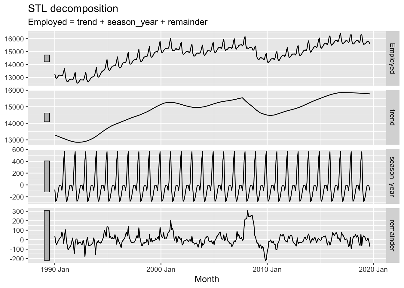
Conceptually, what the window argument to trend() does is adjust the stiffness of the curve that the trendline uses to fit to the data. A longer window, indicated by a higher argument value, makes the curve stiffer, and a shorter window, indicated by a lower argument value, makes the curve less stiff. We’ve adjusted from the default window length of 7 to a much shorter length of 1, making it much less stiff.9 Let’s look at the effect of increasing the window length instead:
Here we can see that, as well as the trend term being somewhat smoother than when a size 7 window length was used, the remainder term, though looking quite noisy, doesn’t really look random anymore. In particular, there seems to be a fairly big jump in the remainder component in the late 2000s. The remainder series also does not particularly stationary, lurching up and down at particular points in the series.
In effect, the higher stiffness of the trend component means it is not able to capture and represent enough signal in the data, and so some of that ‘signal’ is still present in the remainder term, when it should be extracted instead.
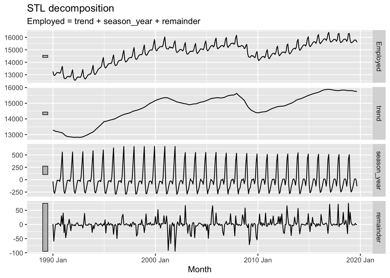
Now what happens if we adjust the window argument in the season() function instead?
In the above I’ve reduced the season window size (by default it’s infinite). Whereas before this seasonal pattern was forced to be constant for the whole time period, this time we an see that it changes, or ‘evolves’, over the course of the time series. We can also see that the remainder component, though looking quite random, now looks especially ‘spiky’, suggesting that the kinds of residuals left are somewhat further from Guassian white noise than in the first example.
Section concluding thoughts
STL decomposition is one of a number of strategies for decomposition available to us. Other examples are described here. However the aims and principles of decomposition are somewhat similar no matter what approach is used.
Having performed a decomposition on time series data, we could potentially apply something like an ARIMA model to the trend component of the data alone for purposes of projection. If using a constant seasonal component, we could then add this component onto forecast values from the trend component, along with noise consistent with the properties of the remainder component. However, there is a variant of the ARIMA model specification that can work with this kind of seasonal data directly. Let’s look at that now
Approach Three: SARIMA
SARIMA stands for ‘Seasonal ARIMA’ (where of course ARIMA stands for Autoregressive-Integrated-Moving Average). Whereas an ARIMA model has a specification shorthand ARIMA(p, d, q), a SARIMA model has an extended specification: SARIMA(p, d, q) (P, D, Q)_S. This means that whereas ARIMA has three parameters to specify, a SARIMA model has seven. This might appear like a big jump in model complexity, but the gap from ARIMA to SARIMA is smaller than it first appears.
To see this it’s first noticing that, as well as terms p, d and q, there are also terms P, D and Q. This would suggest that whatever Autoregressive (p), integration (d) and moving average (q) processes are involved in standard ARIMA are also involved in another capacity in SARIMA. And what’s this other capacity? The clue to this is in the S term.
S10 stands for the seasonal component of the model, and specifies the number of observations that are expected to include a repeating seasonal cycle. As most seasonal cycles are annual, this means S will be 12 if the data are monthly, 4 if the data are quarterly, and so on.
The UPPERCASE P, D and Q terms then specify which standard ARIMA processes should be modelled as occurring every S steps in the data series. Although algebraically this means SARIMA models may look a lot more complicated than standard ARIMA models, it’s really the same process, and the same intuition, applied twice: to characterising the seasonal ‘signals’ in the time series, and to characteristing the non-seasonal ‘signals’ in the time series.
Although there are important diagnostic charts and heuristics to use when determining and judging which SARIMA specification may be most appropriate for modelling seasonal data, such as the PACF and ACF, we can still use the auto.arima() function to see if the best SARIMA specification can be identified algorithmically:
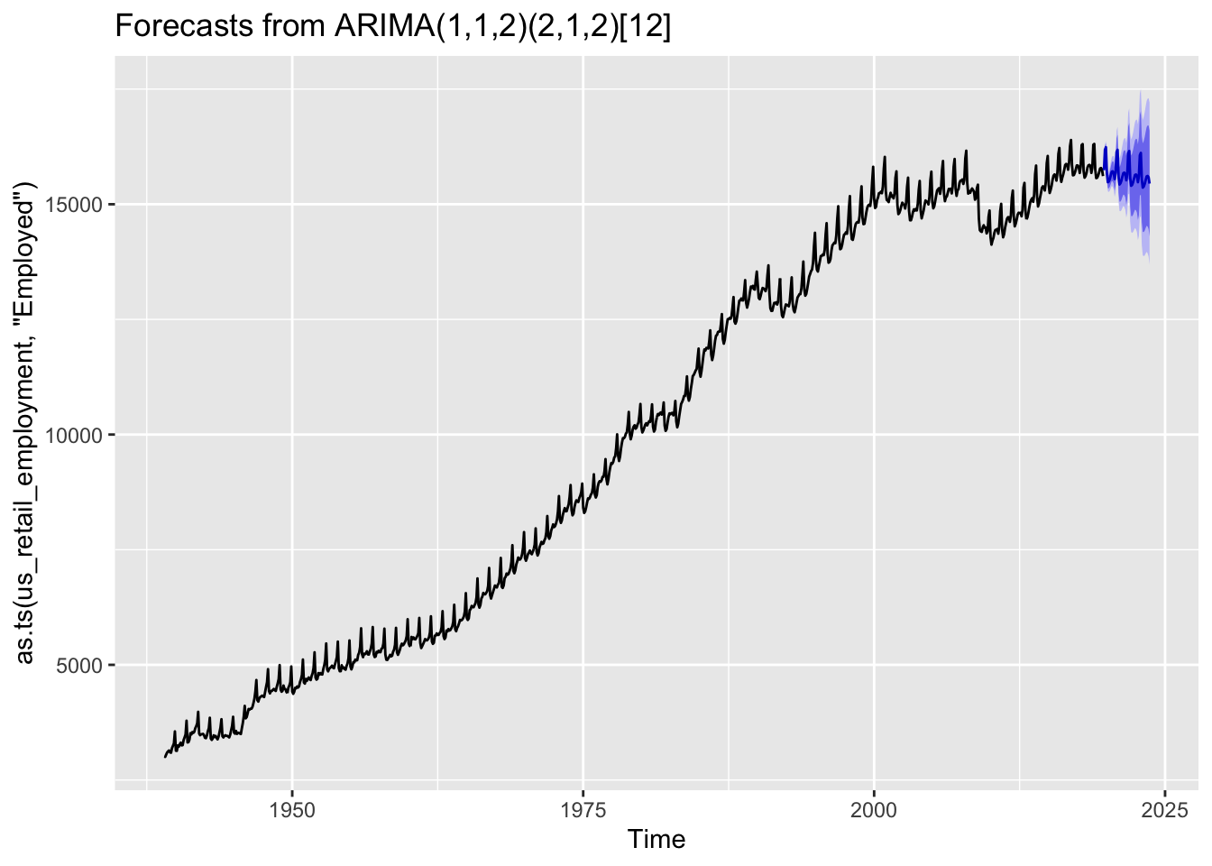
Here auto.arima() produced an ARIMA(1, 1, 2) (2, 1, 2)_12 specification, meaning p=1, d=1, q=2 for the non-seasonal part; and P=2, D=1, Q=2 for the seasonal part.
What kind of forecasts does this produce?
Code
best_sarima_model |>forecast(h=48) |>autoplot()
We can see the forecasts tend to repeat the seasonal pattern apparent throughout the observed data, and also widen in the usual way the further we move from the observed data.
Summing up
In this post we have looked at three approaches for working with seasonal data: aggregating seasonality away; decomposition; and SARIMA. These are far from an exhaustive list, but hopefully illustrate some common strategies for working with this kind of data.
Vector Autoregression (VAR)
In this post, we’ll take time series in a different direction, to show an application of multivariate regression common in time series, called vector autoregression (VAR). VAR is both simpler in some ways, and more complex in other ways, than SARIMA modelling. It’s simpler in that, as the name suggests, moving average (MA) terms tend to not be part of VAR models; we’ll also not be considering seasonality either. But it’s more complicated in the sense that we are jointly modelling two outcomes at the same time.
Model family tree
The following figure aims to show the family resemblances between model specifications and challenges:
flowchart TB
    uvm(univariate models)
    mvm(multivariate models)

    ar("AR(p)")
    i("I(d)")
    ma("MA(q)")
    arima("ARIMA(p, d, q)")
    sarima("ARIMA(p, d, q)[P, D, Q]_s")
    var(VAR)

    ar --> var
    mvm --> var

    i -.-> var

    uvm -- autoregression --> ar
    uvm -- differencing --> i
    uvm -- moving average --> ma
    ar & i & ma --> arima

    arima -- seasonality -->  sarima
So, the VAR model is an extension of the autoregressive component of a standard, univariate AR(p) specification models to multivariate models. It can also include both predictor and response variables that are differenced, hence the the dashed line from I(d) to VAR.
So what is a multivariate model?
You might have seen the term multivariate model before, and think you’re familiar with what it means.
In particular, you might have been taught that whereas a univariate regression model looks something like this:
\[
y = \beta_0 + \beta_1 x_1 + \epsilon
\]
A multivariate regression model looks more like this:
i.e. You might have been taught that, if the predictors include one term for the intercept (the \(\beta_0\) term) and one term for the slope (the \(\beta_1\) term), then this is a univariate model. But if there are two or more terms that can claim to be ‘the slope’ then this is a multivariate model.
However, this isn’t the real distinction between a univariate model and a multivariate model. To see this distinction we have to return, for the umpeenth time, to the ‘grandmother model’ specification first introduced at the start of the main course:
Stochastic Component
\[
Y \sim f(\theta, \alpha)
\]
Systematic Component
\[
\theta = g(X, \beta)
\]
Now, both the response data, \(Y\), and the predictor data, \(X\), are both taken from the same rectangular dataset, \(D\). Let’s say this dataset, \(D\), has six rows and five columns. As a matrix it would look something like this:
Here the dataset \(D\) is made up of a whole series of elements \(d_{i,j}\), where the first subset value indicates the row number \(i\) and the second subset value indicates the column number \(j\). So, for example, \(d_{5, 2}\) indicates the value of the 5th row and 2nd column, whereas \(d_{2, 5}\) indicates the value of the 2nd row and 5th column.
Fundamentally, the first challenge in building a model is deciding which columns from \(D\) we put in the predictor matrix \(X\), and which parts we put into the response matrix \(Y\). For example, if we wanted to predict the third column \(j=3\) given the fifth column \(j=5\) our predictor and response matrices would look as follows:
Where does the column of 1s come from? This is how we specify, in matrix notation, that we want an intercept term to be calculated. Models don’t have to have intercept terms, but in almost all cases we’re likely to be familiar with, they tend to.
Let’s say we now want to include two columns, 2 and 5, from \(D\) in the predictor matrix, leading to what’s commonly (and wrongly) called a ‘multivariate regression’. This means that \(Y\) stays the same, but X is now as follows:
No matter now many columns we include in the predictor matrix, X, however, we still don’t have a real multivariate regression model specification. Even if X had a hundred columns, or a thousand, it would still not be a multivariate regression in the more technical sense of the term.
Instead, here’s an example of a multivariate regression model:
This is an example of a multivariate regression model. We encountered it before when we used the multivariate normal distribution here, and when we draw from the posterior distribution of Bayesian models here, but this is the first time we’ve considered multivariate modelling in the context of trying to represent something we suspect to be true about the world, rather than our uncertainty about the world. And it’s the first example of multivariate regression we’ve encountered in this series. For every previous model, no matter how apparently disparate, complicated or exotic they may appear, they’ve been univariate regression models in the sense that the response component \(Y\) has always only contained one column only.
So, with this definition of multivariate regression, let’s now look at VAR as a particular application of multivariate regression used in time series.
Vector Autoregression
Let’s start with a semi-technical definition:
In vector autoregression (VAR) the values of two or more outcomes, \(\{Y_1(T), Y_2(T)\}\), are predicted based on previous values of those same outcomes \(\{Y_1(T-k), Y_2(T-k)\}\), for various lag periods \(k\).
Where \(Y\) has two columns, and an AR(1) specification (i.e. k is just 1), how is this different from simply running two separate AR(1) regression models, one for \(Y_1\), and the other for \(Y_2\)?
Well, graphically, two separate AR(1) models proposes the following paths of influence:
So, each of the two outcomes at time T is influenced both by its own previous value, but also by the previous value of the other outcome. This other outcome influence is what is represented in the figure above by the diagonal lines: from Y2(T-1) to Y1(T), and from Y1(T-1) to Y2(T).
Expressed verbally, if we imagine two entities - self and other - tracked through time, self is influenced both by self’s history, but also by other’s history too.
Example and application in R
In a blog post, I discussed how I suspect economic growth and longevity growth trends are correlated. What I proposed doesn’t exactly lend itself to the simplest kind of VAR(1) model specification, because I suggested a longer lag between the influence of economic growth on longevity growth, and a change in the fundamentals of growth in both cases. However, as an example of VAR I will ignore these complexities, and use the data I prepared for that post: I also discussed how I suspect economic growth and longevity growth trends are correlated. What I proposed doesn’t exactly lend itself to the simplest kind of VAR(1) model specification, because I suggested a longer lag between the influence of economic growth on longevity growth, and a change in the fundamentals of growth in both cases. However, as an example of VAR I will ignore these complexities, and use the data I prepared for that post:
# A tibble: 147 × 5
    ...1  year series            pct_change period
   <dbl> <dbl> <chr>                  <dbl> <chr>
 1     1  1949 1. Per Capita GDP     NA     Old
 2     2  1950 1. Per Capita GDP      2.20  Old
 3     3  1951 1. Per Capita GDP      2.92  Old
 4     4  1952 1. Per Capita GDP      1.36  Old
 5     5  1953 1. Per Capita GDP      5.07  Old
 6     6  1954 1. Per Capita GDP      3.87  Old
 7     7  1955 1. Per Capita GDP      3.55  Old
 8     8  1956 1. Per Capita GDP      1.28  Old
 9     9  1957 1. Per Capita GDP      1.49  Old
10    10  1958 1. Per Capita GDP      0.815 Old
# ℹ 137 more rows
We need to do a certain amount of reformatting to bring this into a useful format:
Code
wide_ts_series <-gdp_growth_pct_series |>select(-c(`...1`, period)) |>mutate(short_series =case_when( series =="1. Per Capita GDP"~'gdp', series =="2. Life Expectancy at Birth"~'e0',TRUE~NA_character_ ) ) |>select(-series) |>pivot_wider(names_from = short_series, values_from = pct_change) |>arrange(year) |>mutate(lag_gdp =lag(gdp),lag_e0 =lag(e0) ) %>%filter(complete.cases(.))wide_ts_series
So, we can map columns to parts of the VAR specification as follows:
Y1: gdp
Y2: e0 (life expectancy at birth)
period T: gdp and e0
period T-1: lag_gdp and lag_e0
To include two or more variables as the response part, \(Y\), of a linear model we can use the cbind() function to combine more than one variable to the left hand side of the linear regression formula for lm or glm:
We can see here that the model reports a small matrix of coefficients: three rows (one for each coefficient term) and two columns: one for each of the response variables. This is as we should expect.
Back in the main course, we saw we could extract the coefficients, variance-covariance matrix, and error terms of a linear regression model using the functions coefficients, vcov, and sigma respectively.11 Let’s use those functions here too:
The coefficients returns the same kind of 3x2 matrix we saw previously: two models run simultaneously. The error terms is now a vector of length 2: one for each of these models. The variance-covariance matrix is a square matrix of dimension 6: i.e. 6 rows and 6 columns. This is the number of predictor coefficients in each model (the number of columns of \(X\), i.e. 3) times the number of models simultaneously run, i.e. 2.
\(6^2\) is 36, which is the number of elements in the variance-covariance matrix of this VAR model. By contrast, if we had run two independent models - one for gdp and the other for e0 - we would have two 3x3 variance-variance matrices, producing a total of 18 12 terms. This should provide some reassurance that, when we run a multivariate regression model of two outcomes, we’re not just doing the equivalent of running separate regression models for each outcome, but in slightly fewer lines.
Now, let’s look at the model summary:
Code
summary(var_model)
Response gdp :

Call:
lm(formula = gdp ~ lag_gdp + lag_e0, data = wide_ts_series)

Residuals:
    Min      1Q  Median      3Q     Max
-12.679  -1.061   0.143   1.483   6.478

Coefficients:
            Estimate Std. Error t value Pr(>|t|)
(Intercept)  1.99440    0.42480   4.695 1.34e-05 ***
lag_gdp      0.06173    0.12829   0.481    0.632
lag_e0      -0.48525    0.79314  -0.612    0.543
---
Signif. codes:  0 '***' 0.001 '**' 0.01 '*' 0.05 '.' 0.1 ' ' 1

Residual standard error: 2.691 on 68 degrees of freedom
Multiple R-squared:  0.007555,  Adjusted R-squared:  -0.02163
F-statistic: 0.2588 on 2 and 68 DF,  p-value: 0.7727


Response e0 :

Call:
lm(formula = e0 ~ lag_gdp + lag_e0, data = wide_ts_series)

Residuals:
     Min       1Q   Median       3Q      Max
-1.45680 -0.19230 -0.00385  0.24379  1.38706

Coefficients:
            Estimate Std. Error t value Pr(>|t|)
(Intercept)  0.28108    0.06157   4.565 2.15e-05 ***
lag_gdp      0.01179    0.01859   0.634  0.52823
lag_e0      -0.33063    0.11495  -2.876  0.00537 **
---
Signif. codes:  0 '***' 0.001 '**' 0.01 '*' 0.05 '.' 0.1 ' ' 1

Residual standard error: 0.39 on 68 degrees of freedom
Multiple R-squared:  0.1086,    Adjusted R-squared:  0.08243
F-statistic: 4.144 on 2 and 68 DF,  p-value: 0.02003
The summary is now reported for each of the two outcomes: first gdp, then e0.
Remember that the outcome is percentage annual change in the outcome of interest from the previous year. i.e. both series have already been ‘differenced’ to produce approximately stationary series. It also means that the intercept terms are especially important, as they indicate the long-term trends observed in each series.
In this case the intercepts for both series are positive and statistically significant: over the long term, GDP has grown on average around 2% each year, and life expectancy by around 0.28%. As the blog post this relates to makes clear, however, these long-term trends may no longer apply.
Of the four lag (AR(1)) terms in the model(s), three are not statistically significant; not even close. The exception is the lag_e0 term for the e0 response model, which is statistically significant and negative. Its coefficient is also of similar magnitude to the intercept too.
What does this mean in practice? In effect, that annual mortality improvement trends have a tendency to oscillate: a better-than-average year tends to be followed by a worse-than-average year, and a worse-than-average year to be followed by a better-than-average year, in both cases at higher-than-chance rates.
What could be the cause of this oscillatory phenomenon? When it comes to longevity, the phenomenon is somewhat well understood (though perhaps not widely enough), and referred to as either ‘forward mortality displacement’ or, more chillingly, ‘harvesting’. This outcome likely comes about because, if there were an exceptionally bad year in terms of (say) influenza mortality, the most frail and vulnerable are likely to be those who die disproportionately from this additional mortality event. This means that the ‘stock’ of people remaining the following year have been selected, on average, to be slightly less frail and vulnerable than those who started the previous year. Similarly, an exceptionally ‘good’ year can mean that the average ‘stock’ of the population in the following year is slightly more frail than in an average year, so more susceptible to mortality. And so, by this means, comparatively-bad-years tend to be followed by comparatively-good-years, and comparatively-good-years by comparatively-bad-years.
Though this general process is not pleasant to think about or reason through, statistical signals such as the negative AR(1) coefficient identified here tend to keep appearing, whether we are looking for them or not.
Conclusion
In this post we’ve both concluded the time series subseries, and returned to and expanded on a few posts earlier in the series. This includes the very first post, where we were first introduced to the grandmother formulae, the posts on statistical modelling using both frequentist and Bayesian methods, and a substantive post linking life expectancy with economic growth.
Although we’ve now first encountered multivariate regression models in the context of time series, they are a much more general phenomenon. Pretty much any type of model we can think of and apply in a univariate fashion - where \(Y\) has just a single column - can conceivably be expanded to two mor more columns, leading to their more complicated multiple regression variants.
What’s missing?
In choosing to focus on the ARIMA modelling specification, we necessarily didn’t cover some other approaches to time series. This is similar to our series on causal inference, which stuck largely to one of the two main frameworks for thinking about the problems of causal inference - Rubin’s Missing Data framework - and only gave some brief coverage and attempt at consiliation of the other framework - the Pearlean graph-based framework - in the final post.
So, like the final post of the Causal Inference series, let’s discuss a couple of key areas that I’ve not covered in the series so far: state space models; and demographic models.
State Space Models and ETS
Borrowing concepts from control theory - literally rocket science! - and requiring an unhealthy level of knowledge of linear algebra to properly understand and articulate, state space models represent a 1990s statistical formalisation of - mainly - a series of model specifications first developed in the 1950s. In this sense they seem to bookend ARIMA model specifications, which were first developed in the 1970s. The 1950s models were based around the concept of exponential smoothing: the past influences the present, but the recent past influences the present more than the distant past. 13
State space models involve solving (or getting a computer to solve) a series of simultaneous equations that link observed values over time \(y_t\) to a series of largely unobserved and unobservable model parameters. The key conceptual link between state space models and control theory is that these observed parameters are allowed to change/evolve over time, in response to the degree of error between predicted and observed values at different points in time.
To conceptualise what’s going on, think of a rocket trying to hit another moving target: the target the rocket’s guidance system is tracking keeps changing, as does the position of the rocket relative to its target. So, the targetting parameters used by the rocket to ensure it keeps track of the target need to keep getting updated too. And more recent observations of the target’s location are likely to be more important to determining where the rocket should move, and so how its parameters should be updated, than older observations. Also, the older observations are already in a sense incorporated into the system, as they influenced past decisions about the rocket’s parameters, and so its trajectory in the past, and so its current position. So, given the rocket’s current position, the most recent target position may be the only information needed, now, to decide how much to update the parameters.
To add 14 to the analogy (which in some use-cases may have not been an analogy), we could imagine having some parameters which determine how quickly or slowly other parameters get updated. Think of a dial that affects the stiffness of another dial: when this first dial is turned down, the second dial can be moved clockwise or counterclockwise very quickly in response to the moving target; when the first dial is turned up, the second dial is more resistant to change, so takes longer to turn: this is another way of thinking about what exponential smoothing means in practice. There’s likely to be a sweet spot when it comes to this first type of dial: too stiff is bad, as it means the system takes a long time to adjust to the moving target; but too responsive is bad too, as it means the system could become very unstable very quickly. Both excess stiffness and excess responsiveness can contribute to the system (i.e. our model predictions) getting further and further away from its target, and so to greater error.
In practice, with the excellent packages associated with Hyndman and Athanasopoulos’s excellent Forecasting book, we can largely ignore some of the more technical aspects of using state space models for time series forecasting with exponential smoothing, and just think of such models by analogy with ARIMA models, as model frameworks with a number of parameters to either select, or use heuristic or algorithmic methods to select for us. With ARIMA with have three parameters: for autoregression (p), differencing (d), and moving average (q); and with Seasonal ARIMA each of these receives a seasonal pair: p pairs with its seasonal analogue, P; d pairs with its seasonal analogue D; and q with its seasonal analogue Q.
The exponential smoothing analogue of the ARIMA framework is known as ETS, which stands for error-trend-season. Just as ARIMA model frameworks take three ‘slots’ - an AR() slot, an I() slot, and a MA() slot - ETS models also have three slots to be filled. However, these three slots don’t take numeric values, but the following arguments:
The error slot E(): takes N for ‘none’, A for ‘additive’, or M for ‘multiplicative’
The trend slot T(): takes N for ‘none’, A for ‘additive’, or A_d for ‘additive-damped’
The seasonal slot S(): takes N for ‘none’, A for ‘additive’, or M for ‘multiplicative’.
So, regardless of their different backgrounds, we can use ETS models as an alternative to, and in a very similar way to, ARIMA and SARIMA models.15
Demographic forecasting models
Another (more niche) type of forecasting model I’ve not covered in this series are those used in demographic forecasting, such as the Lee-Carter model specification and its derivatives. When forecasting life expectancy, we could simply model life expectancy directly… or we could model each of its components together: the mortality rates at each specific year of age, and then derive future life expectancies from what the forecast age specific life expectancies at different ages imply the resultant life expectancy should be (i.e. perform a life table calculation on the projected/forecast values for a given future year, much as we do for observed data). This is our second example of multivariate regression, which we were first introduced to earlier. However, Lee-Carter style models can involve projecting forward dozens, if not over a hundred, response values at the same time, whereas in the VAR model example we just had two response values.
Lee-Carter style models represent an intersection between forecasting and factor analysis, due to the way the observed values of many different age-specific mortality rates are assumed to be influenced by, and provide information that can inform, an underlying latent variable known as the drift parameter. Once (something like) factor analysis is used to determine this drift parameter, the (logarithm of the) mortality rates at each specific age are assumed to follow this drift approximately, subject to some random variation, meaning the time series specification they follow is random-walk-with-drift (RWD), which (I think) is an ARIMA(0, 1, 0) specification. This assumption of a single underlying latent drift parameter influencing all ages has been criticised as perhaps too strong a structural assumption, leading both to the suggestion that each age-specific mortality rate should be forecast independently with RWD, or that the Lee-Carter assumptions implicit in its specification be relaxed in a more piecemeal fashion, leading to some of the alternative longevity forecasting models summarised and evaluated in this paper, and this paper.
The overlap between general time series and demographic forecasting is less tenuous than it might first appear, when you consider that one of the authors of the first of the two papers above is none other than Rob Hyndman, whose forecasting book I’ve already referenced and made use of many times in this series. Hyndman is also the maintainer of R’s demography package. So, much of what can be learned about time series can be readily applied to demography too.
Finally, demographic forecasting models in which age-specific mortality over time is modelled open up another way of thinking about the problem: that of spatial statistics. Remember that with exponential smoothing models the assumed information value of models declines exponentially with time? As mentioned in an earlier footnote this is largely what’s known as Tobler’s First Law of Geography, but applied to just a single dimension (time) rather than two spatial dimensions such as latitude and longitude. Well, with spatial models there are two spatial dimensions, both of which have the same units (say, metres, kilometres, etc). Two points can be equally far apart, but along different spatial dimensions. Point B could be 2km east of point A, or 2km north of point A, or 2km north-east of point A.16 In each case, the distance between points is the same, and so the amount of downweighting of the information value of point B as to the true value of point A would be the same.
Well, with the kind of data used by Lee-Carter style models, we have mortality rates that are double indexed: \(m_{x,t}\), where \(x\) indexes the age in years, and \(t\) indexes the time in years. Note the phrase in years: both age and time are in the same unit, much as latitude and longitude are in the same unit. So it makes sense to think of two points on the surface - \(m_{a,b}\) and \(m_{c,d}\) - as being a known distance apart from each other,17 and so for closer observations to be more similar or informative about each other than more distant values. This kind of as-if-spatial reasoning leads to thinking about how a surface of mortality rates might be smoothed appropriately, with estimates for each point being a function of the observed value of that point, plus some kind of exponentially weighted average of more and less proximately neighbouring points. (See, for example, Girosi & King’s framework)
Summing up
In this last post, we’ve scratched the surface on a couple of areas related to time series that the main post series didn’t cover: state space modelling and demographic forecasting models. Although hopefully we can agree that they’re both interesting topics, they’ve also helped to illustrate why the main post series has been anchored around the ARIMA modelling framework. Time series is a complex area, and so by sticking with ARIMA, we’ve managed to avoid getting too far adrift.
Footnotes
Which is also the default, so not strictly necessary this time.↩︎
Two further things to note: Firstly, that if there were more than one observational unit i then the data frame should be grouped by the observational unit, then arranged by time. Secondly, that because the first time unit has no time unit, its lagged value is necessarily missing, hence NA.↩︎
Or equivalently and more commonly summing up the log of these numbers↩︎
This is in some ways a bad example, as influenza is of course highly seasonal, and one flu episode may be negatively predictive of another flu episode in the same season. But I’m going with it for now…↩︎
Hurray! We’ve demonstrated something we should know from school, namely that if \(y = \alpha + \beta x\), then \(\frac{\partial y}{\partial x} = \beta\).↩︎
The information appears to be ‘overdeterimined’, as one of the metadata fields should be inferrable given the other pieces of information. I suspect this works as something like a ‘checksum’ test, to ensure the data are as intended.↩︎
Autoregressive terms p can be included as part of non-stationary series, and there can be an arbitrary number of differencing operations d, but the moving average term q is only suitable for stationary series. So, for example, ARIMA(1,0,0) with drift can be possible, as can ARIMA(1,1,0) with drift, but ARIMA(0,0, 1) with drift is not a legitimate specification.↩︎
Occasionally, we might also see repeated patterns over non-annual timescales. For example, we might see the apparent population size of a country shifting abruptly every 10 years, due to information from national censuses run every decade being incorporated into the population estimates. Or if we track sales by day we might see a weekly cycle, because trade during the weekends tends to be different than during the weekdays.↩︎
How this works is due to the acronym-in-the-acronym: LOESS, meaning local estimation. Effectively for each data point a local regression slope is calculated based on values a certain number of observations ahead and behind the value in question. The number of values ahead and behind considered is the ‘window’ size.↩︎
A primary aim extracting these components from a linear regression in this way is to allow something approximating a Bayesian posterior distribution of coefficients to be generated, using a multivariate normal distribution (the first place we actually encountered a multivariate regression), without using a Bayesian modelling approach. This allows for the estimating and propagation of ‘honest uncertainty’ in predicted and expected outcomes. However, as we saw in the main course, it can sometimes be as or more straightforward to just use a Bayesian modelling approach.↩︎
A complicating coda to this is that state space modelling approaches can also be applied to ARIMA models.↩︎
Using a little trigonometry, this would be about 1.41 km east of point A, and 1.41km north of point A.↩︎
Again, a little trigomometry tells us that the Cartesian distance between two points \(m_{a,b}\) and \(m_{c,d}\) should be \(d = \sqrt{(c-a)^2 + (d-b)^2}\). In practice with spatial statistics two elements are often encoded in terms of adjacency: 1 if two elements are contiguous (next to each other); 0 if they are not.↩︎